livin’ on lake time
DESIGN ENTREPRENEUR SERIES


This entire experience taught me many new things, as well as adding to my existing knowledge and skills. I further developed my skills in Illustrator and RISO printing. I gained new skills using the letterpress and sublimation printing. It was also a great experience working with a local business to create this project.
SPECS
+ Adobe Illustrator
+ MIRO
+ Risograph Printing
+ Letterpress
+ Sublimation Printing
+ System
+ Typography
+ Illustration
BRIEF
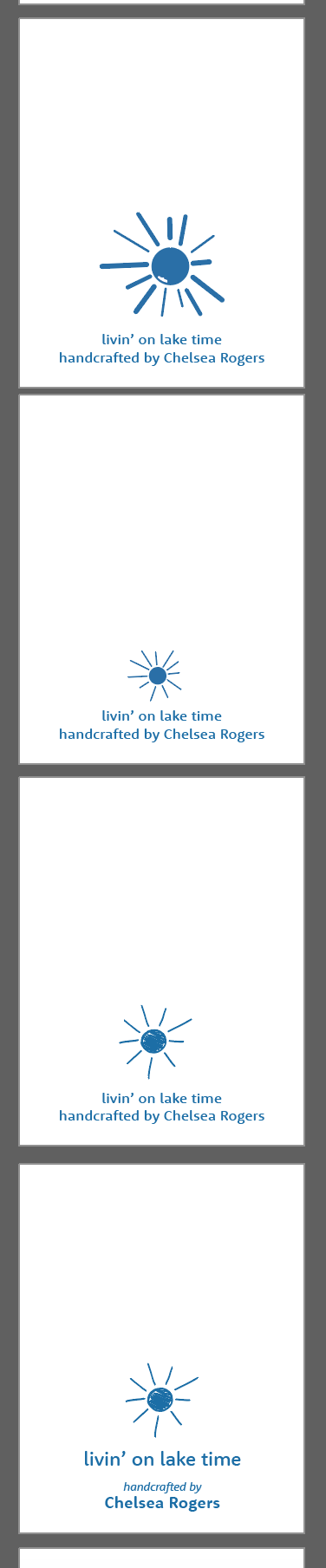
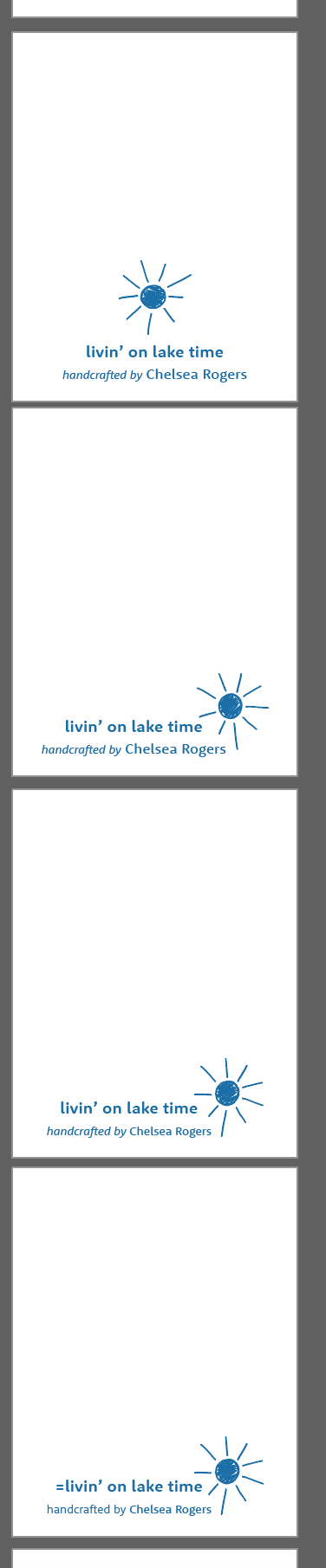
livin’ on lake time was a semester-long project where we developed, designed, and produced a line of thoughtfully crafted paper goods intended for the marketplace. The class teamed up with the Detroit Wood Type Company to bring these ideas to fruition with the letterpress. Each student in the class created their own unique line of products that were sold collectively as the Baltimore St. Society. We split the class up into teams, each helping create a certain aspect of the class brand. The teams included photography, website building, copywriting, display building, and branding. I worked on the branding team with Sophie Boysen. Together we created the logo for Baltimore St. Society, inspired by the road our school is on and the paper products we shared with the community.
Visit the Detroit Wood Type Company
Visit Baltimore St. Society
Visit Sophie Boysen
![]()
![]()
![]()
![]()
PROCESS
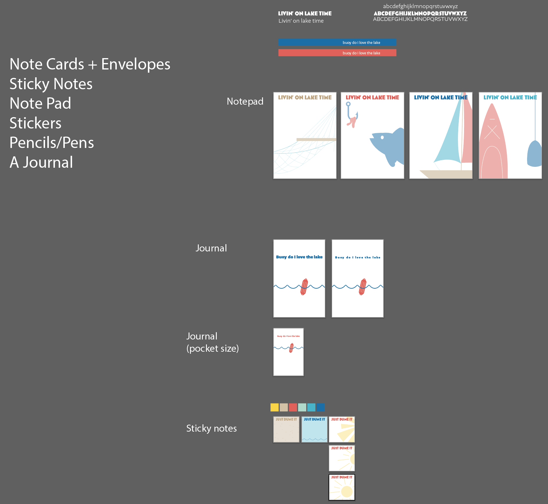
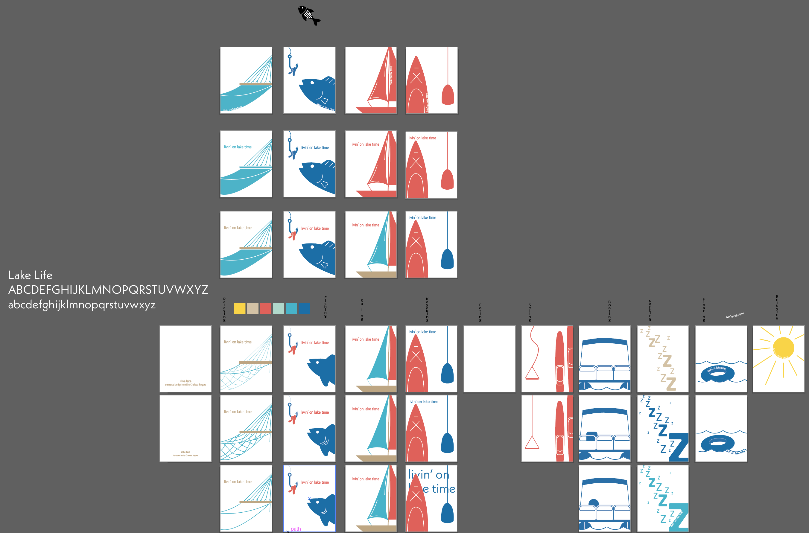
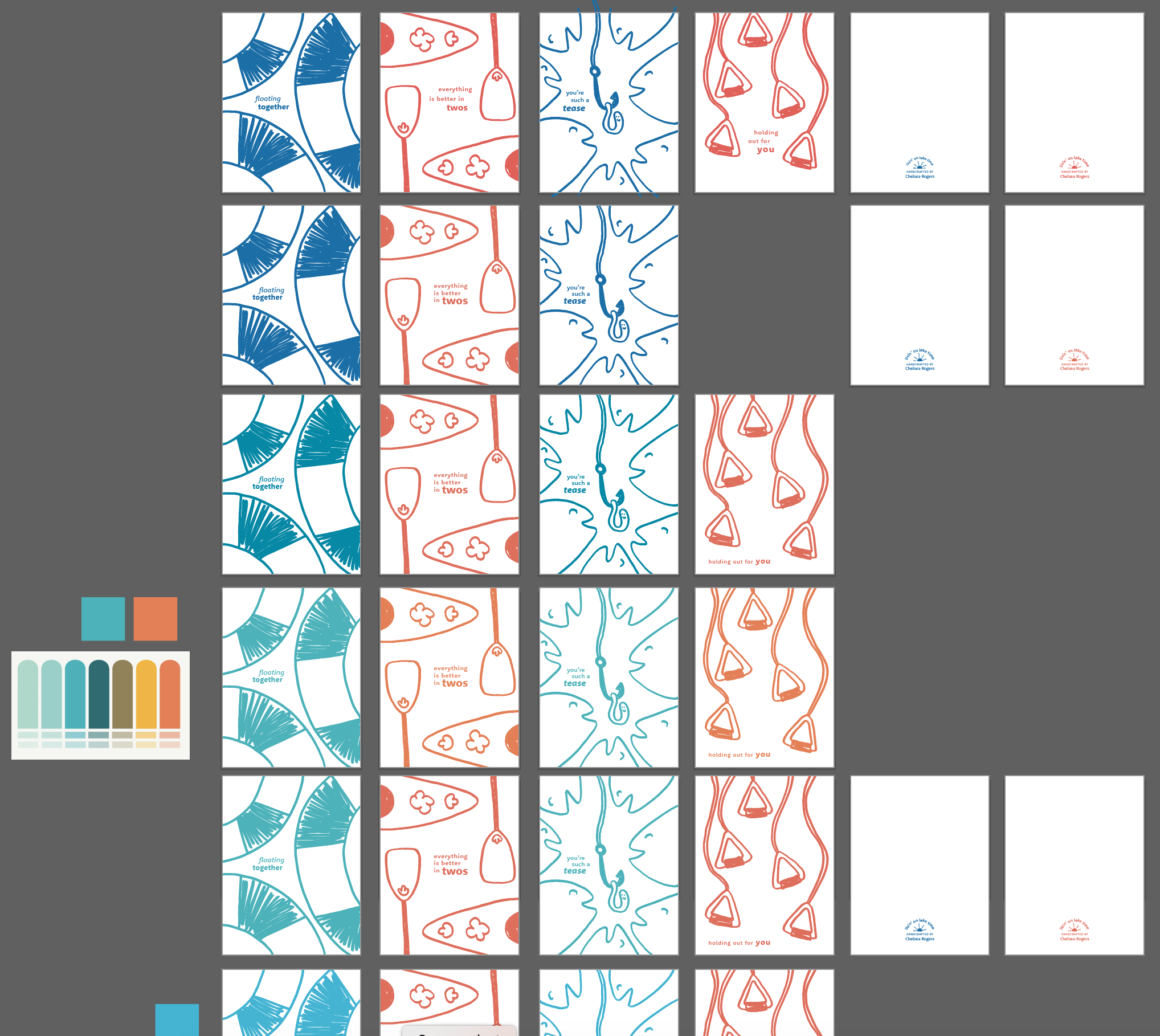
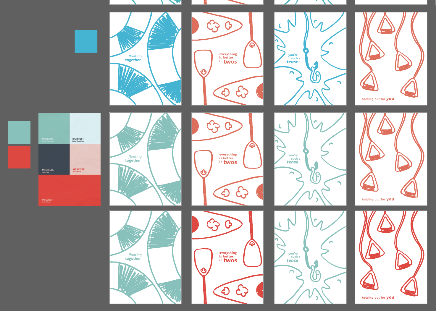
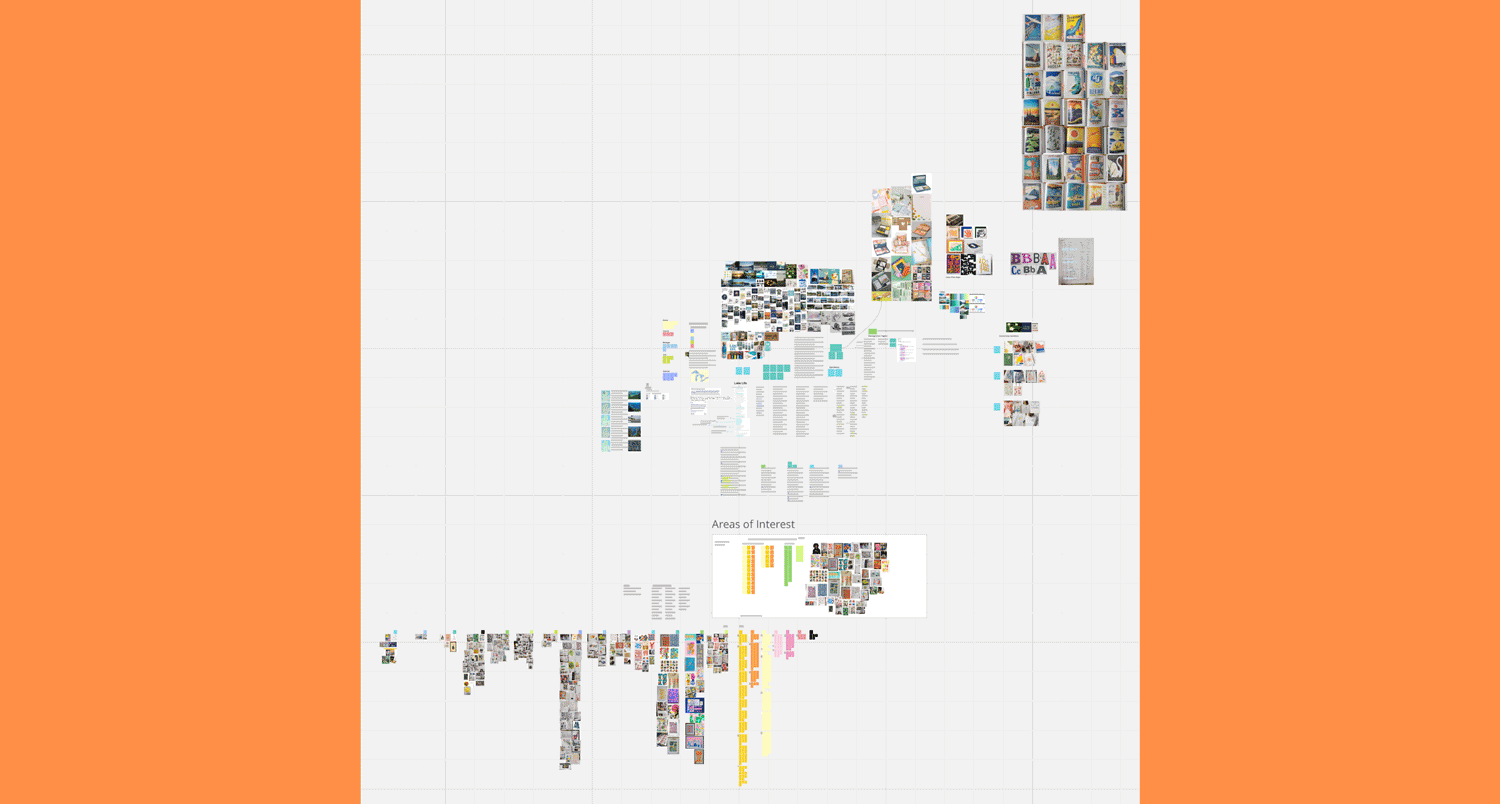
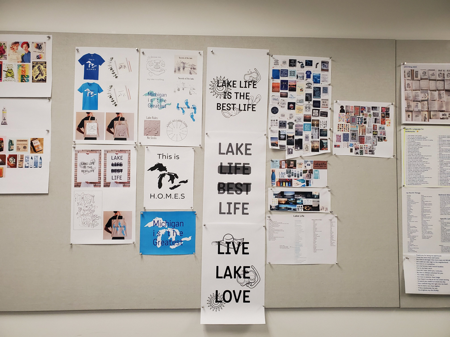
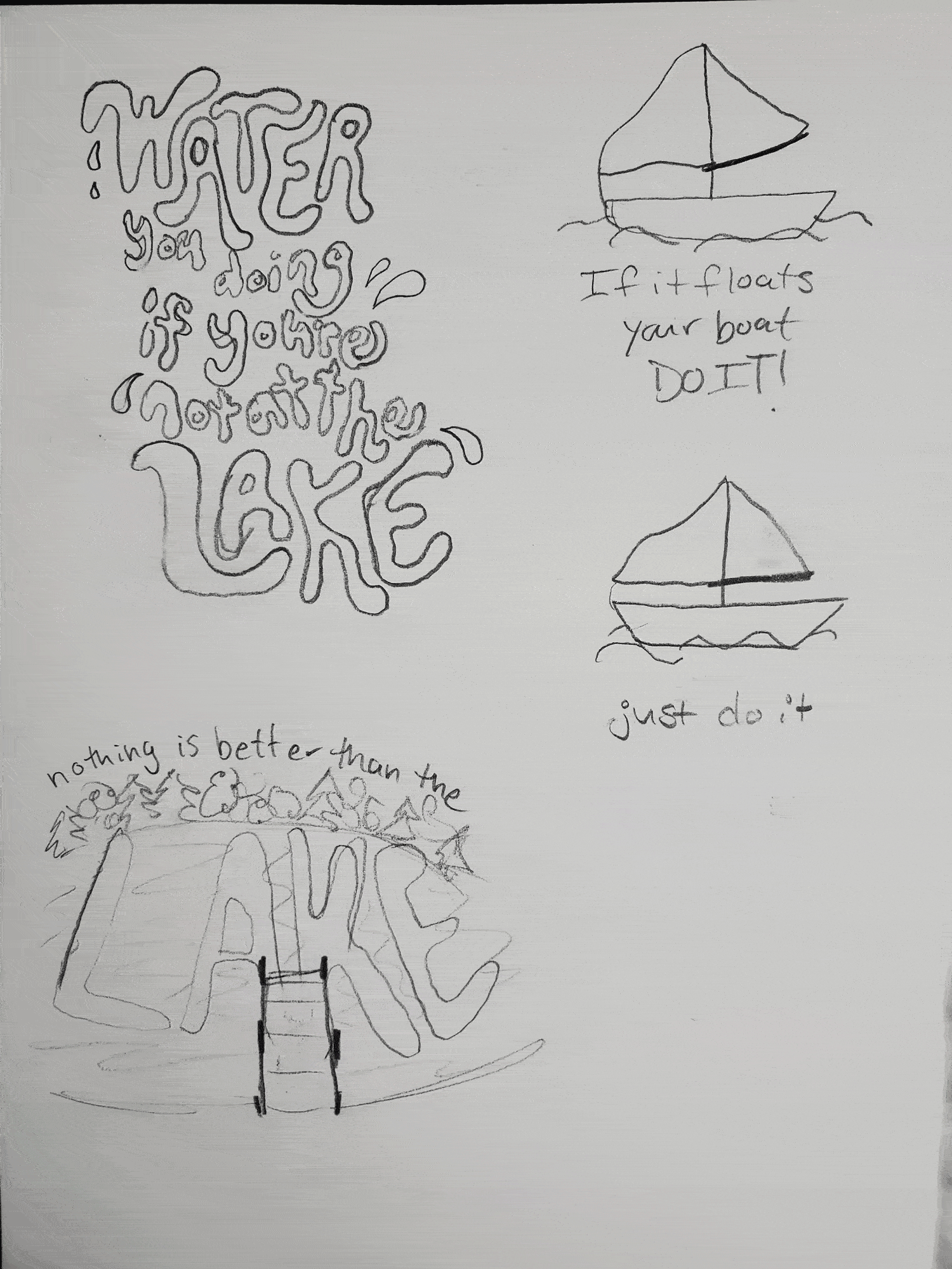
livin’ on lake time was inspired by my love of going to the lake, something I have enjoyed my entire life. Before diving into creating, I developed an expansive mood board, on MIRO, with research, words, phrases, product ideas, inspiration, names, colors, and whatever else I thought about to aid in this process. I was greatly inspired by playful imagery, bright colors, and a humanistic quality.
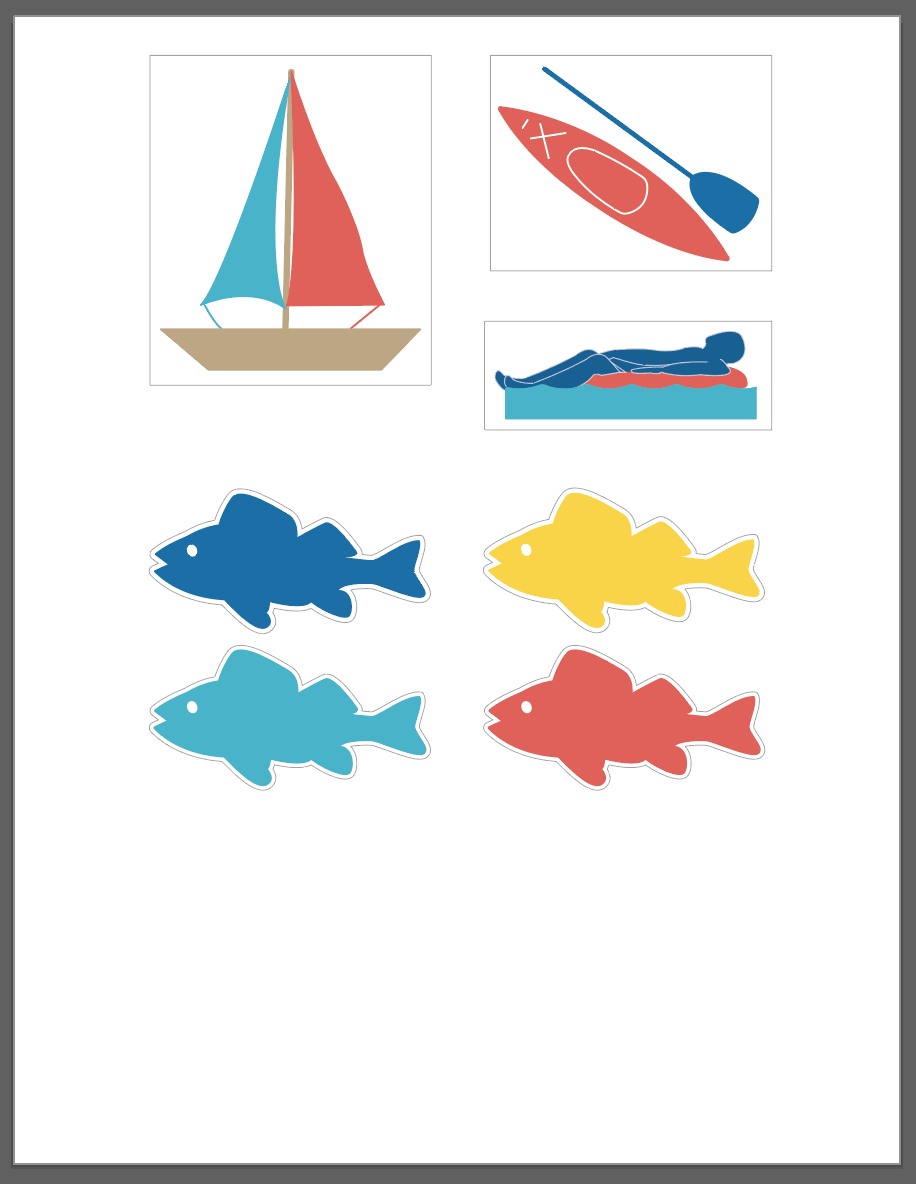
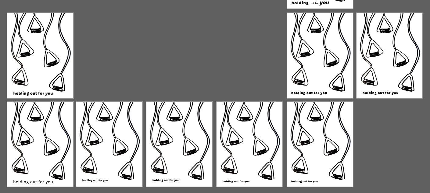
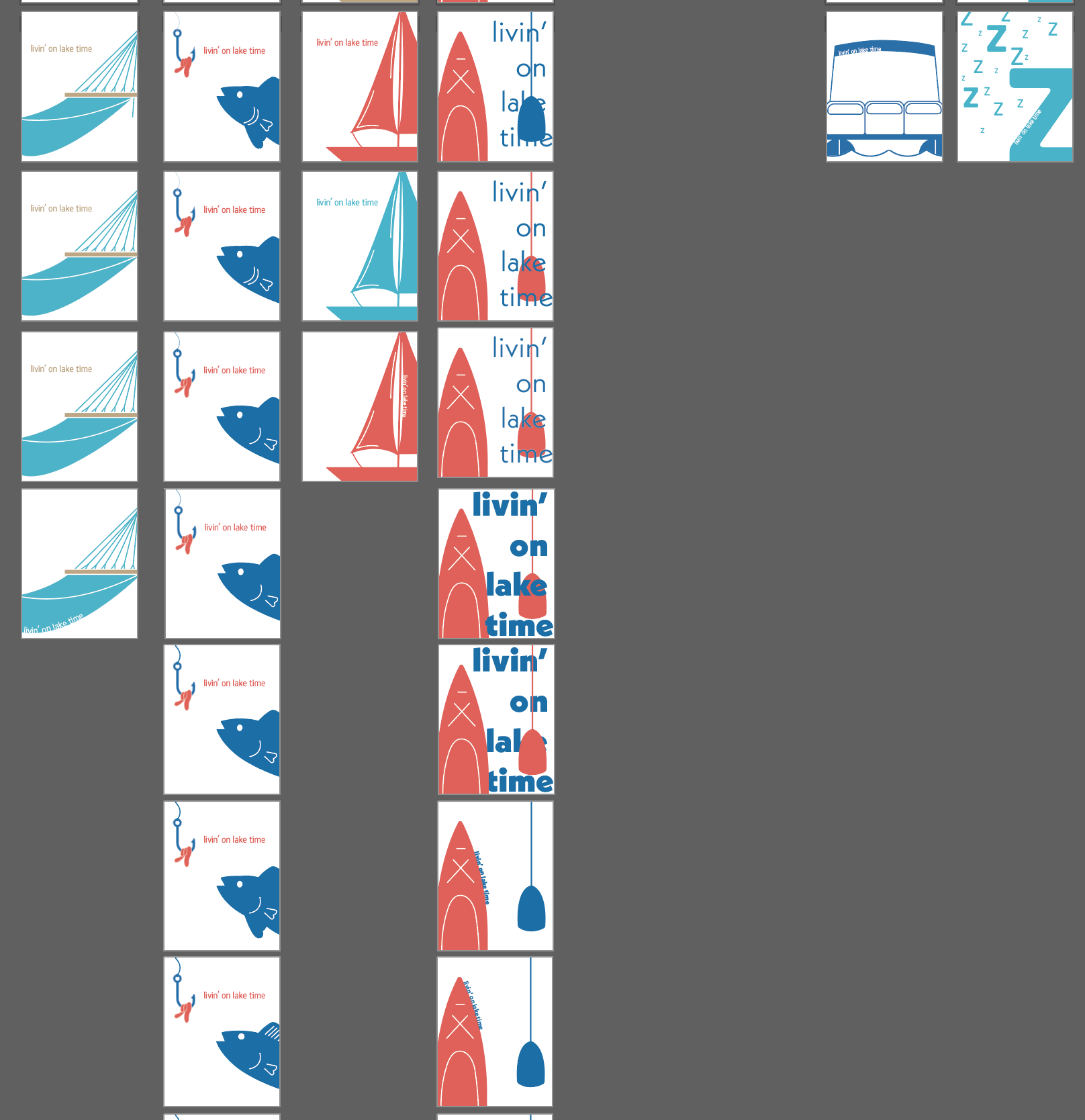
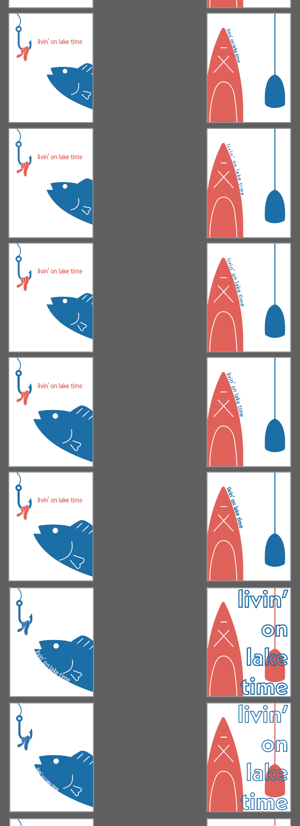
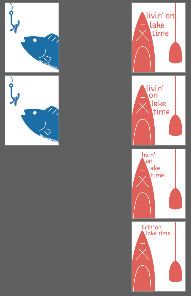
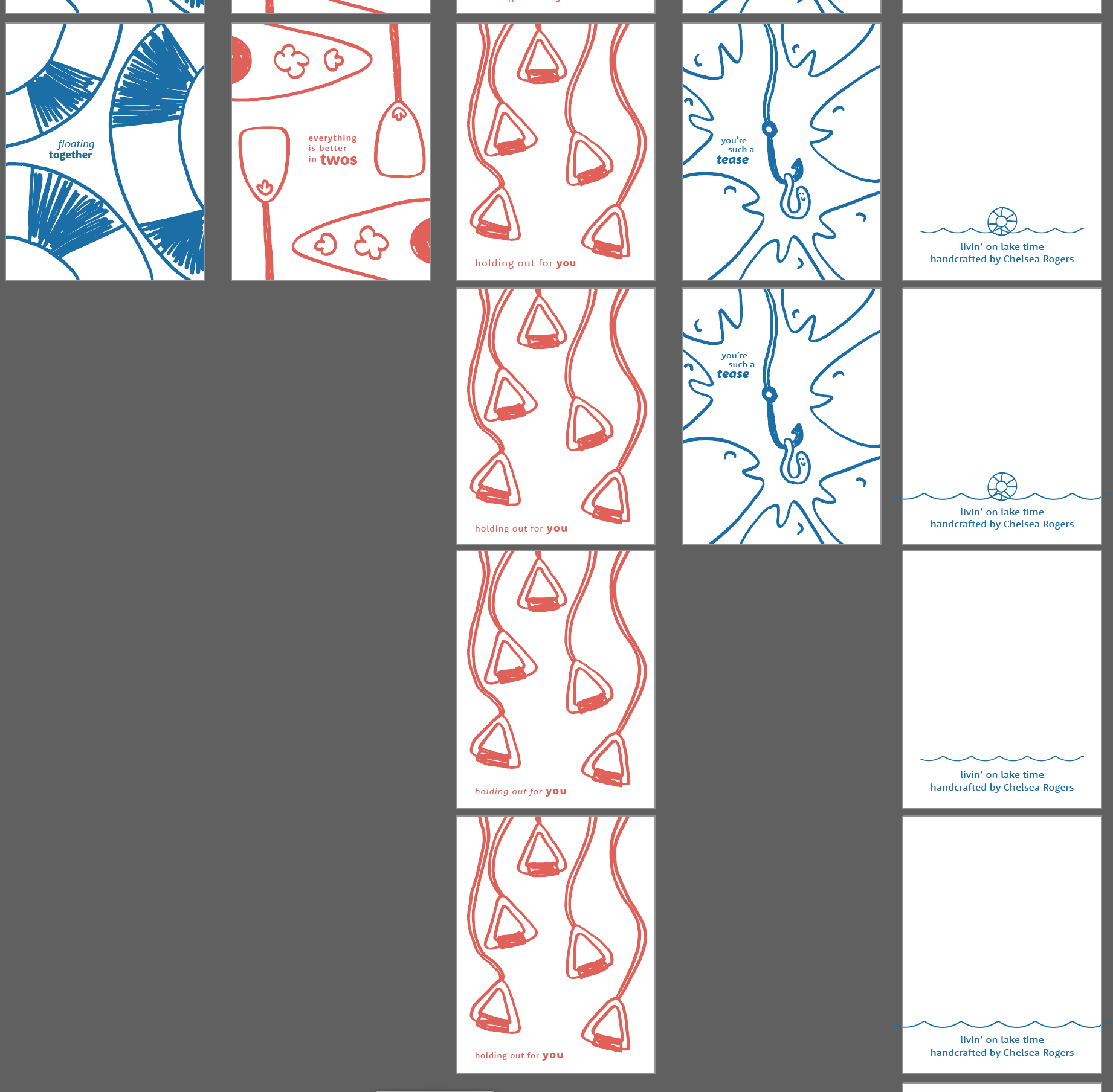
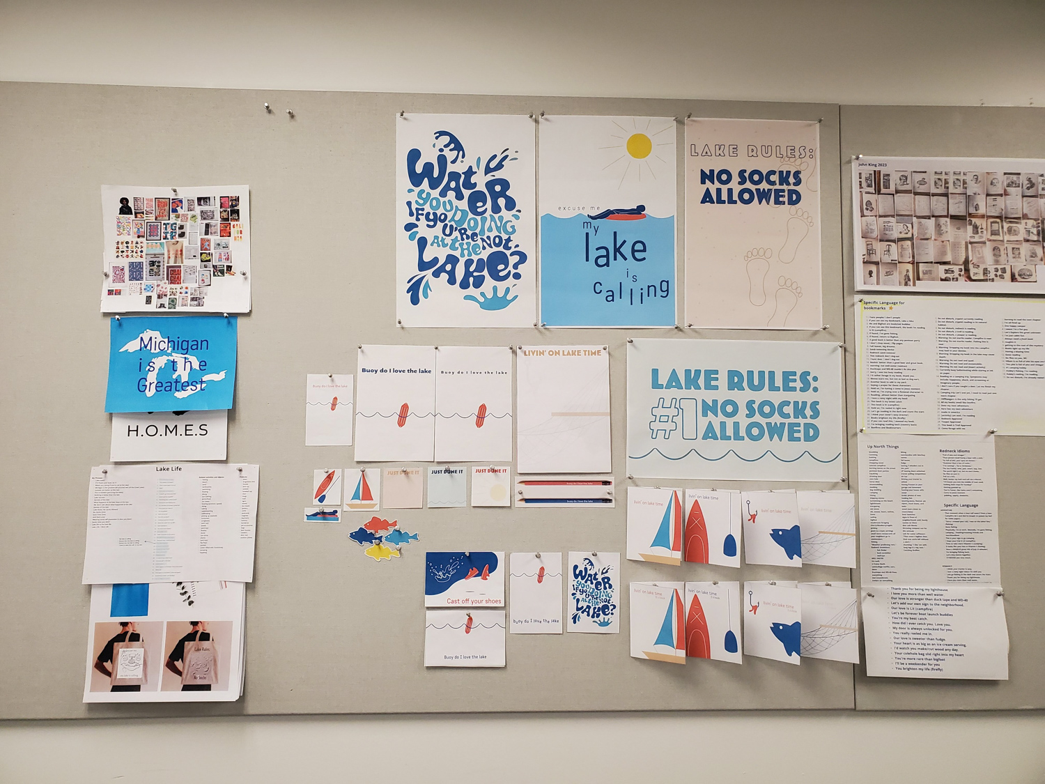
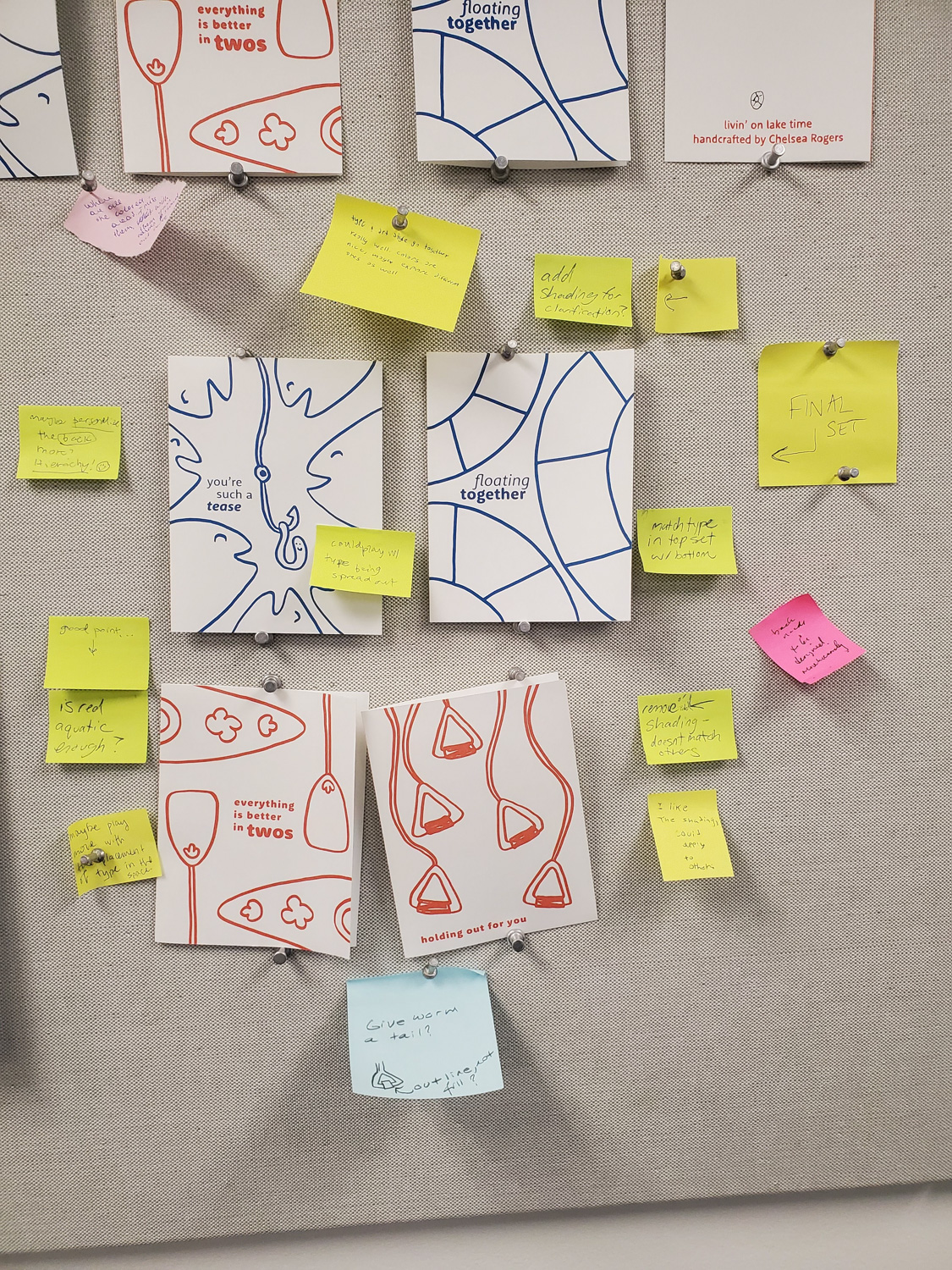
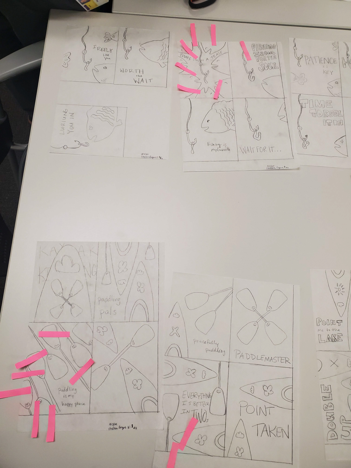
My handmade illustrations represent various aspects or activities you may experience when you’re at the lake. This series features cards that represent floating on the water, fishing, kayaking, and skiing (or any water sport where you are pulled behind a boat). I paired these fun illustrations with embracing phrases to drive the feeling of human connection.
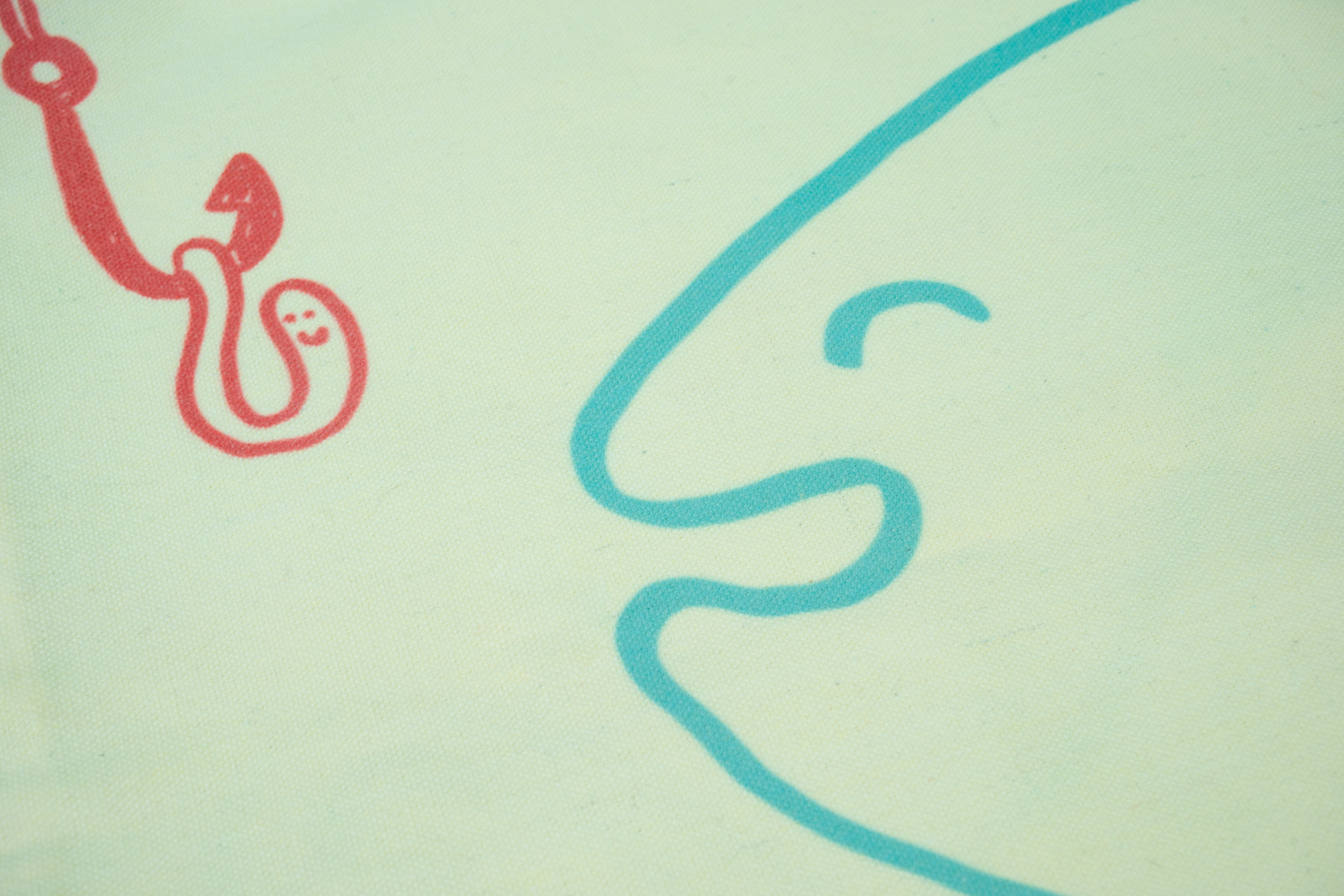
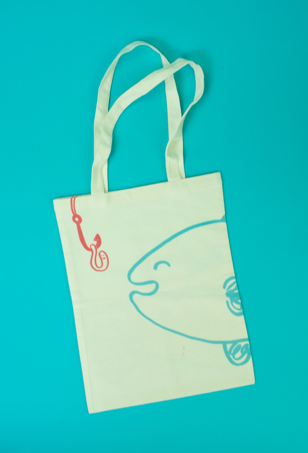
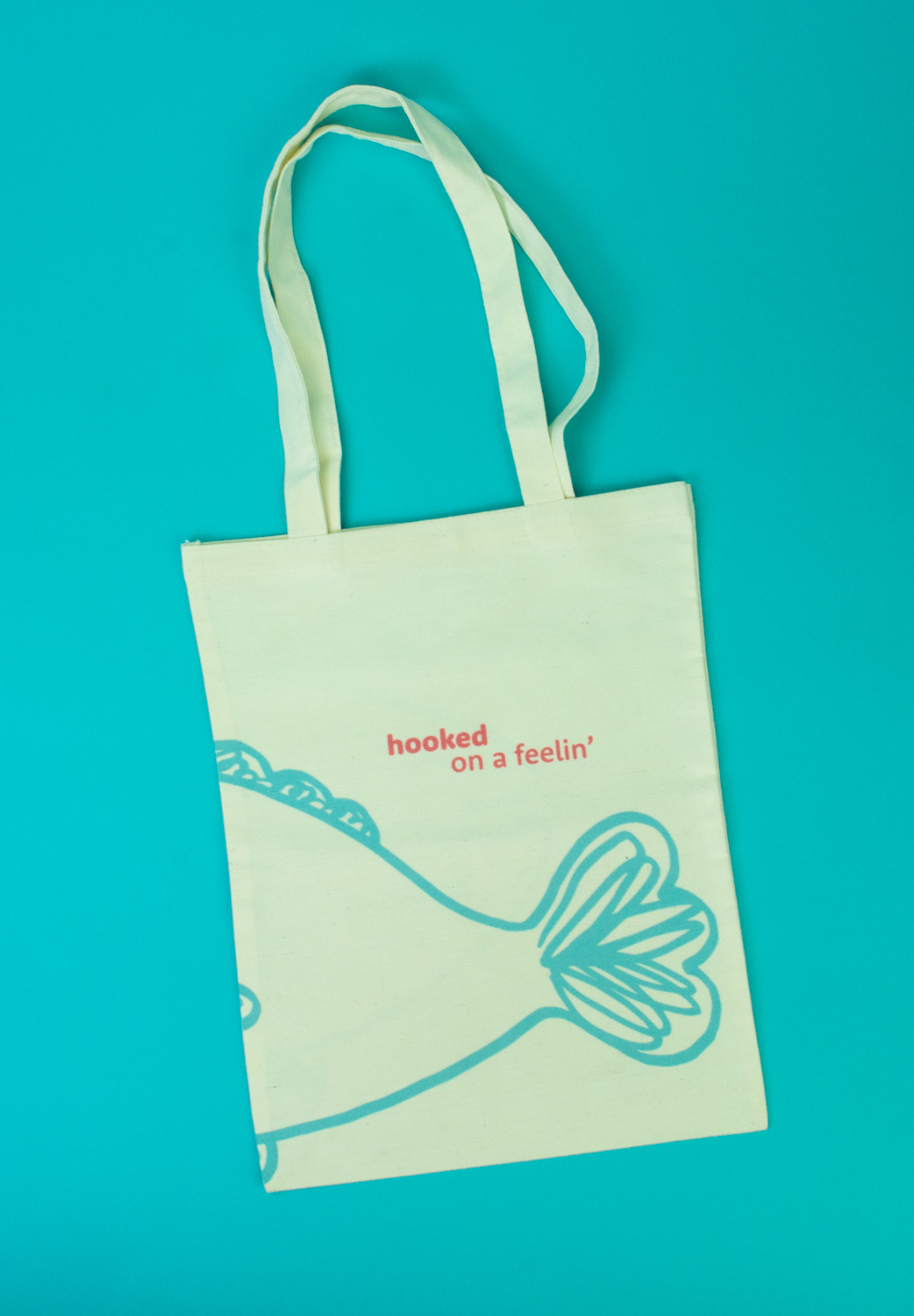
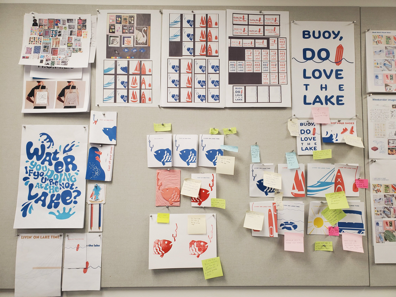
Along with my series of four cards, I created a tote bag. This is often an item you see at the lake. It is quite useful for carrying all your things down to the beach, on the boat, and such. I carried over the fish into this piece, as it was a fan favorite. This illustration includes a happy fish looking at a worm on the hook. I wrapped the fish around both sides of the tote bag, as I thought it would be an interesting aspect to see. One side includes the worm, the other includes another embracing phrase, hooked on a feelin’.
The designing phase of this project was fun, however I think the actual creation of the products was the most fun! Since I had four cards in this series, I didn’t want to take away too much time from my classmates and decided to split the printing process with my card series. Half of them were RISO printed and the other half were printed on the letterpress. RISO printing is something that I love and enjoy, so the process of making these wasn’t new to me. I did run into an obstacle, as one of the colors I planned on using was broken. I went through a series of different color options to find one that worked best with my concept and ink for the letterpress.
I enjoyed my time working at the Detroit Wood Type Company. Everything I did there was new to me, and I loved the entire process. I learned how to mix my ink color, how to lock up my plate in a chase, how to use a small, portable card printing letterpress, and how to properly clean it all up. Using the letterpress is a process I would like to explore in the future.
Creating the tote bags introduces another new process to me, called sublimation printing. For this process, the design gets printed on a kind of heat transfer paper. This then goes on top of the physical item to be printed and into a heat press. The actual heating process only takes a couple of minutes, so it’s fairly quick.
livin’ on lake time was a semester-long project where we developed, designed, and produced a line of thoughtfully crafted paper goods intended for the marketplace. The class teamed up with the Detroit Wood Type Company to bring these ideas to fruition with the letterpress. Each student in the class created their own unique line of products that were sold collectively as the Baltimore St. Society. We split the class up into teams, each helping create a certain aspect of the class brand. The teams included photography, website building, copywriting, display building, and branding. I worked on the branding team with Sophie Boysen. Together we created the logo for Baltimore St. Society, inspired by the road our school is on and the paper products we shared with the community.
Visit the Detroit Wood Type Company
Visit Baltimore St. Society
Visit Sophie Boysen


PROCESS
livin’ on lake time was inspired by my love of going to the lake, something I have enjoyed my entire life. Before diving into creating, I developed an expansive mood board, on MIRO, with research, words, phrases, product ideas, inspiration, names, colors, and whatever else I thought about to aid in this process. I was greatly inspired by playful imagery, bright colors, and a humanistic quality.
My handmade illustrations represent various aspects or activities you may experience when you’re at the lake. This series features cards that represent floating on the water, fishing, kayaking, and skiing (or any water sport where you are pulled behind a boat). I paired these fun illustrations with embracing phrases to drive the feeling of human connection.
Along with my series of four cards, I created a tote bag. This is often an item you see at the lake. It is quite useful for carrying all your things down to the beach, on the boat, and such. I carried over the fish into this piece, as it was a fan favorite. This illustration includes a happy fish looking at a worm on the hook. I wrapped the fish around both sides of the tote bag, as I thought it would be an interesting aspect to see. One side includes the worm, the other includes another embracing phrase, hooked on a feelin’.
The designing phase of this project was fun, however I think the actual creation of the products was the most fun! Since I had four cards in this series, I didn’t want to take away too much time from my classmates and decided to split the printing process with my card series. Half of them were RISO printed and the other half were printed on the letterpress. RISO printing is something that I love and enjoy, so the process of making these wasn’t new to me. I did run into an obstacle, as one of the colors I planned on using was broken. I went through a series of different color options to find one that worked best with my concept and ink for the letterpress.
I enjoyed my time working at the Detroit Wood Type Company. Everything I did there was new to me, and I loved the entire process. I learned how to mix my ink color, how to lock up my plate in a chase, how to use a small, portable card printing letterpress, and how to properly clean it all up. Using the letterpress is a process I would like to explore in the future.
Creating the tote bags introduces another new process to me, called sublimation printing. For this process, the design gets printed on a kind of heat transfer paper. This then goes on top of the physical item to be printed and into a heat press. The actual heating process only takes a couple of minutes, so it’s fairly quick.
EXPERIENCE


MOODBOARD
![]()
PROCESS WALL

SKETCHES


ITERATION