The Little Blue Box
PACKAGING DESIGN
BRIEF
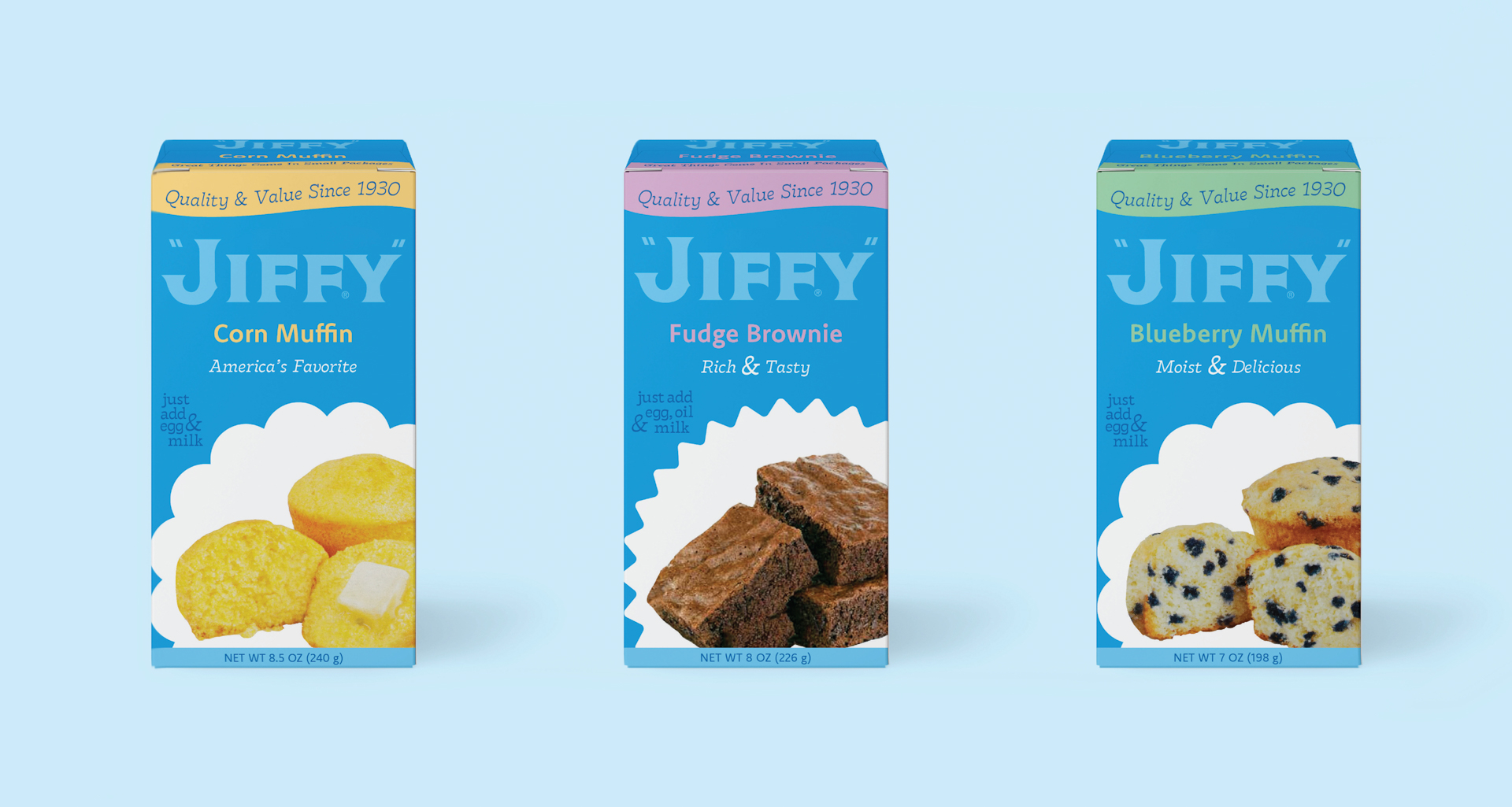
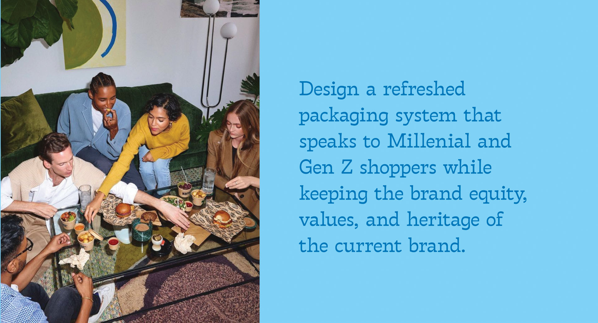
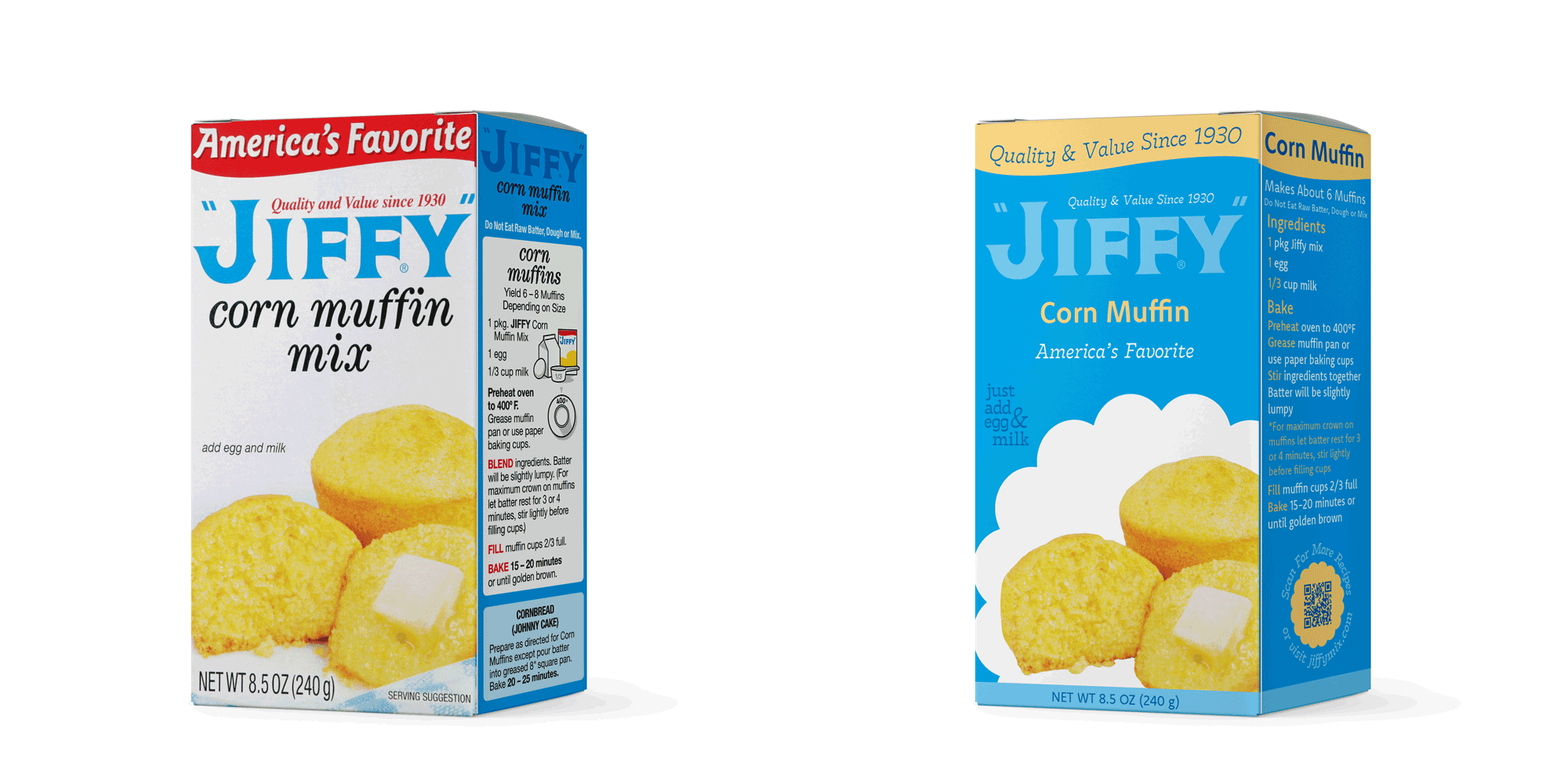
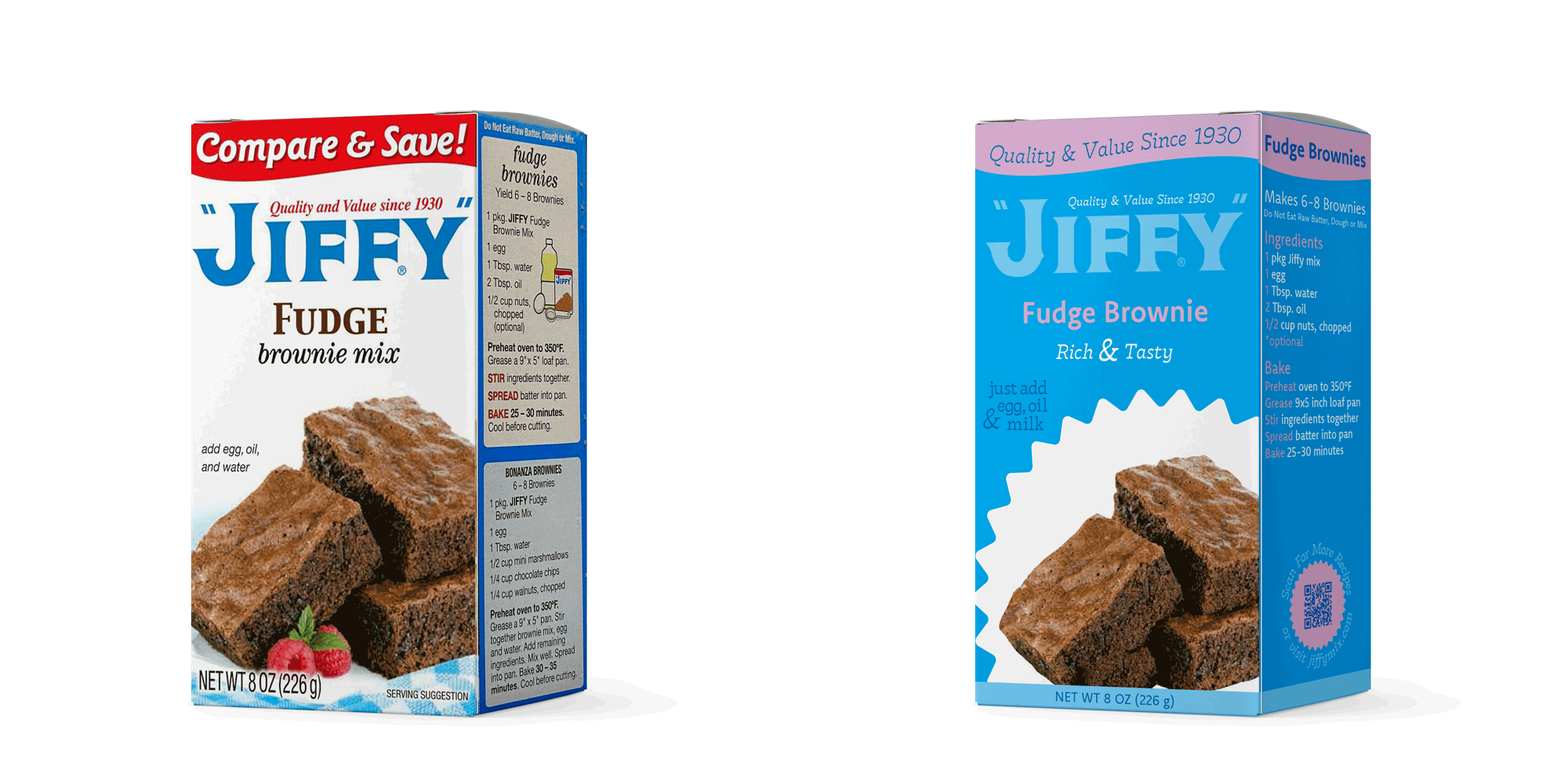
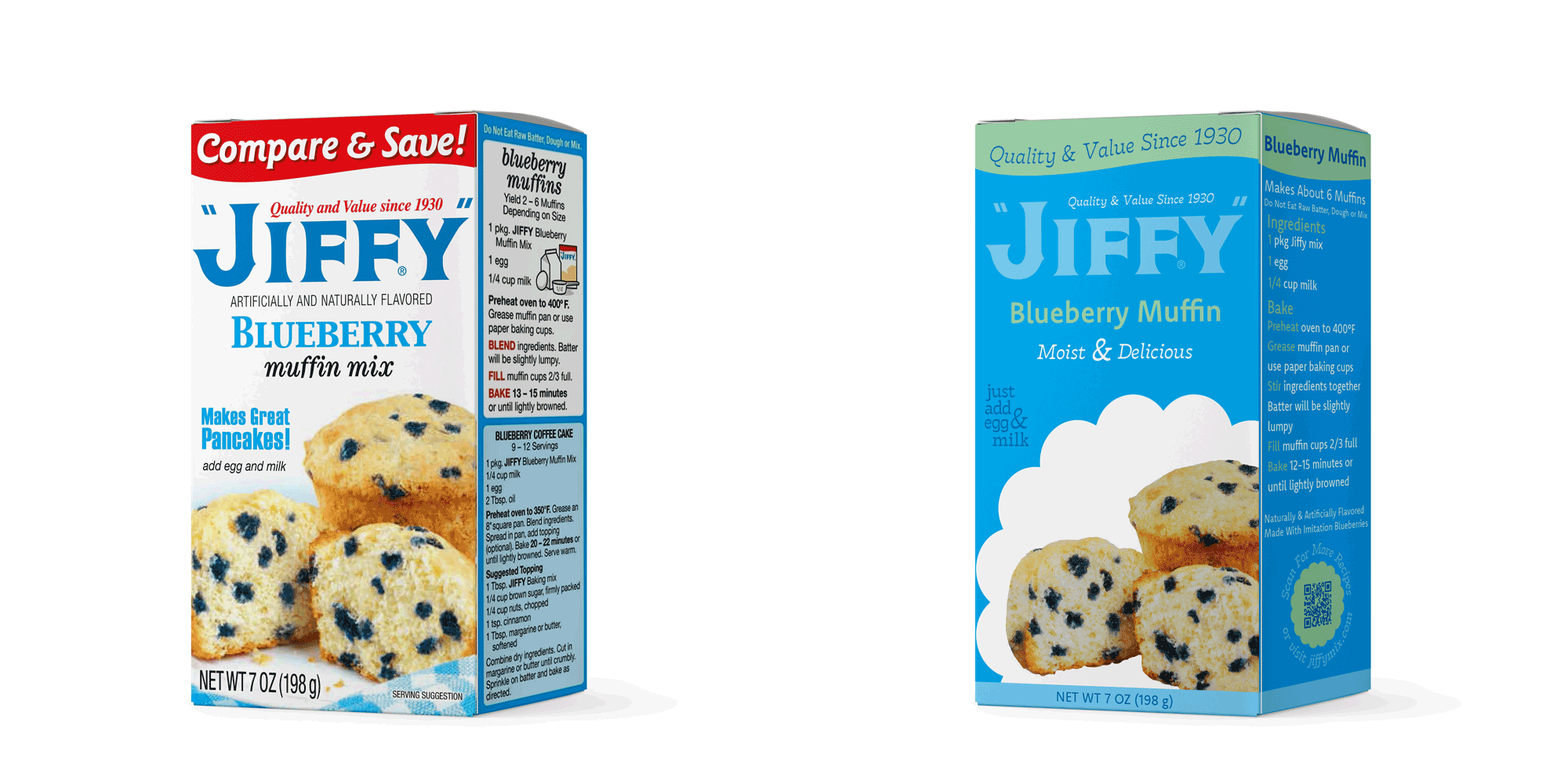
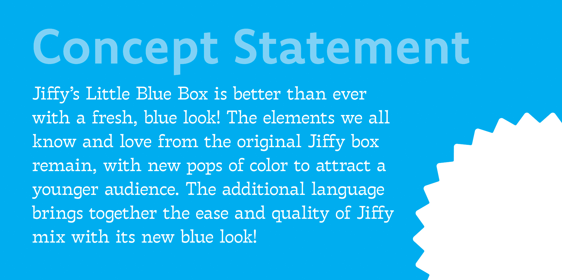
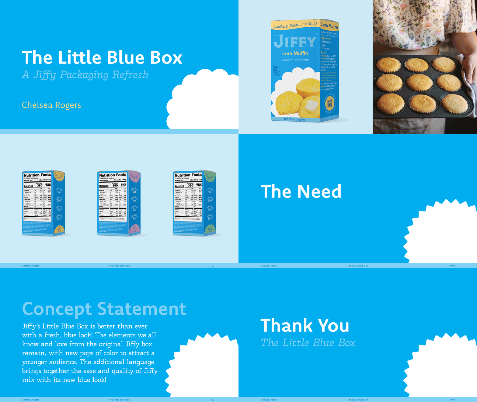
We all know and love Jiffy, they’ve been around for nearly 100 years! Since the beginning, their packaging has mostly stayed the same. Jiffy’s Little Blue Box is now better than ever with a fresh, blue look! The elements we all know and love from the original Jiffy box remain, with new pops of color to attract a younger audience. The additional language brings together the ease and quality of Jiffy mix with its new blue look! Don’t let this new blue distract you, as the packaging design maintains the brand equity, values, and heritage of Jiffy.
TARGET AUDIENCE
Gen Z and Millenials

PROCESS
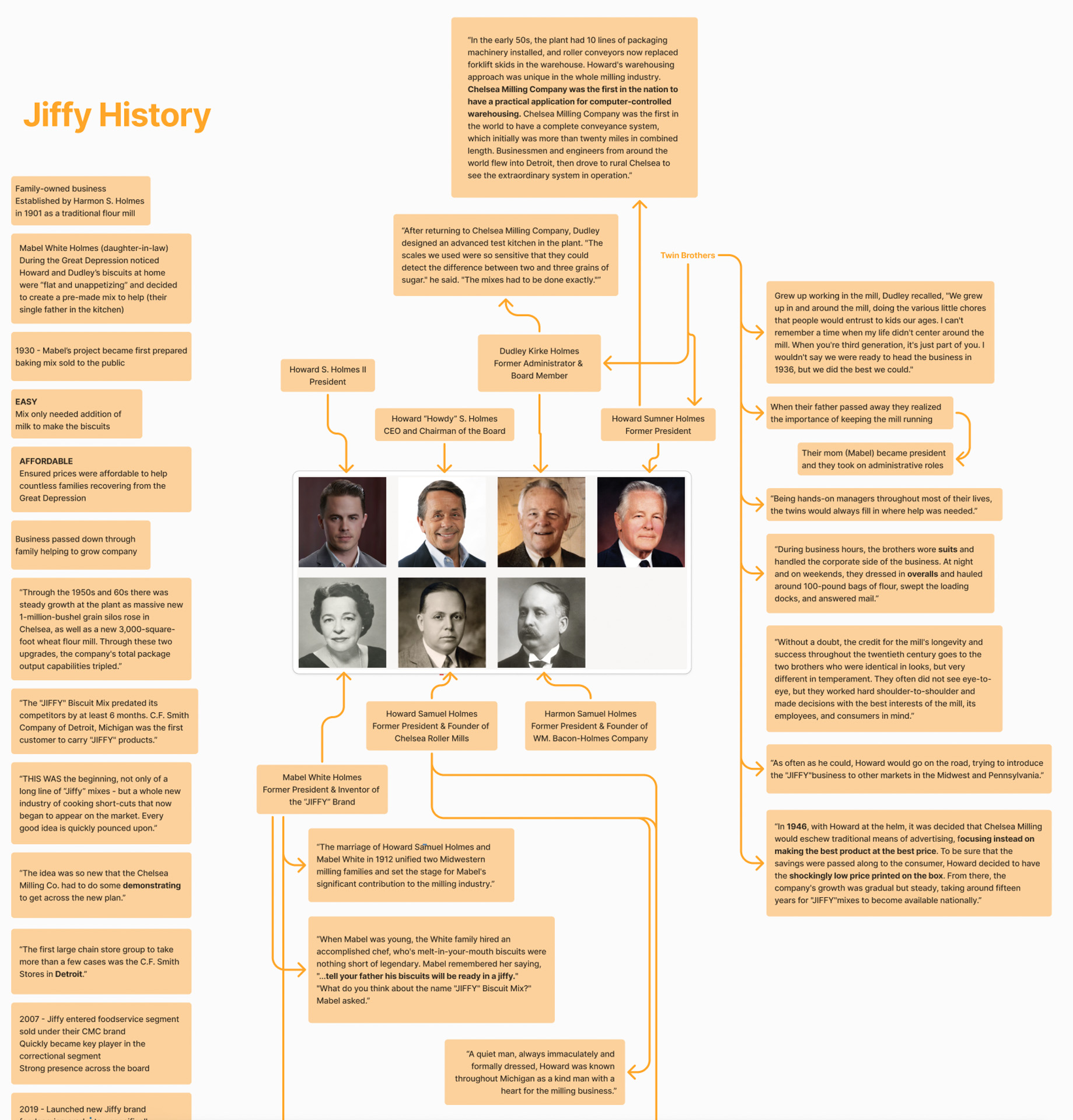
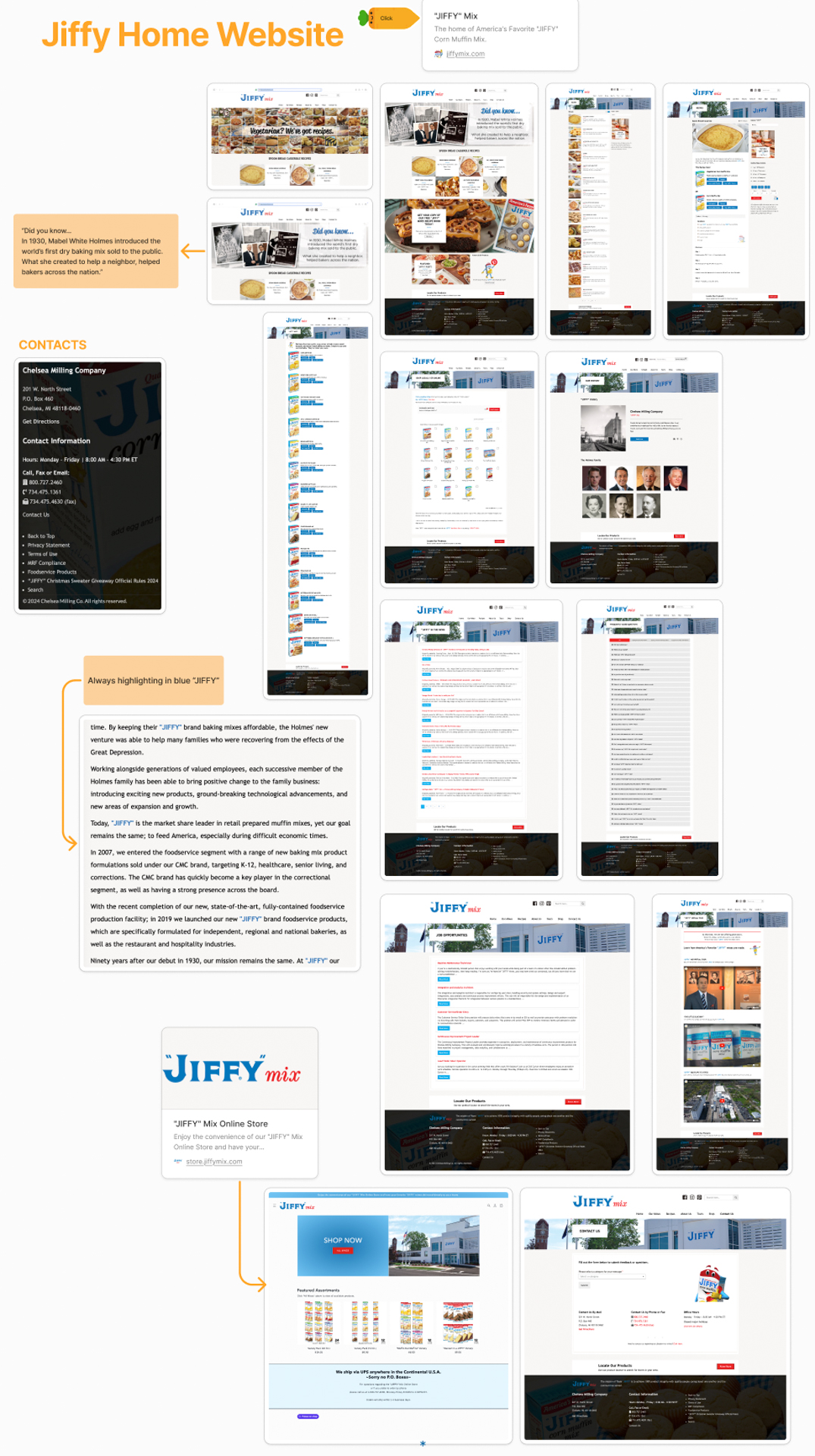
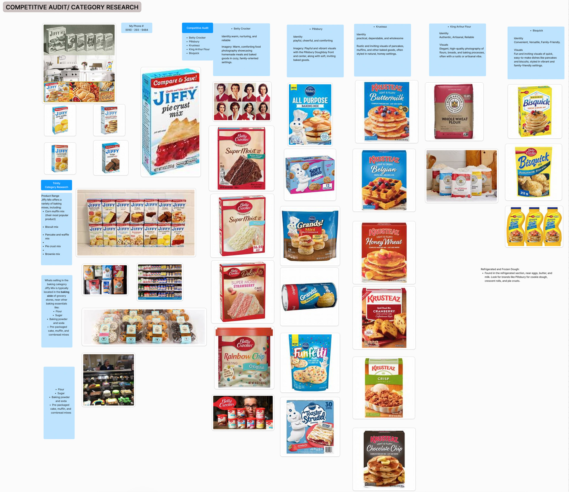
Beginning with research, I teamed up with two other classmates, Trinity Tubbs and Kennedy Noble. We split the areas of research between us, including Jiffy’s brand and history, target audience demographics and shopping habits, as well as category research and brand audit. After gathering our research, we summarized what we learned in a presentation, and went our separate ways to create our own unique Jiffy packaging refresh concepts.
Visit Trinity Tubbs
Visit Kennedy Noble
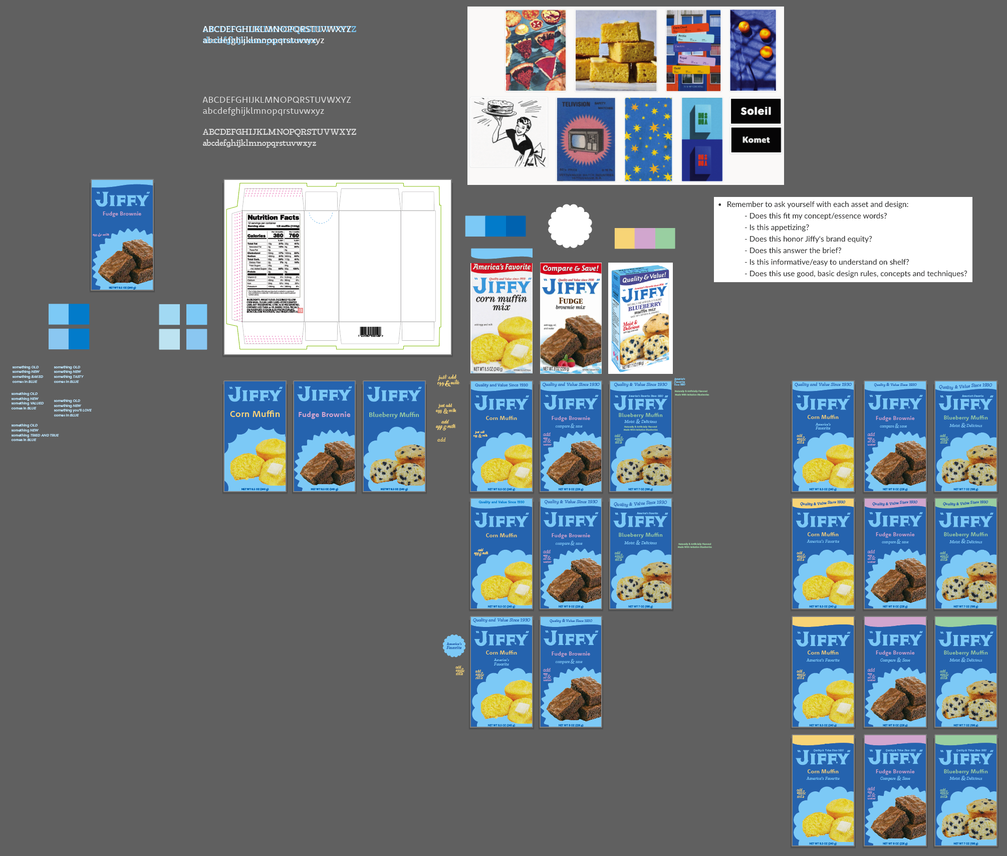
Through our research, I heard people referring to Jiffy’s product as “the little blue box” and this phrase stood out to me. I think it’s an endearing saying to use referring to a product that’s known and loved all across the country. I used this phrase to develop my package refresh concept of The Little Blue Box where I planned to make the entire box blue.
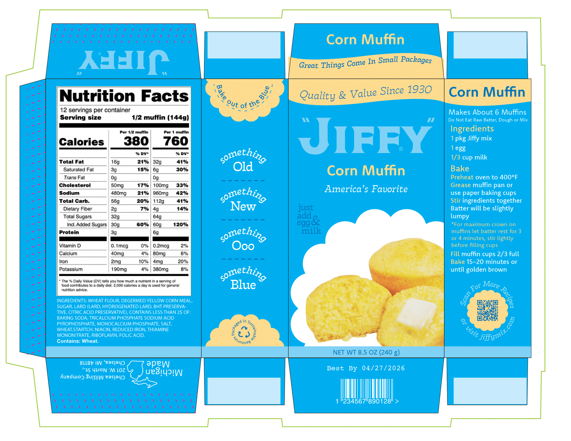
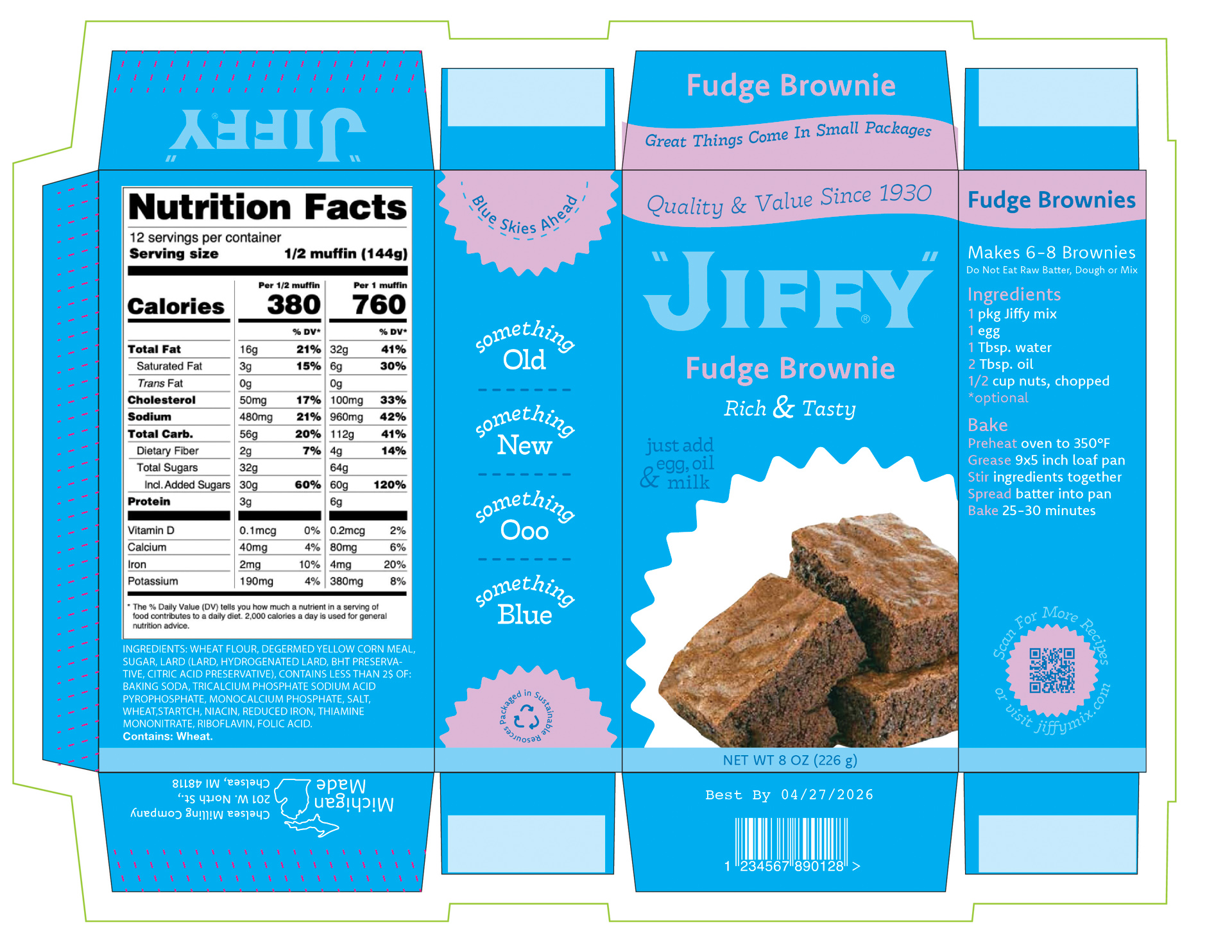
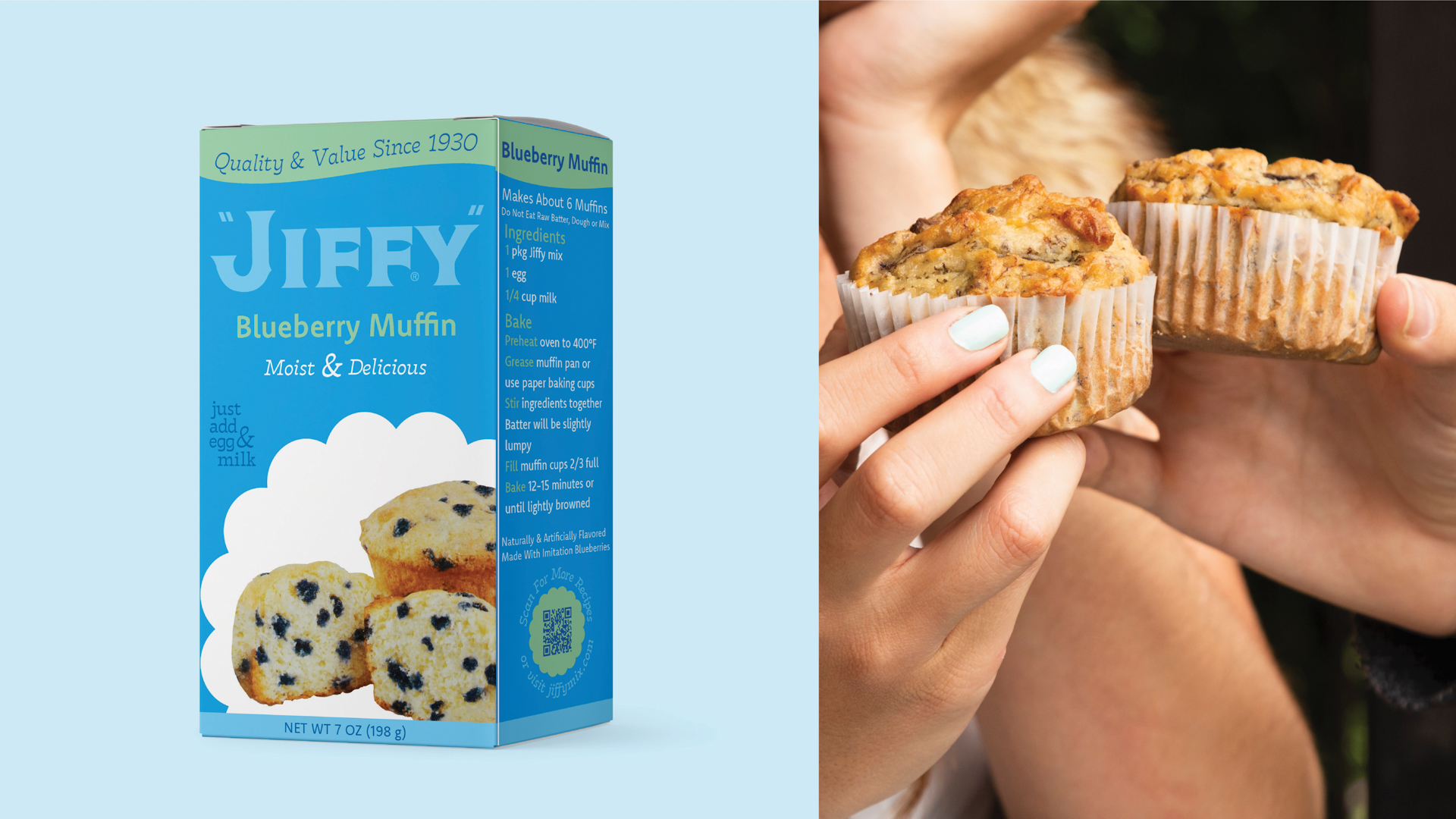
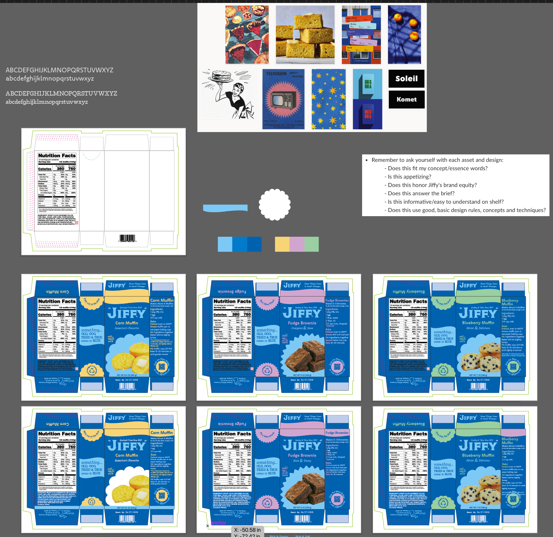
Jiffy products have become a household staple and are many people’s go-to baking mix. With this in mind, I needed to preserve the essence of Jiffy that everyone knows, especially having changed the appearance of the box so dramatically. To do this, I kept the same composition of content on the front panel while keeping much of the original language. The bold blue used on the entire box is the same blue that Jiffy currently uses on their boxes.
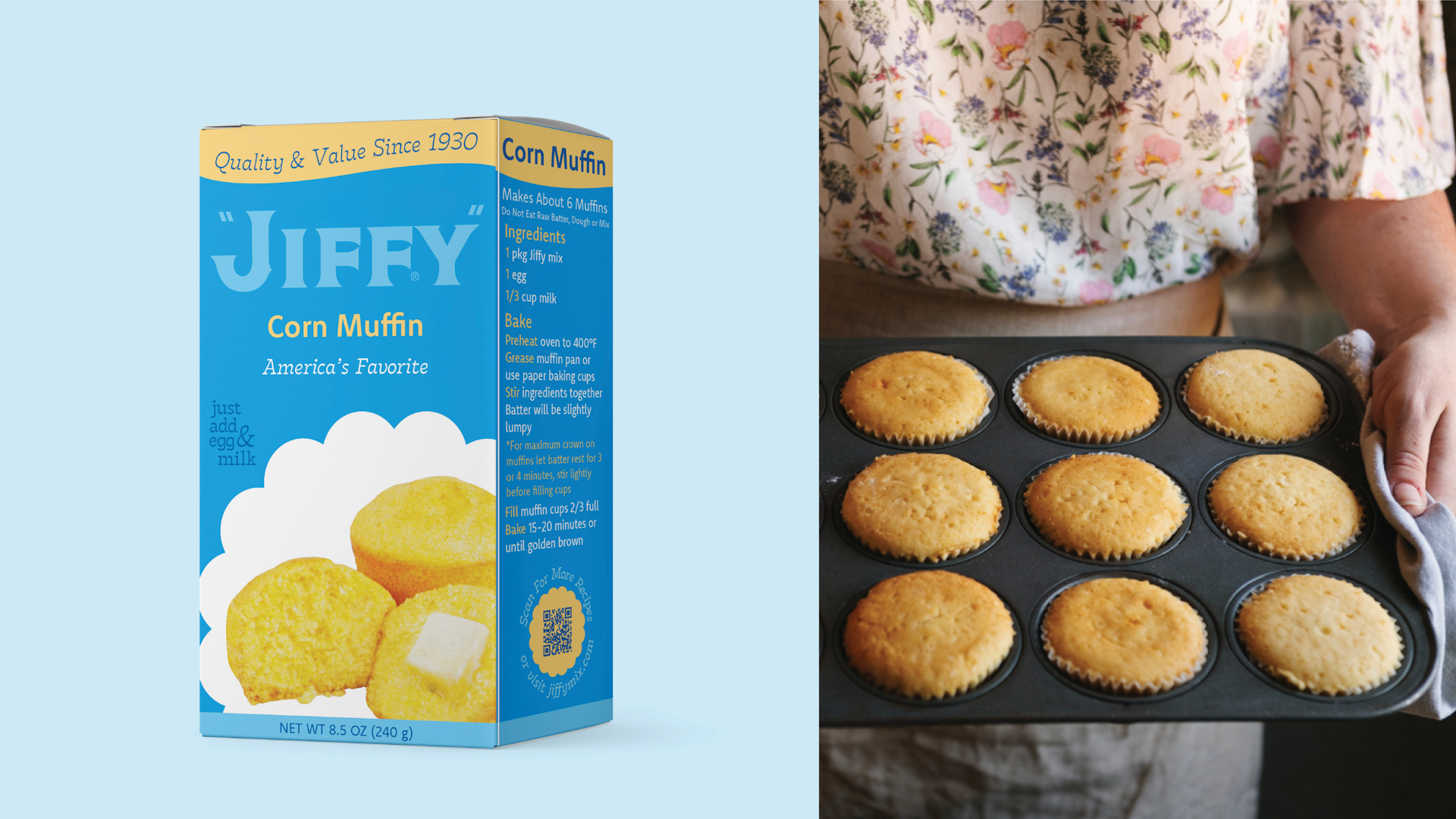
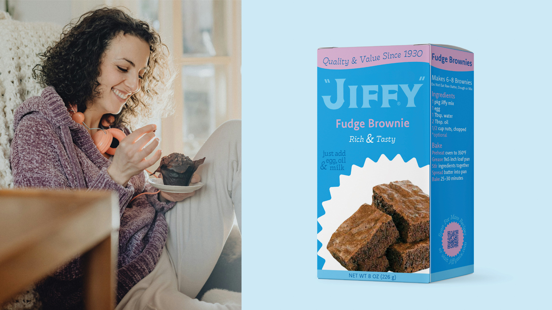
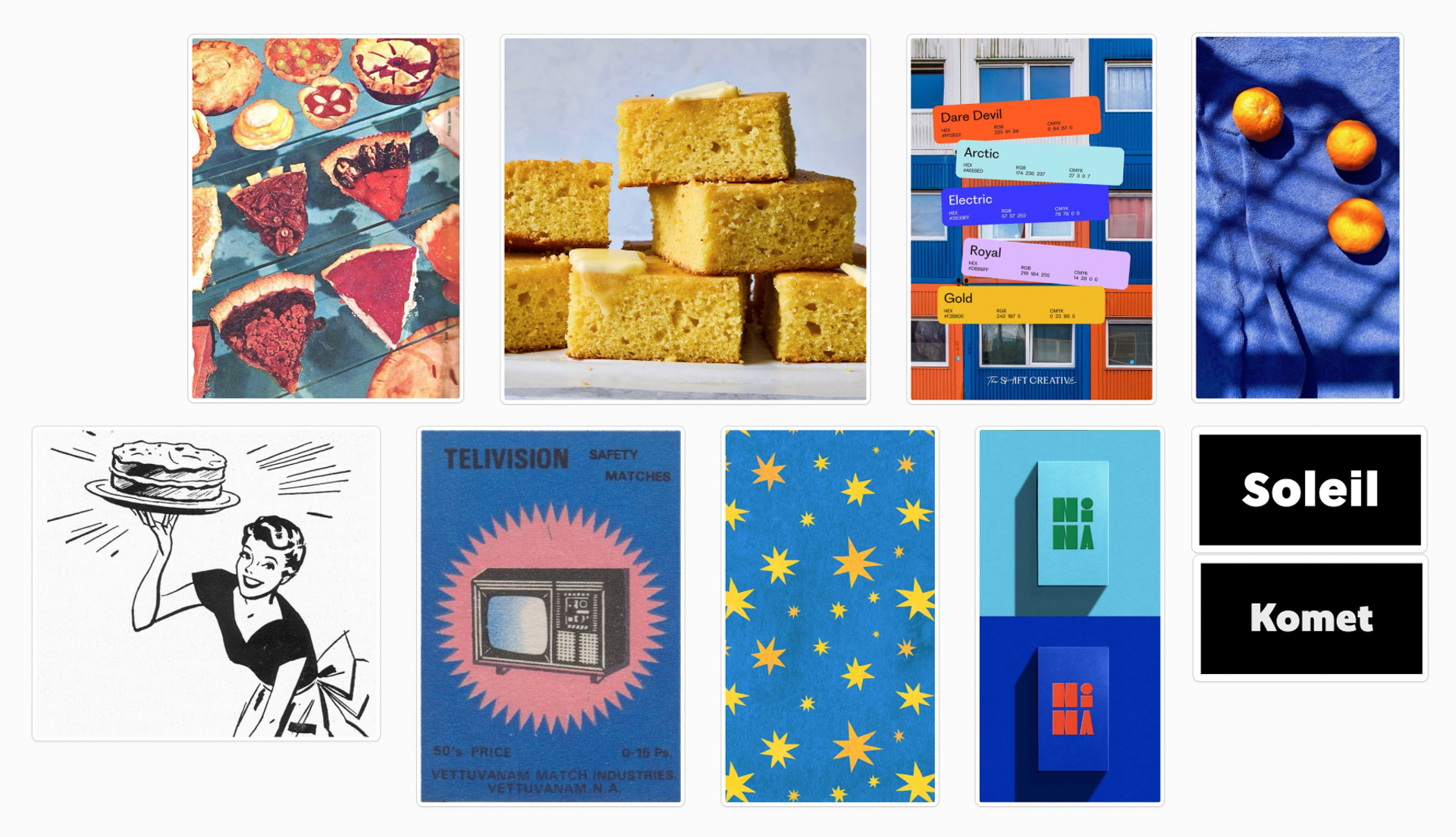
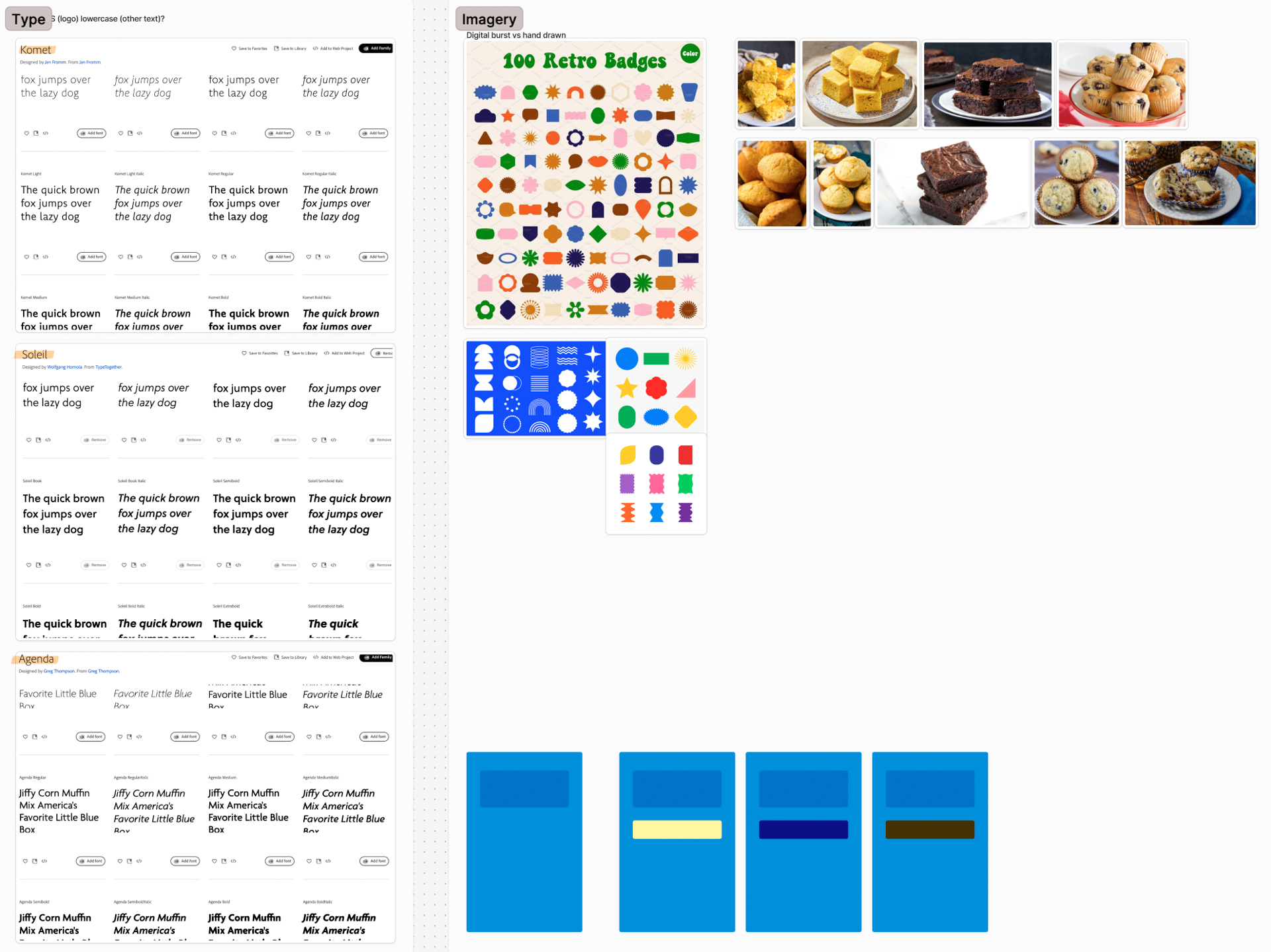
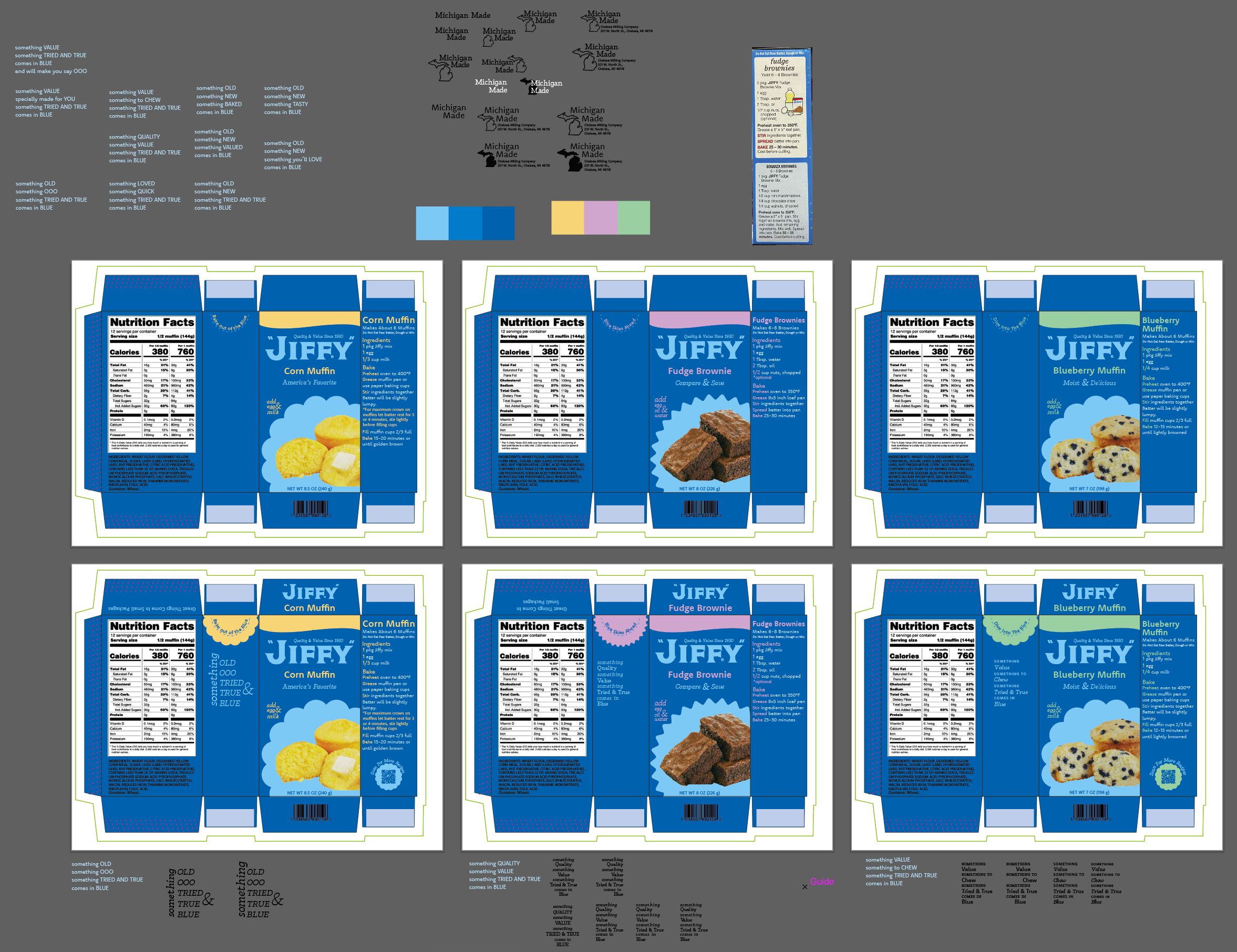
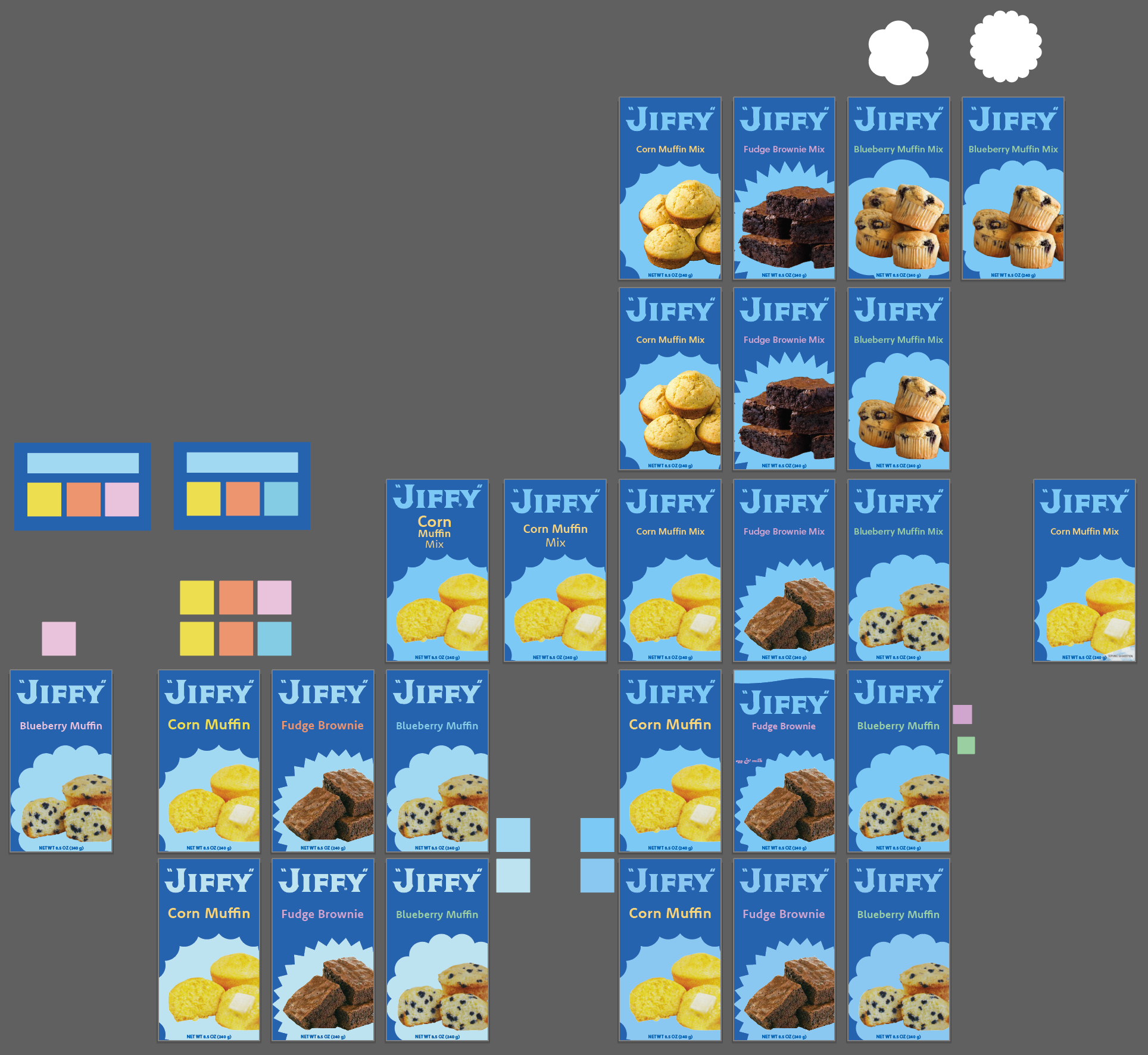
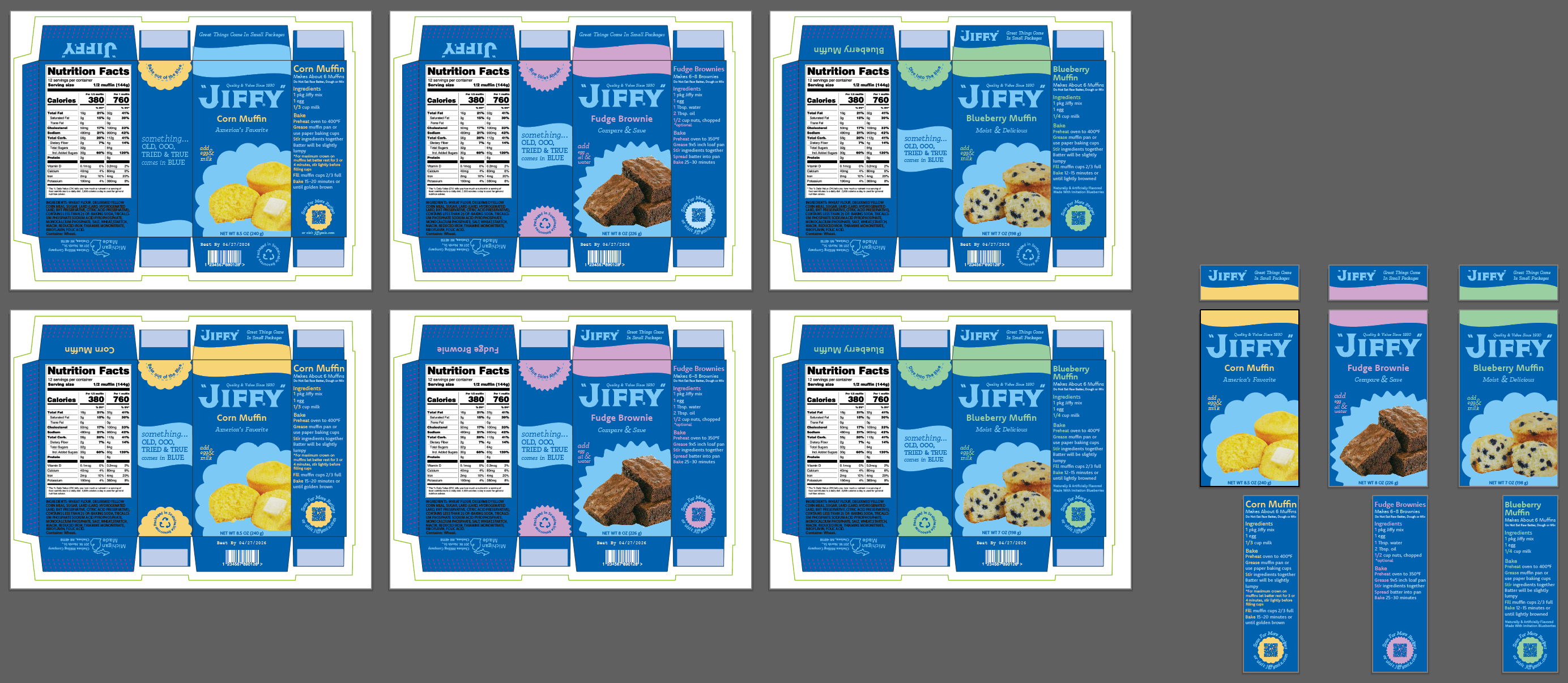
I introduced a new, lighter blue to contrast with the original Jiffy blue, while pushing the Little Blue Box concept. I added new language to support the narrative of The Little Blue Box, as well as adding new pops of color to represent each flavor while attracting a younger audience. I used two new typefaces, one being a sans serif to help modernize the brand, and a serif to pay homage to the original italic serif used. Using two fonts helps to create a sense of depth on the boxes too. I introduced new shapes in the design as well, each one varies with the type of product that is in the box. For example, all the muffins have the rounded, fluffy shape, and items like brownies have the more starburst like shape, while crusts, cakes, and other kinds of mixes would have a different corresponding shape.
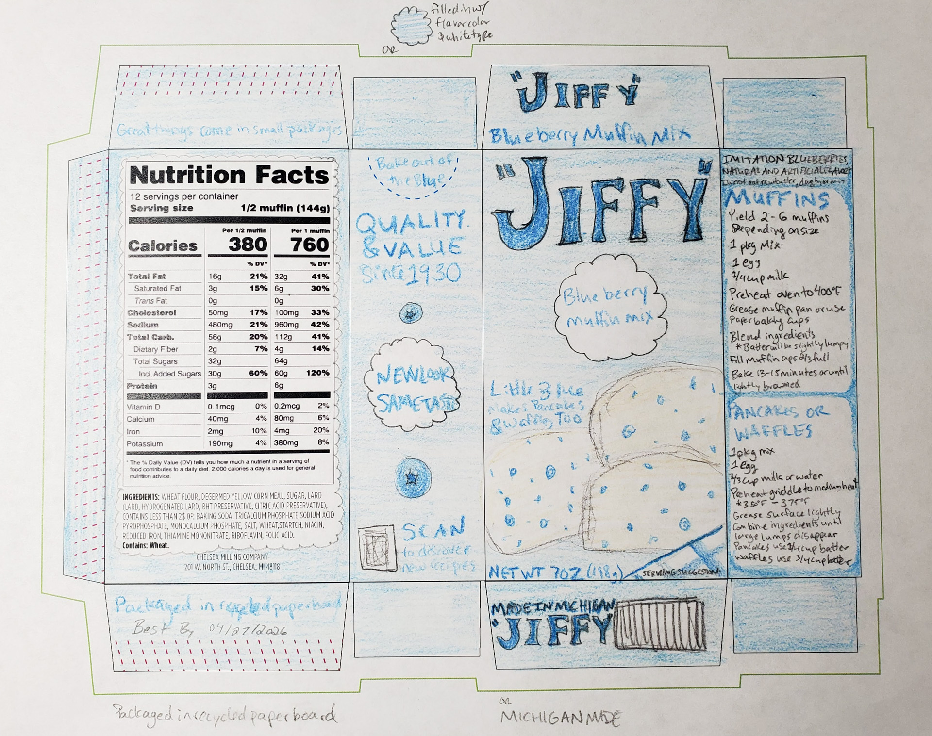
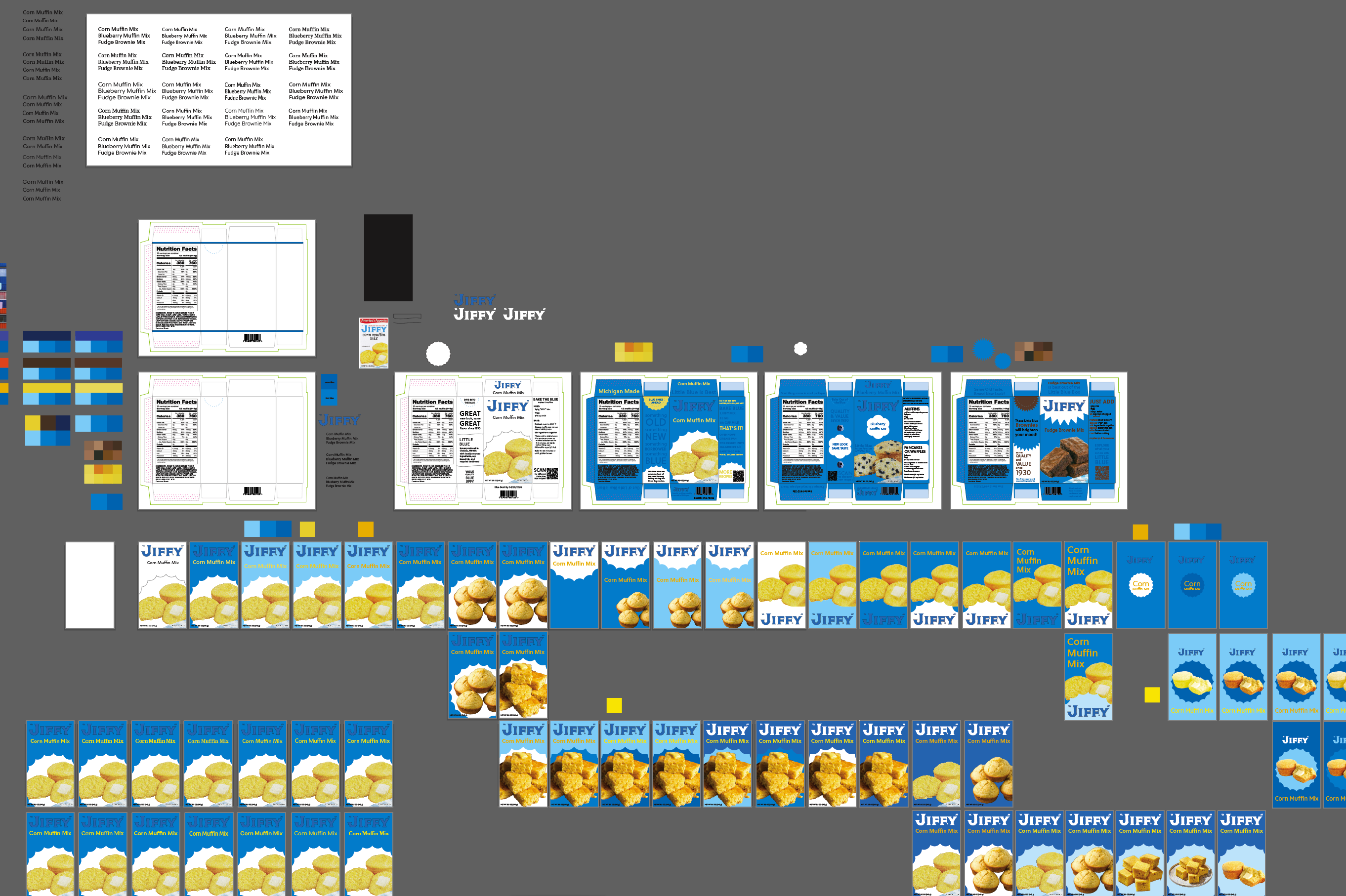
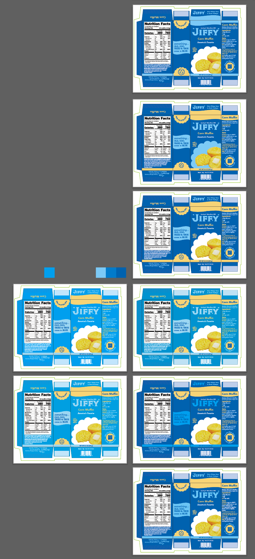
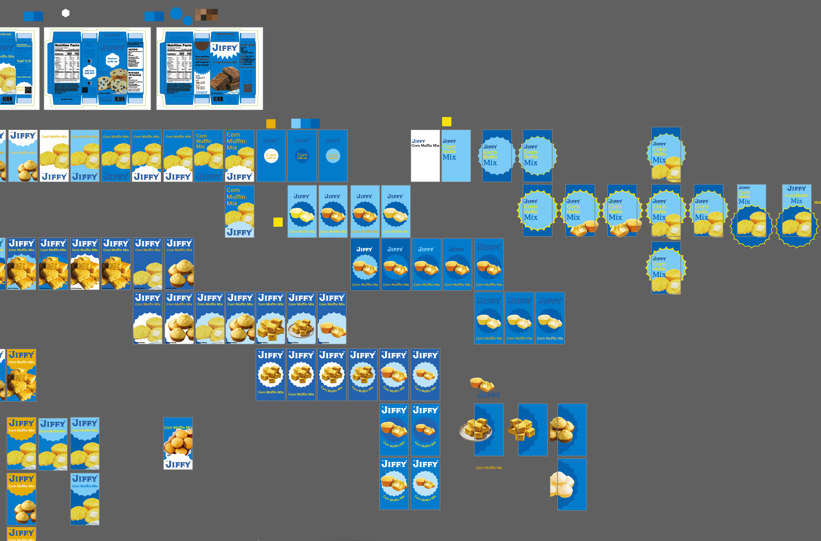
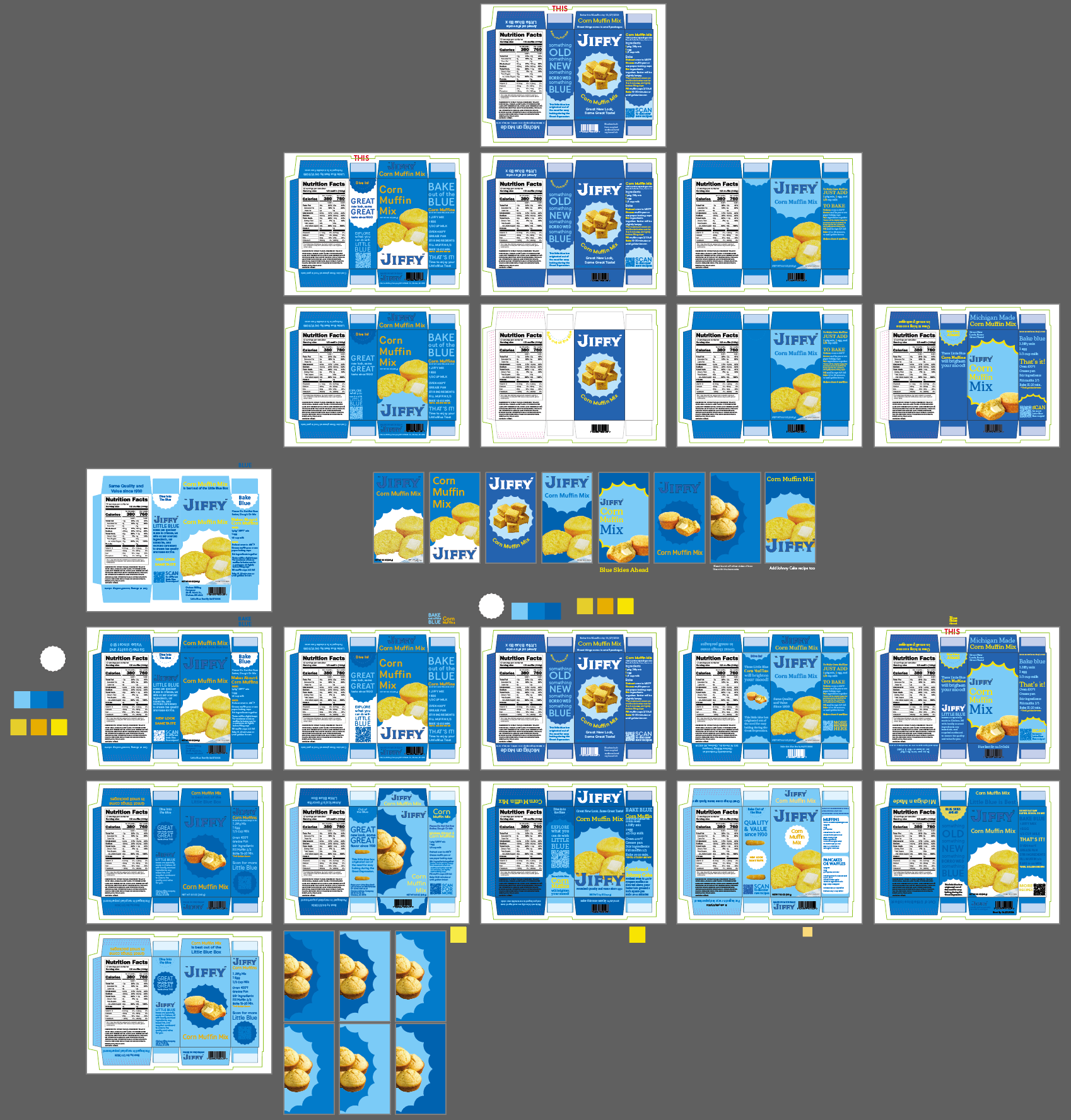
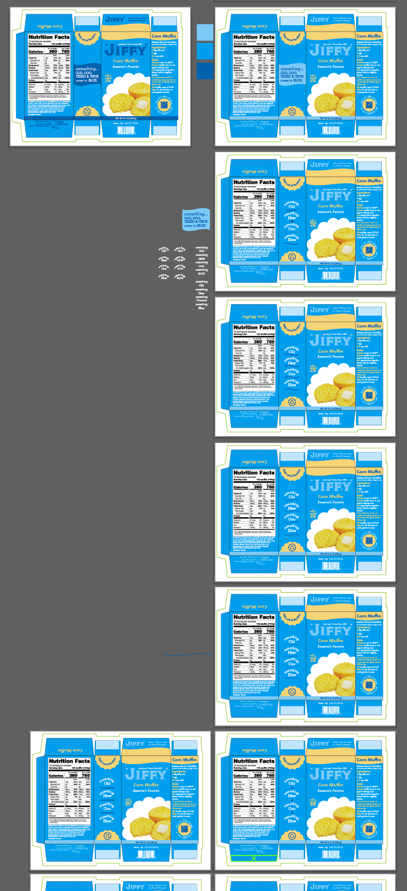
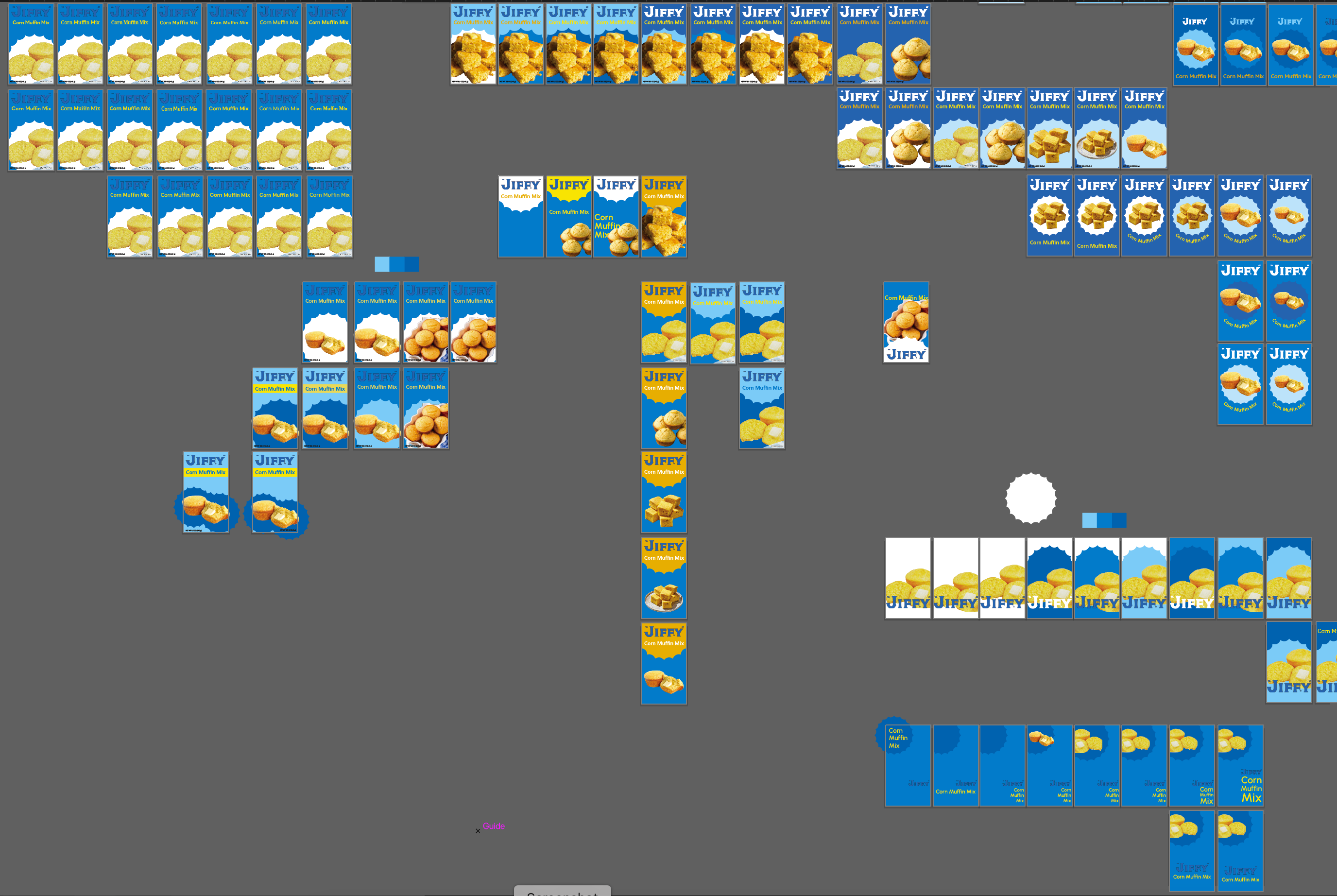
Throughout my entire process, I printed out my designs and folded the box to help me understand what elements were and were not working. Once my designs were becoming more refined, I mocked them up digitally, in addition to paper mockups.
All in all, I aimed to design a refreshed package that is still recognizable as Jiffy, but attracts a younger demographic to help pass on the tradition.


KNOWLEDGE GAINED
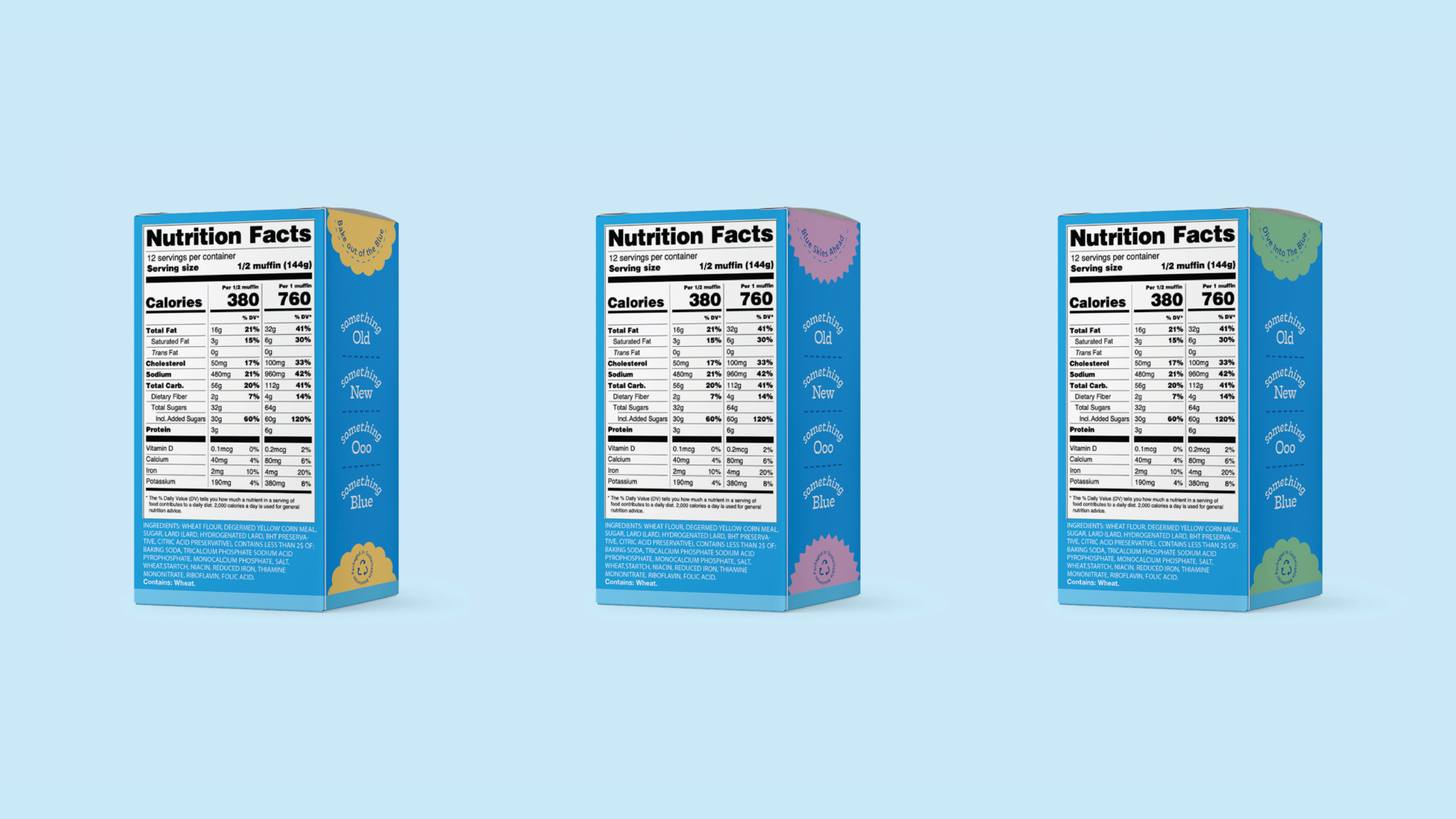
Creating this packaging, I learned various requirements of what needs to be included like the barcode size, net weight, minimum text size, and QR code size. This helped me to think about the product more literally and how it would function. I further developed my understanding of working within an existing brand and the importance of maintaining their essence.
SPECS
+ 3 Packages of different mixes
+ Illustrator
+ Photoshop
+ Figjam
+ Iteration
+ System
+ Identity
FINAL PRESENTATION
![]()
RESEARCH




Research Presentation
MOODBOARD





SKETCHES


PROCESS







EXPERIENCE


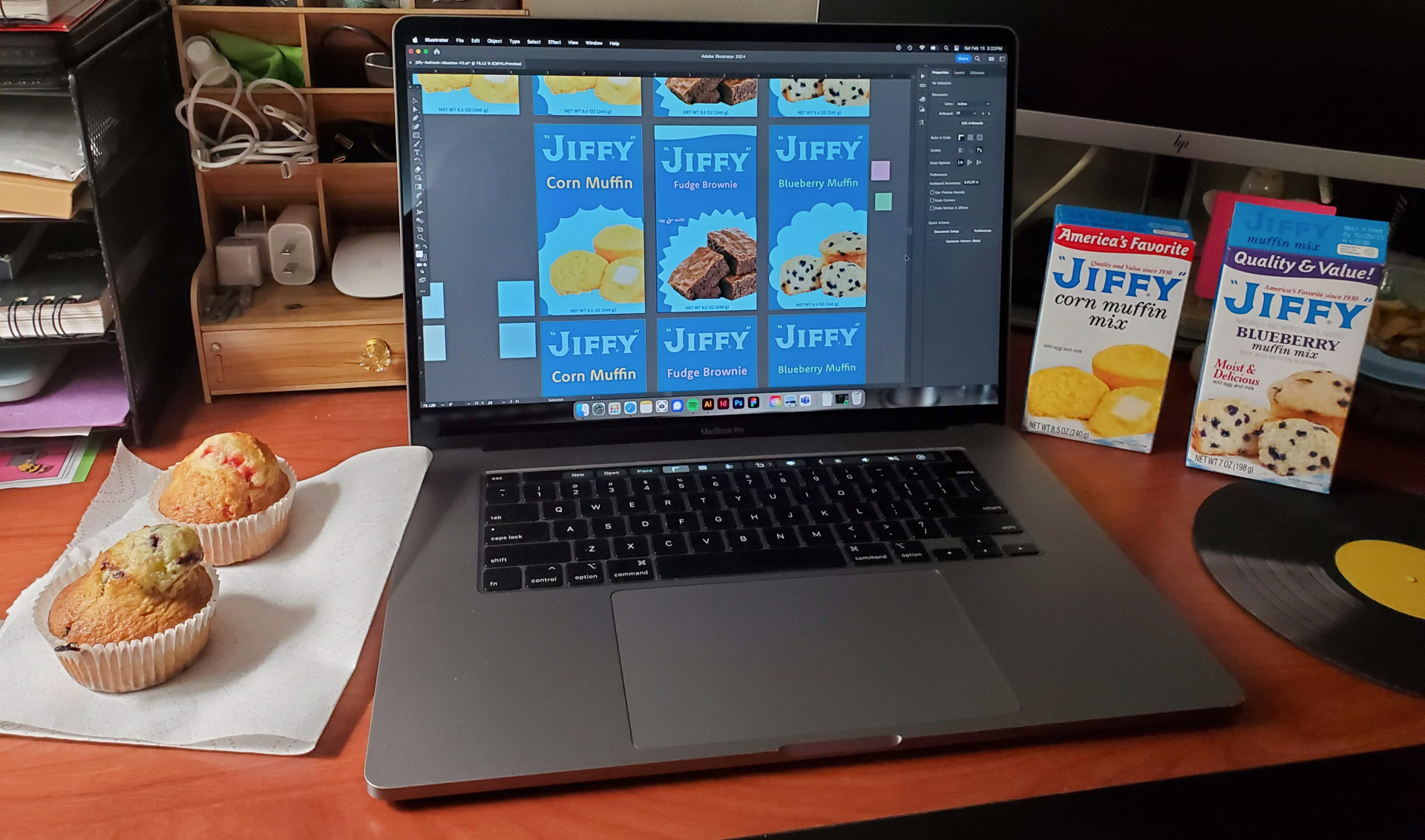
Physical dieline Reference
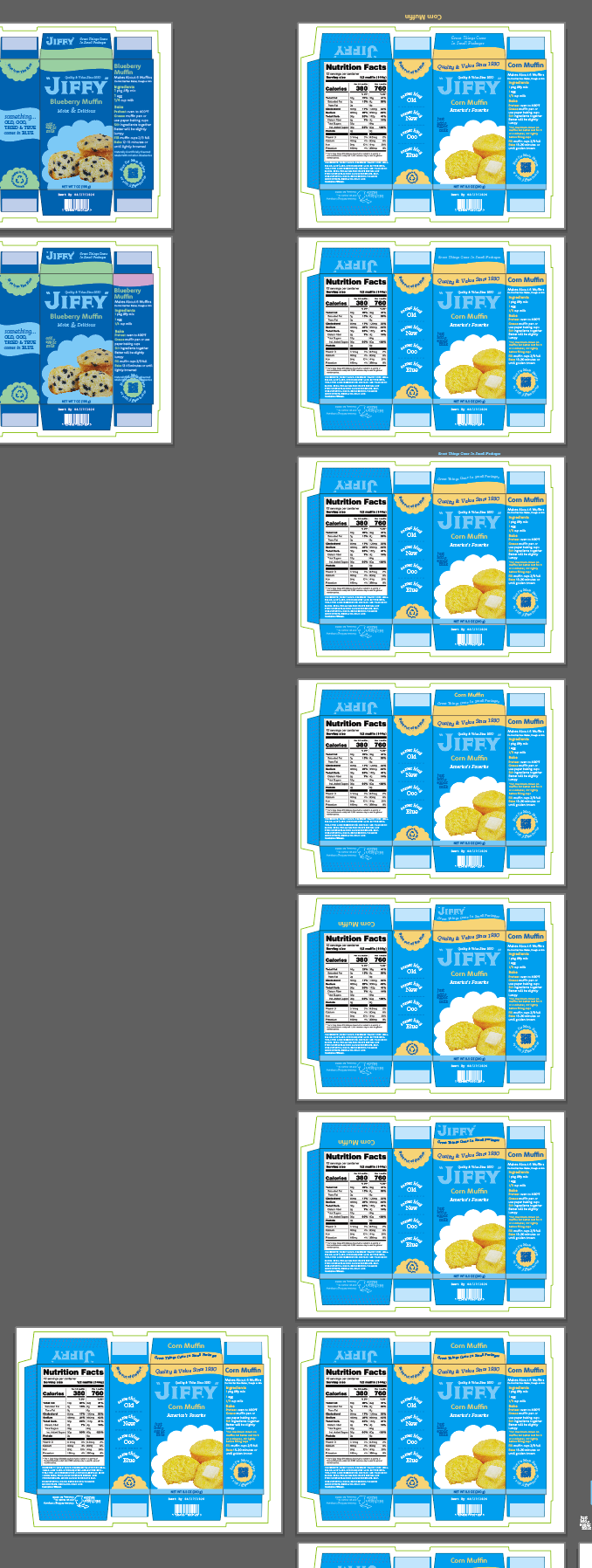
I made SO many Little Blue Boxes
Surrounded by Jiffy