Magnamic Milk
BRANDING DESIGN

 BRIEF
BRIEF826 National is a non-profit organization that provides tutoring to kids all over the United States. Their first 826 location was a pirate supply store in San Francisco, as they purchased a commercial building requiring items to be sold. Their solution was to create a unique store that was specific to the city and make it fun to attract kids. Inspired by this, Magnamic Milk is a brand identity system created to exist in Bend, Oregon.
Visit 826 National Here
AUDIENCE
Kids K-12 in need of writing education and tutoring services


 PROCESS
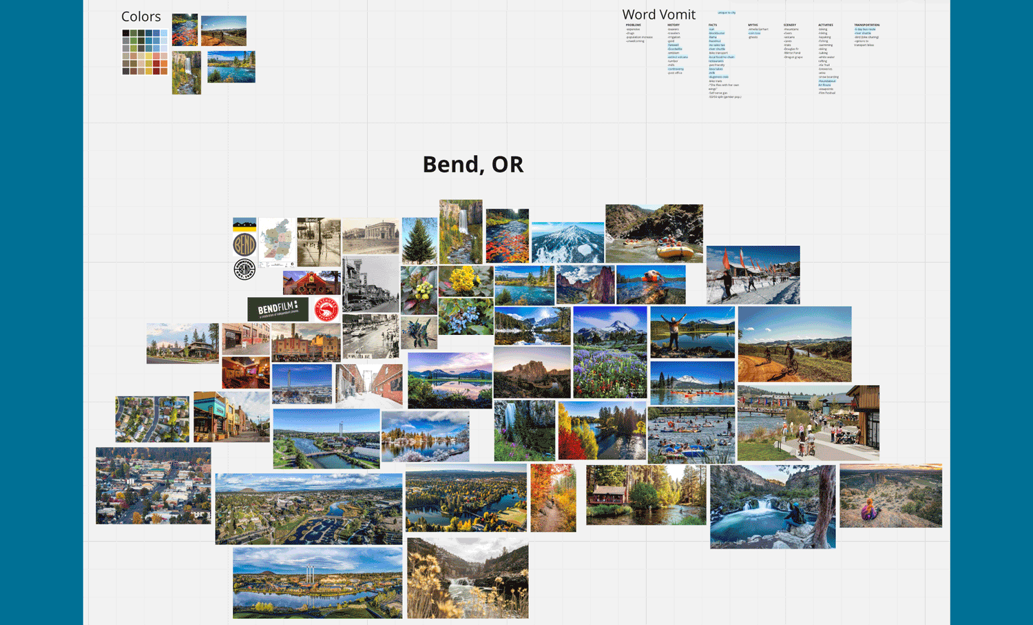
I worked with Ethan Cwiek on the research portion of this project. We randomly selected a city from a list. Bend, Oregon was new to both of us and we were intrigued by the name. Ethan and I split up the research, combined it into a MIRO board, and created a final presentation together using Keynote to share all the interesting facts we learned about Bend. After presenting to the class, we went our separate ways to create our unique 826 brands.
Visit Ethan Cwiek
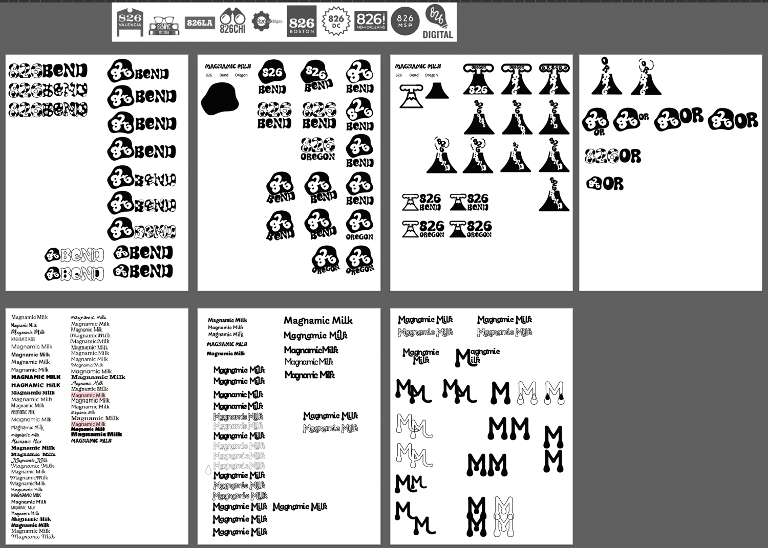
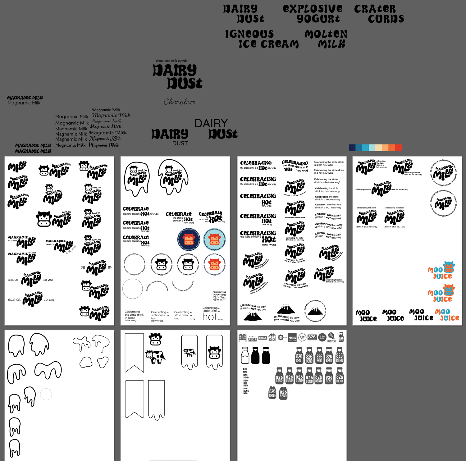
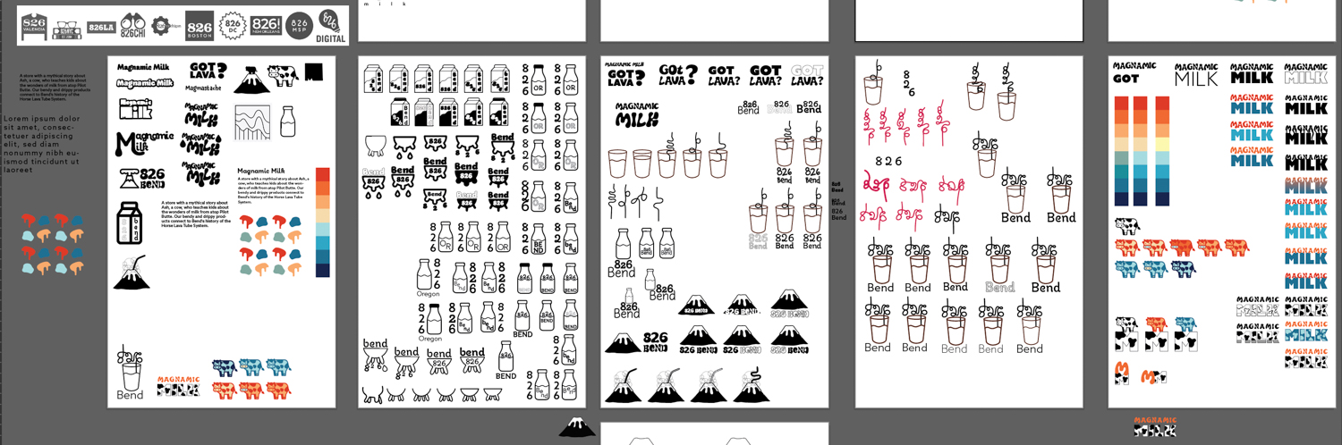
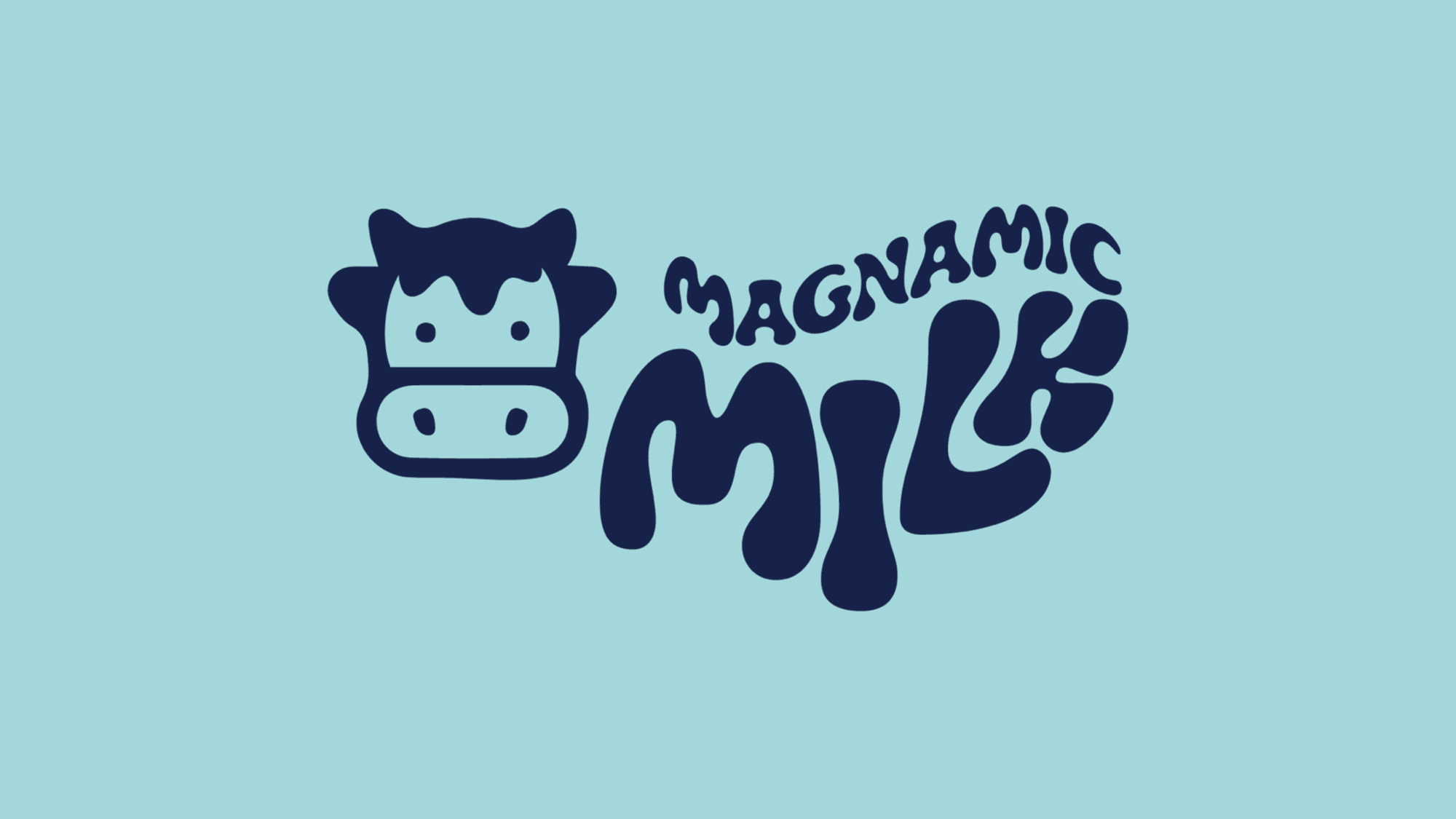
When creating a concept for this project, we were encouraged to combine two random facts about our location to get the most unique results. After exploring many different elements, I settled on the fact that Oregon’s state drink is milk and that Bend has a lava tube system flowing underneath the city, as well as having an extinct volcano. After landing on my two bits of information, I listed out words for each topic to see what I could combine to make an interesting store for kids, as well as to see their similarities and differences. And so I landed on Magnamic Milk, a lava-themed dairy store.
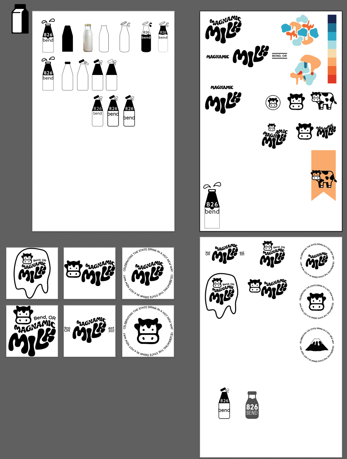
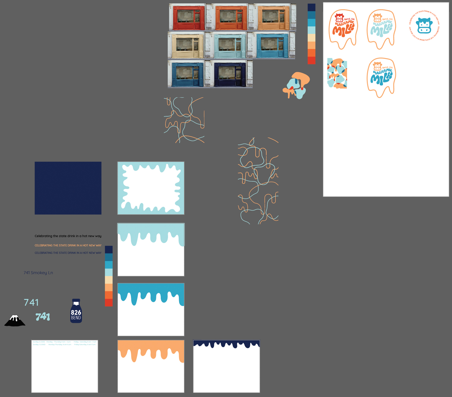
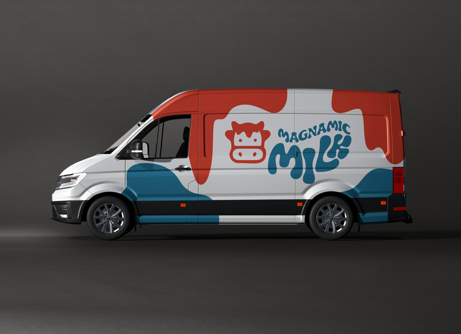
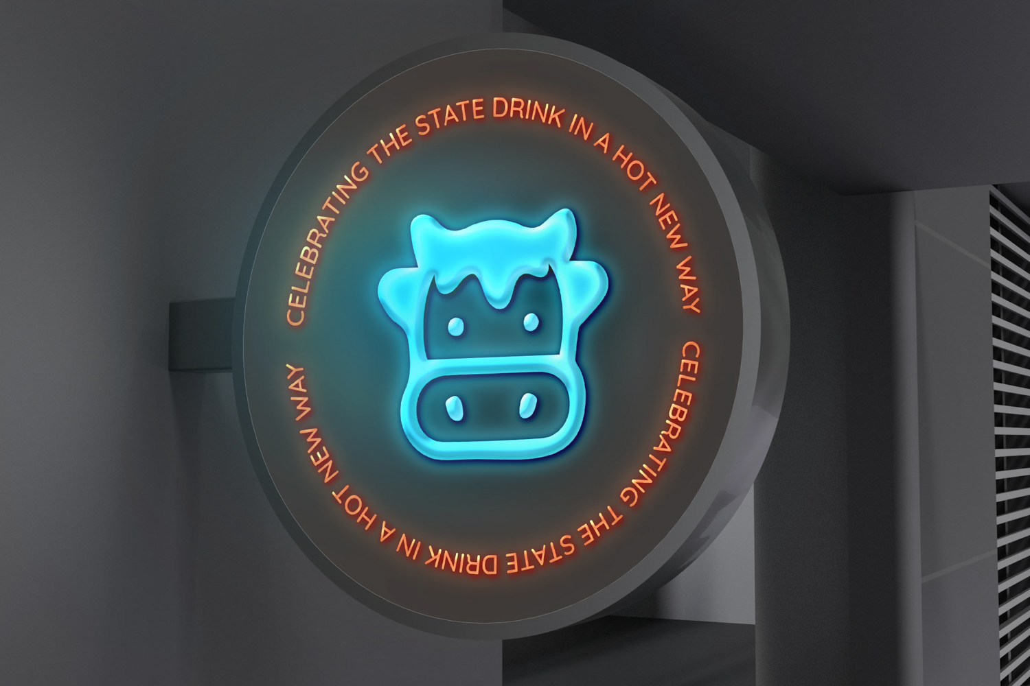
This brand identity system consists of stationery items, including a logo system, business card, letterhead, and envelope; five store products; a vehicle; a storefront; a sign; social media posts; and a motion piece. I chose to contrast two typefaces for this brand, one being organic to represent the flow of lava and one geometric to complement. the organic element. Adding to contrasting elements, I used an array of colors to represent the coldness of milk and the warmth of lava.

KNOWLEDGE GAINED
This was the first brand identity project I’ve worked on, and it taught me many new things. I developed a new understanding of how a system functions and that it is a continuous story. I expanded my understanding of color use and consistency across a system. I also gained an understanding of packaging design and developed my skills in InDesign and After Effects.
SPECS
+ Adobe Illustrator
+ Adobe Indesign
+ Adobe After Effects
+ MIRO
+ Keynote
+ Identity
+ System
+ Typography
+ Collaboration
![]()
![]()
![]()
This was the first brand identity project I’ve worked on, and it taught me many new things. I developed a new understanding of how a system functions and that it is a continuous story. I expanded my understanding of color use and consistency across a system. I also gained an understanding of packaging design and developed my skills in InDesign and After Effects.
SPECS
+ Adobe Illustrator
+ Adobe Indesign
+ Adobe After Effects
+ MIRO
+ Keynote
+ Identity
+ System
+ Typography
+ Collaboration


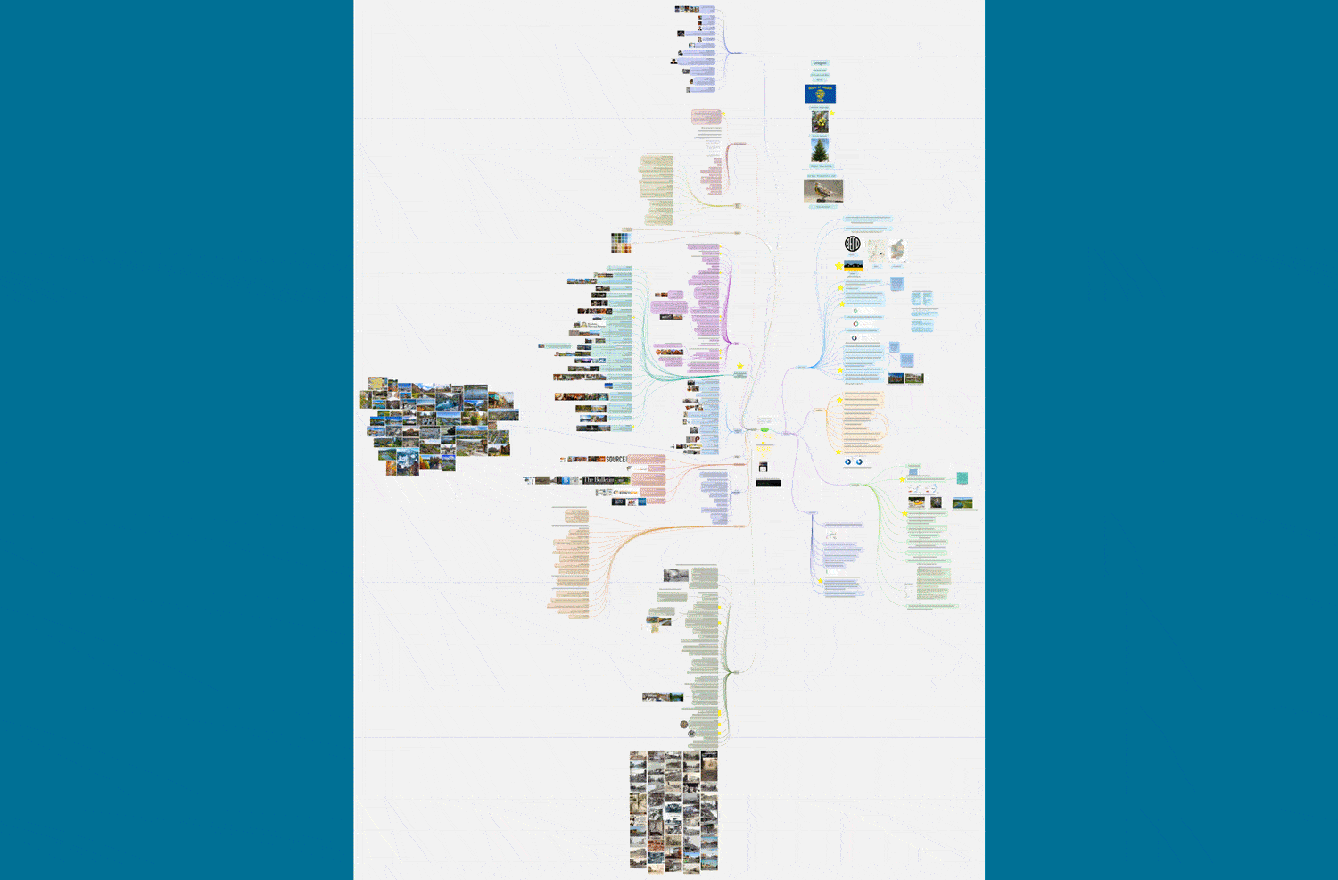
FINAL PRESENTATION
![]()
RESEARCH
Research Presentation
MOODBOARD
SKETCHES


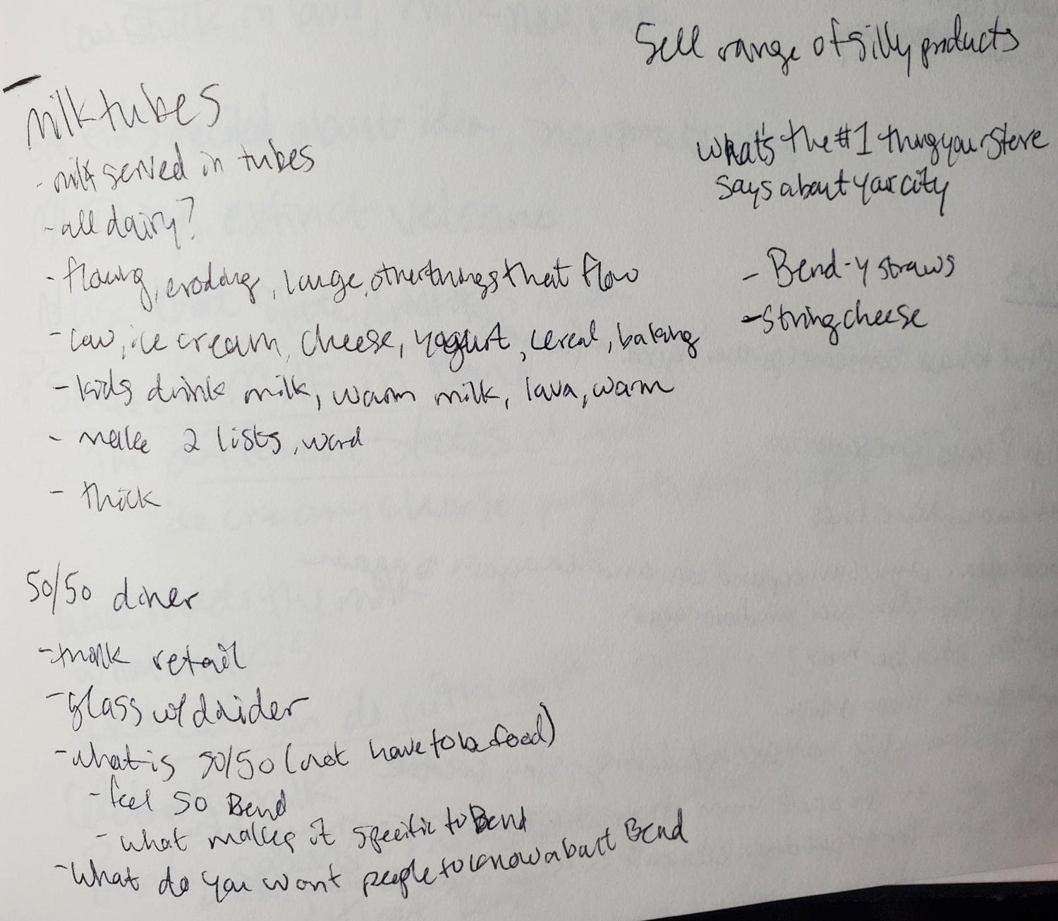


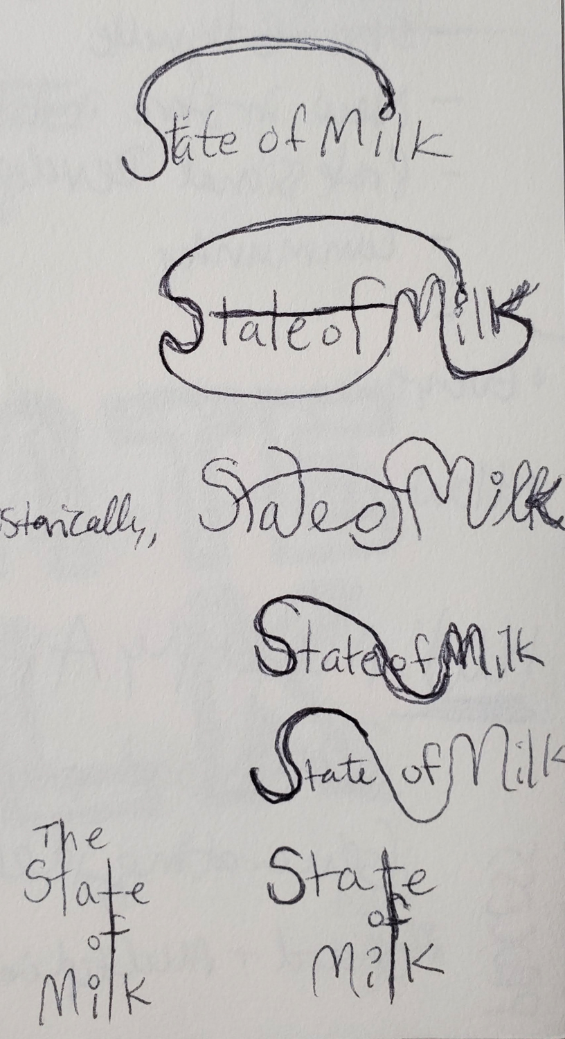


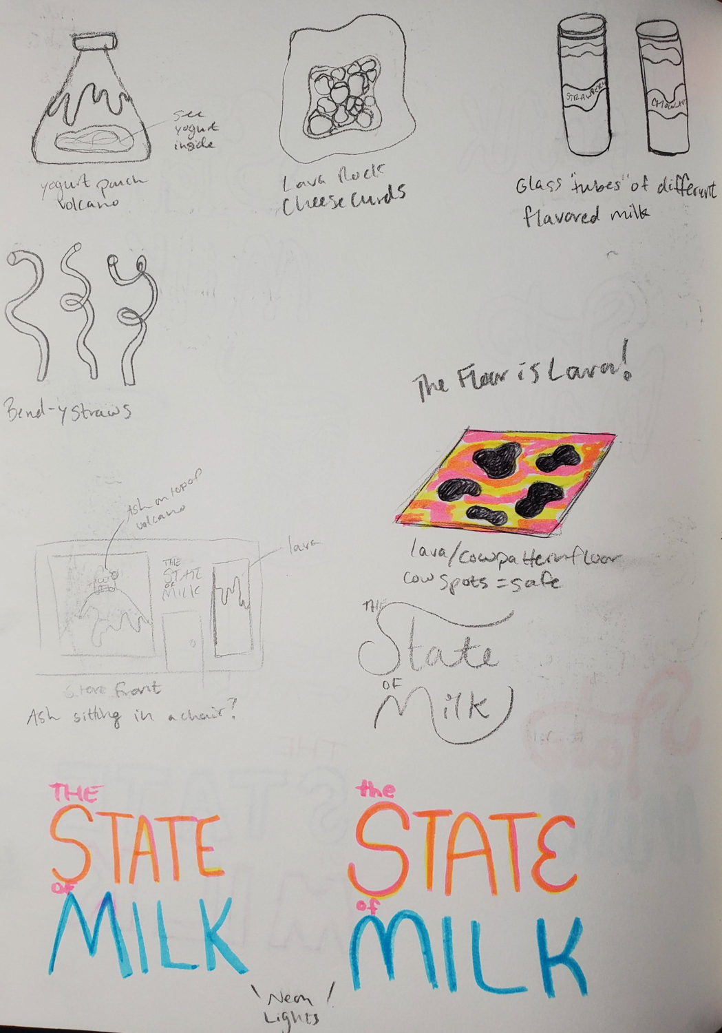


ITERATION