Hand In Hand
BRAND CAMPAIGN


BRIEF
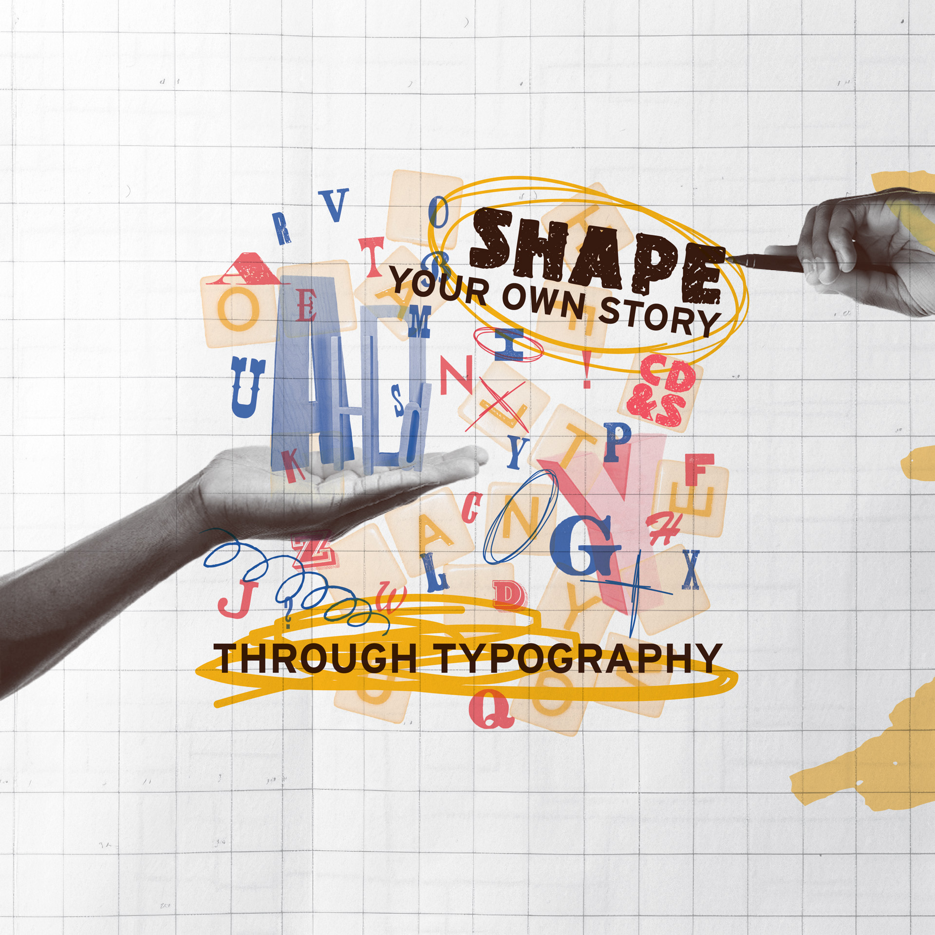
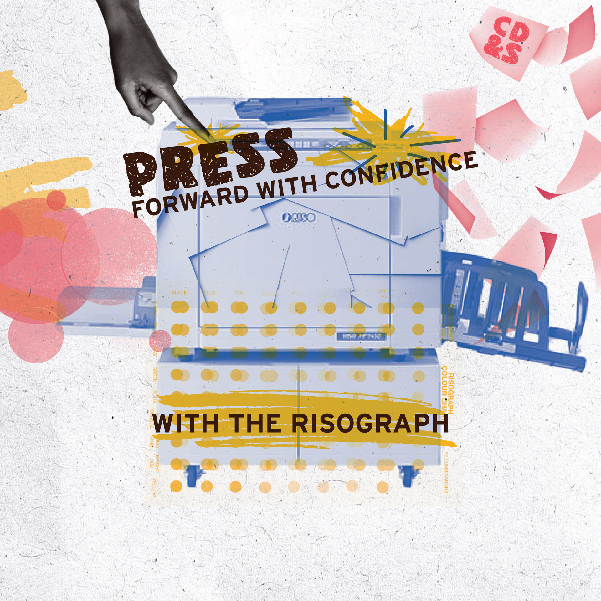
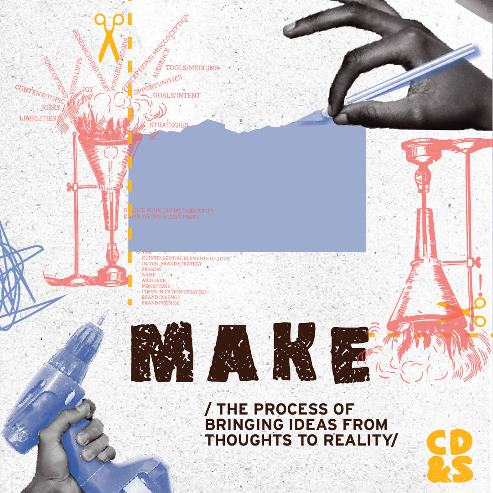
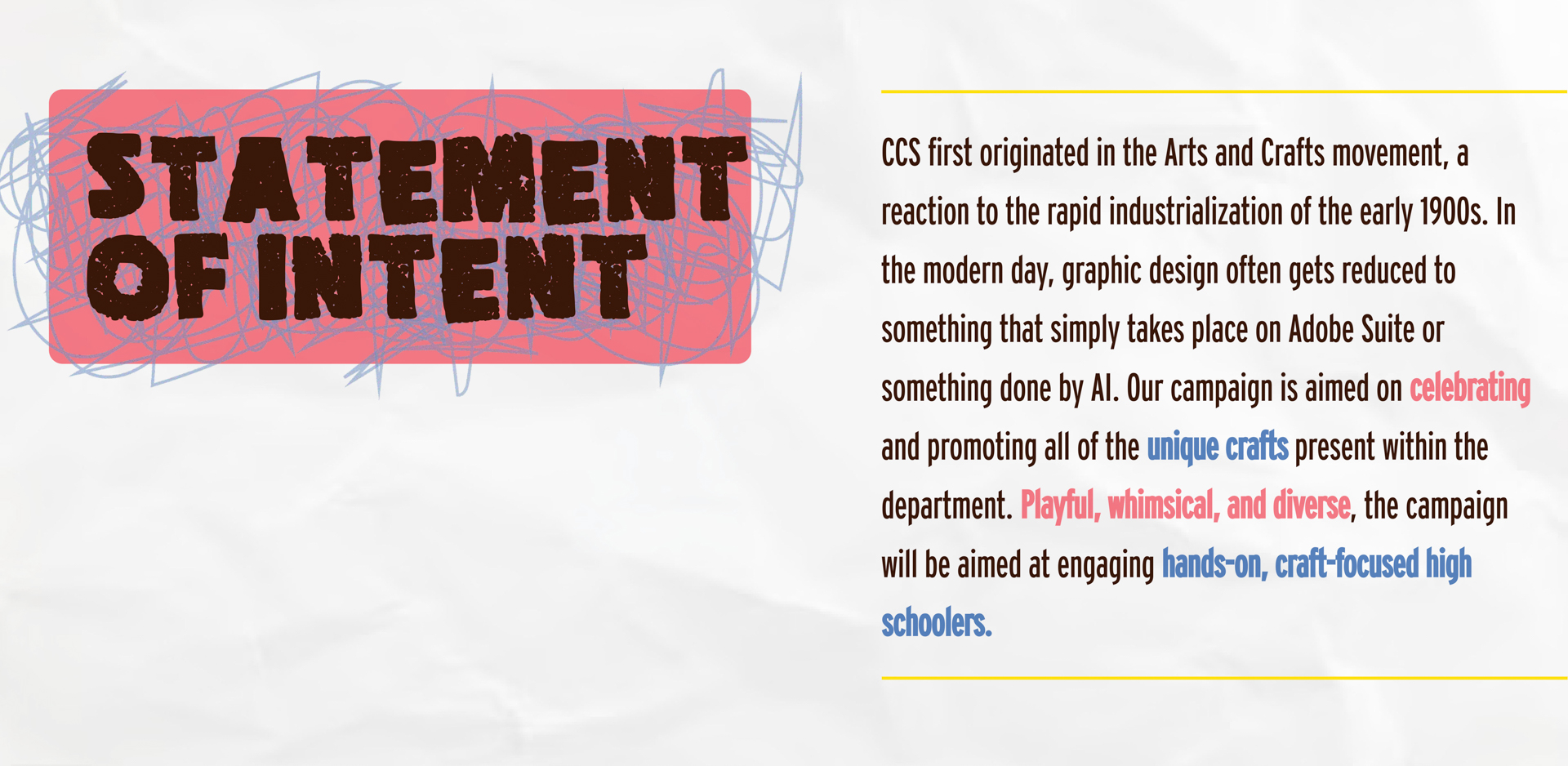
Hand In Hand is a campaign for the Communication Design & Strategy department at the College for Creative Studies that celebrates working with our hands and the handicraft resources available in the department. This campaign embraces the tools and techniques students use when designing. While most of the graphic design field is stereotypically digital, Hand In Hand encourages students to set aside the screen and create with their hands.
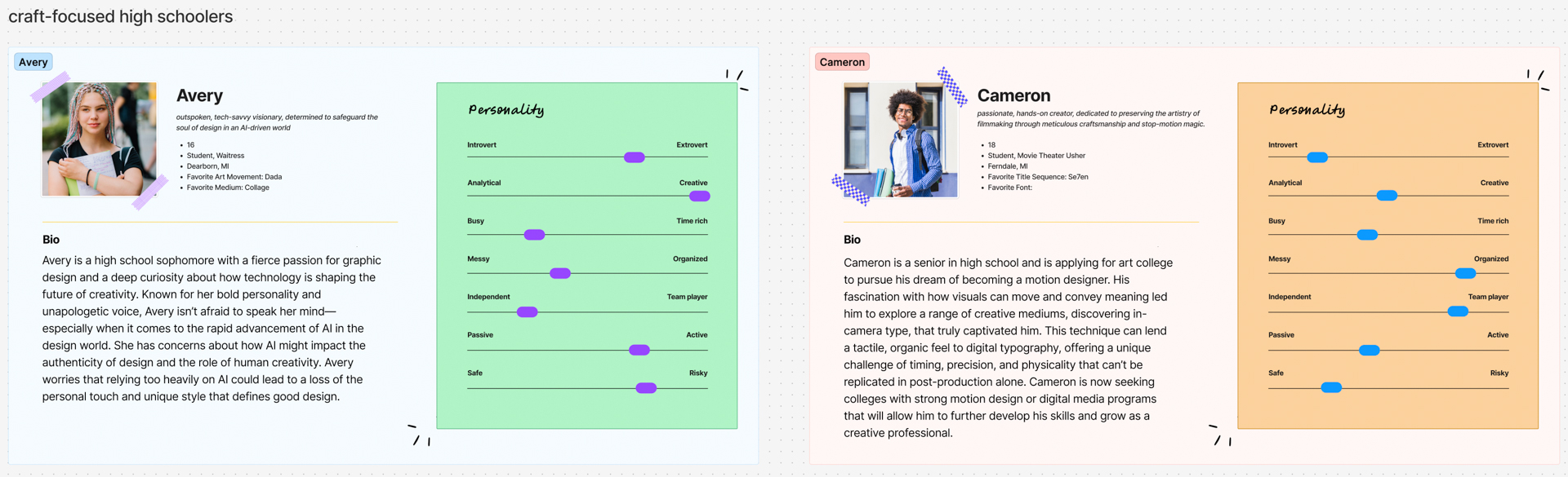
AUDIENCE
Hands-on, craft-focused high schoolers
Hand In Hand is a campaign for the Communication Design & Strategy department at the College for Creative Studies that celebrates working with our hands and the handicraft resources available in the department. This campaign embraces the tools and techniques students use when designing. While most of the graphic design field is stereotypically digital, Hand In Hand encourages students to set aside the screen and create with their hands.
AUDIENCE
Hands-on, craft-focused high schoolers


PROCESS
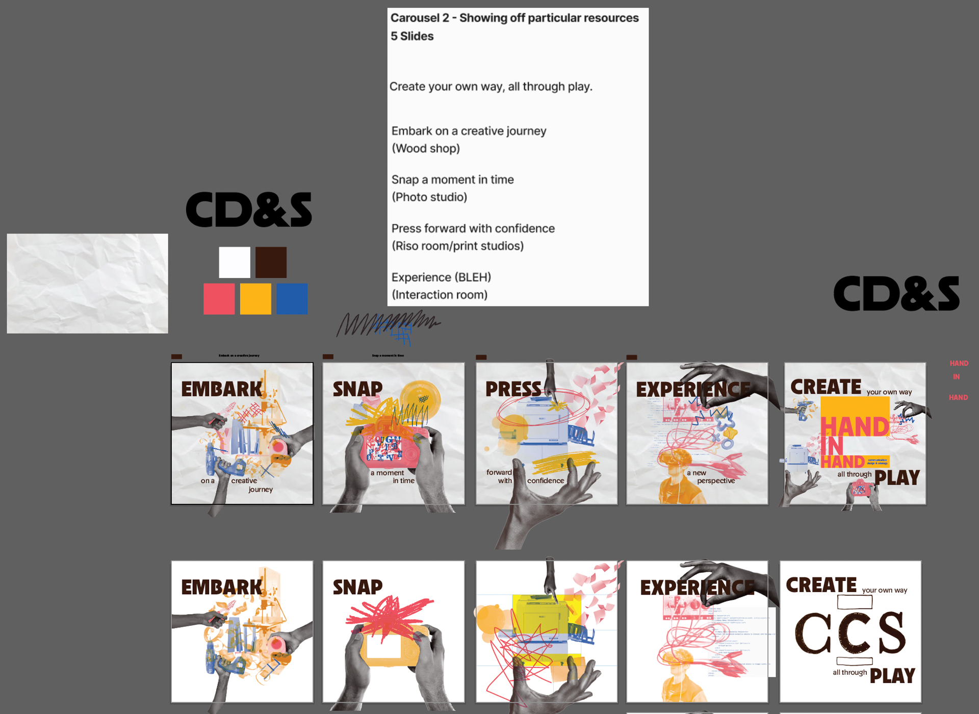
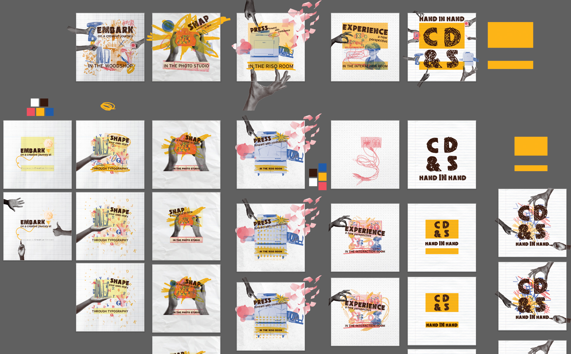
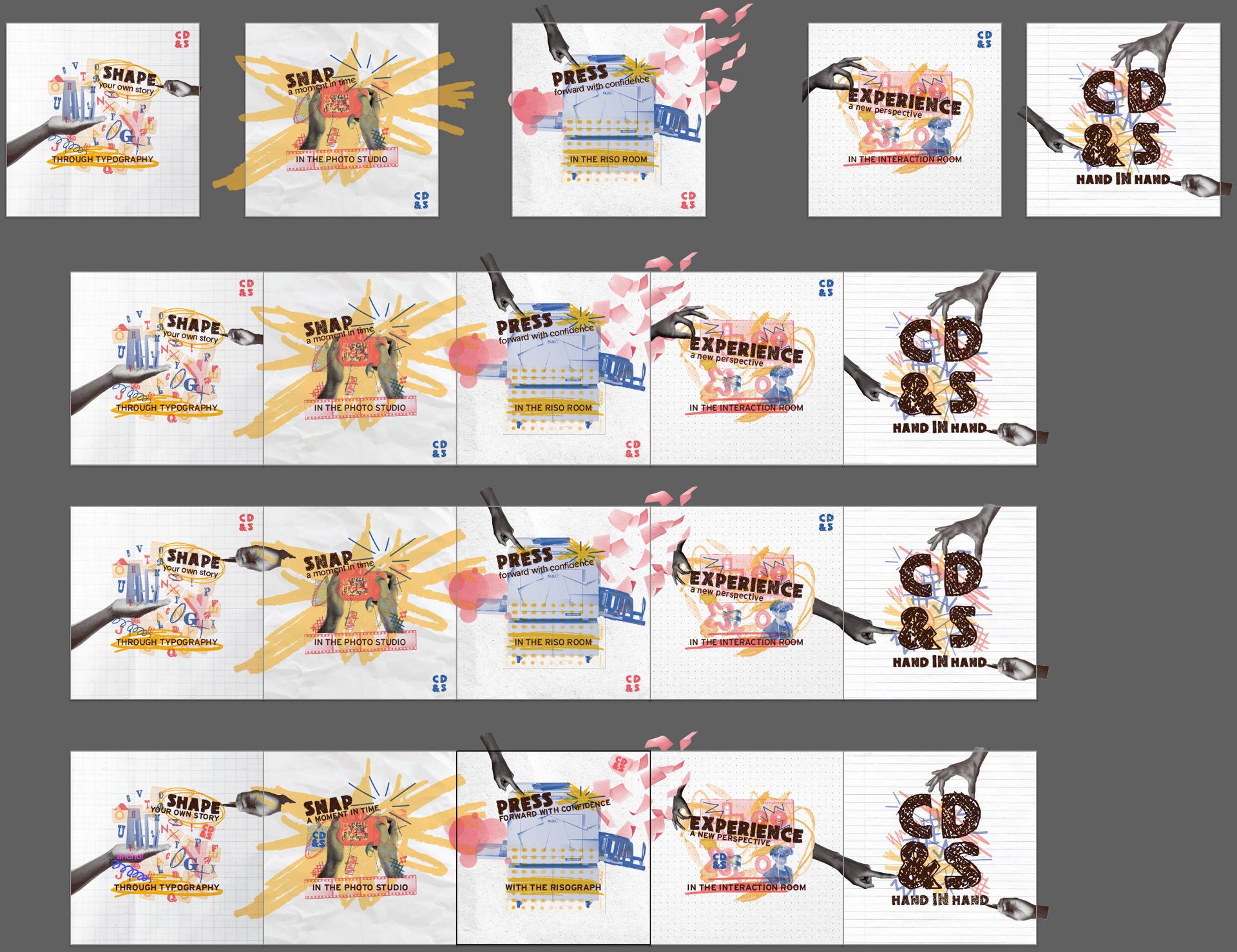
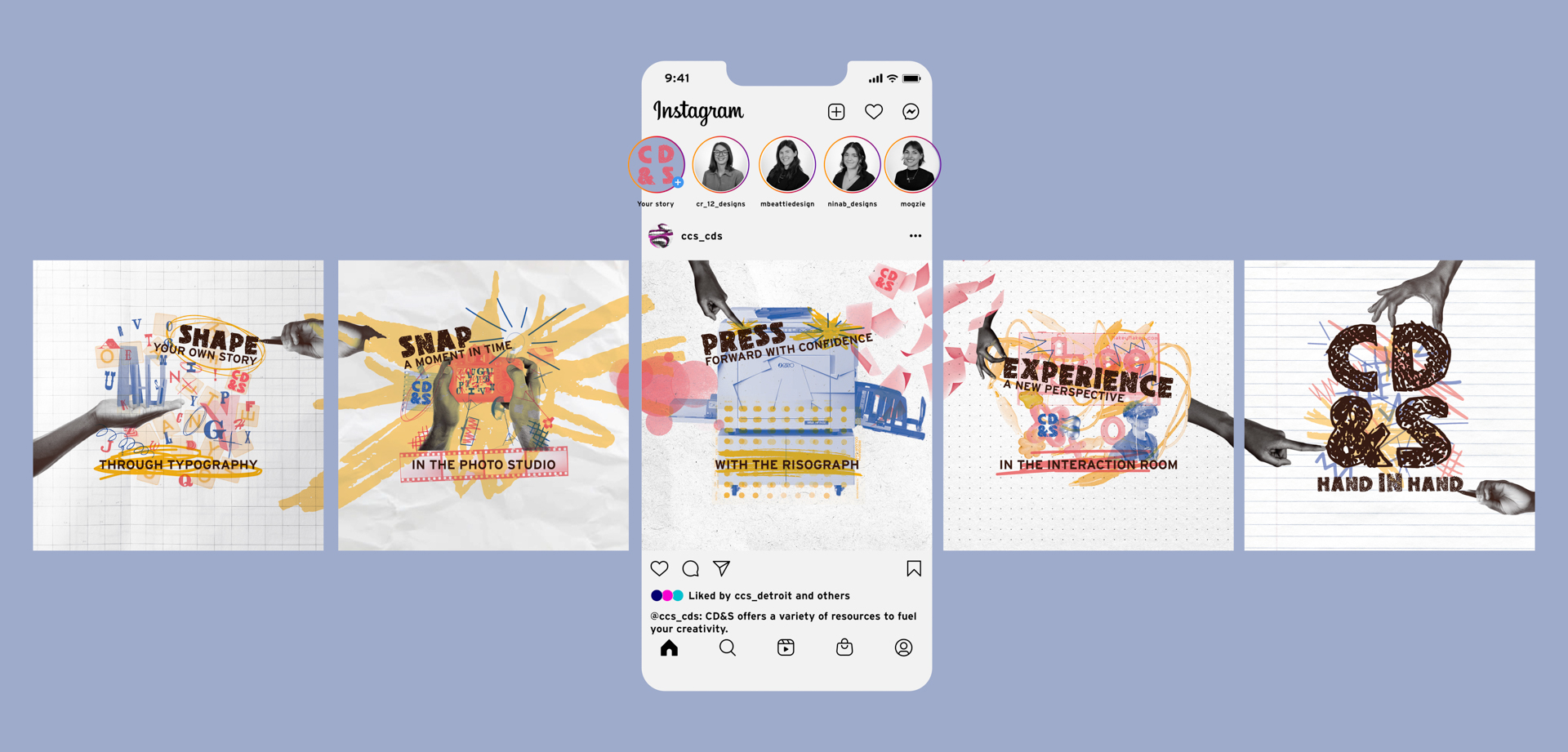
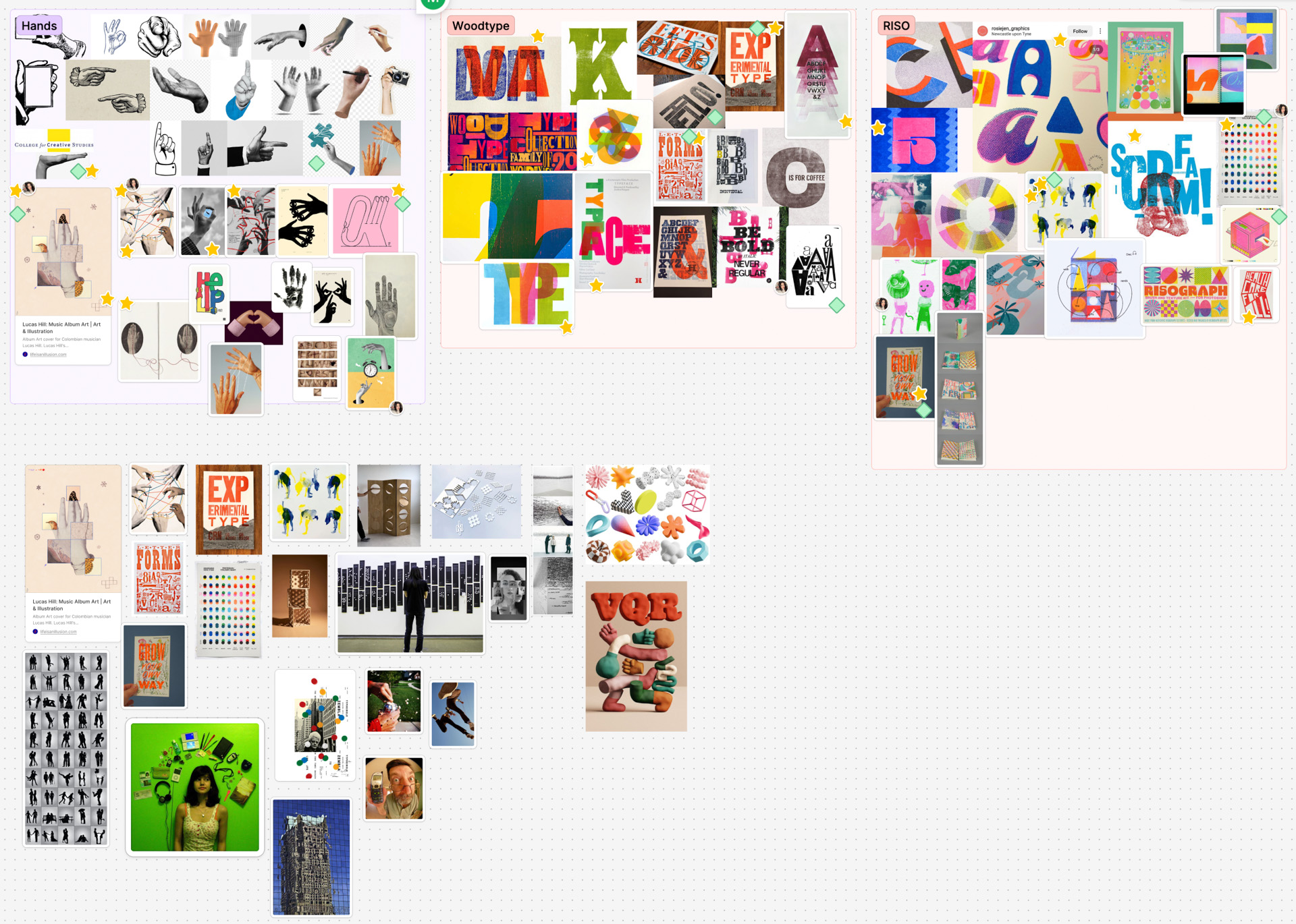
After forming our group, we immediately agreed to design a campaign that involved working with our hands instead of on a screen. We started by splitting up areas of research about CCS including the Taubman Center building, cultural context, programs offered, and history. We were inspired by the Arts and Crafts Movement and helped us to write our concept statement promoting the value of working with our hands. We built out a mood board with various categories relating to our concept and narrowed it down to one inspiration board for our visual direction. To reflect the hands-on feeling, we gave the images a duotone texture connecting to the riso printer (and its use in our department). We also chose our color palette based on the riso ink colors and went with bright red, sunflower, and lake. The riso prints colors in layers showing some transparency between elements. Our campaign reflects this by using the darken blending mode on every element. We chose the font Neighbor because of its quirky special characters pushing creativity within design. Furthering the hand-made feel, we printed out, traced, and uploaded Neighbor as a custom font. We were also inspired by collaging our elements together, as this is a practice we do in CD&S. Our grids were based off of the “yellow box” as seen in the CCS logo. This box represents the “creative zone” so we used this area to anchor our elements.
After setting our brand guidelines each person in our group created a series of sketches. We placed them together and discussed which elements we liked best and why. This helped us all stay on the same page and understand how to move further with our campaign design language. We landed on a mostly full collage style with a hand interacting with the elements in the design.
KNOWLEDGE GAINED
I learned new things about CCS through our research. I further developed my understanding of speaking clearly in order to be on the same page as my group members. I gained deeper knowledge on how to keep a consistent brand when working on a team.
SPECS
+ Motion Video 7 seconds - 1920 x 1080
+ Motion Video 15 seconds - 1920 x 1080
+ Motion Video 30 seconds - 1920 x 1080
+ Vlog 15 seconds - 1080 x 1080
+ 9 carousel slides for social media
+ Illustrator
+ Photoshop
+ After Effects
+ Figma
ROLES
Madeline Beattie
-Motion video (7, 15, 30 seconds)
-Researching
-Moodboarding
-Concept development
-Deck presentation
Nina Bommarito
-Social media carousel (4 slides)
-Researching
-Moodboarding
-Concept development
Morgan Guerrieri
-Vlog motion piece 15 seconds
-Researching
-Moodboarding
-Concept development
Chelsea Rogers
-Social media carousel (5 slides)
-Researching
-Moodboarding
-Concept development
RESEARCH


MOODBOARD


SKETCHES
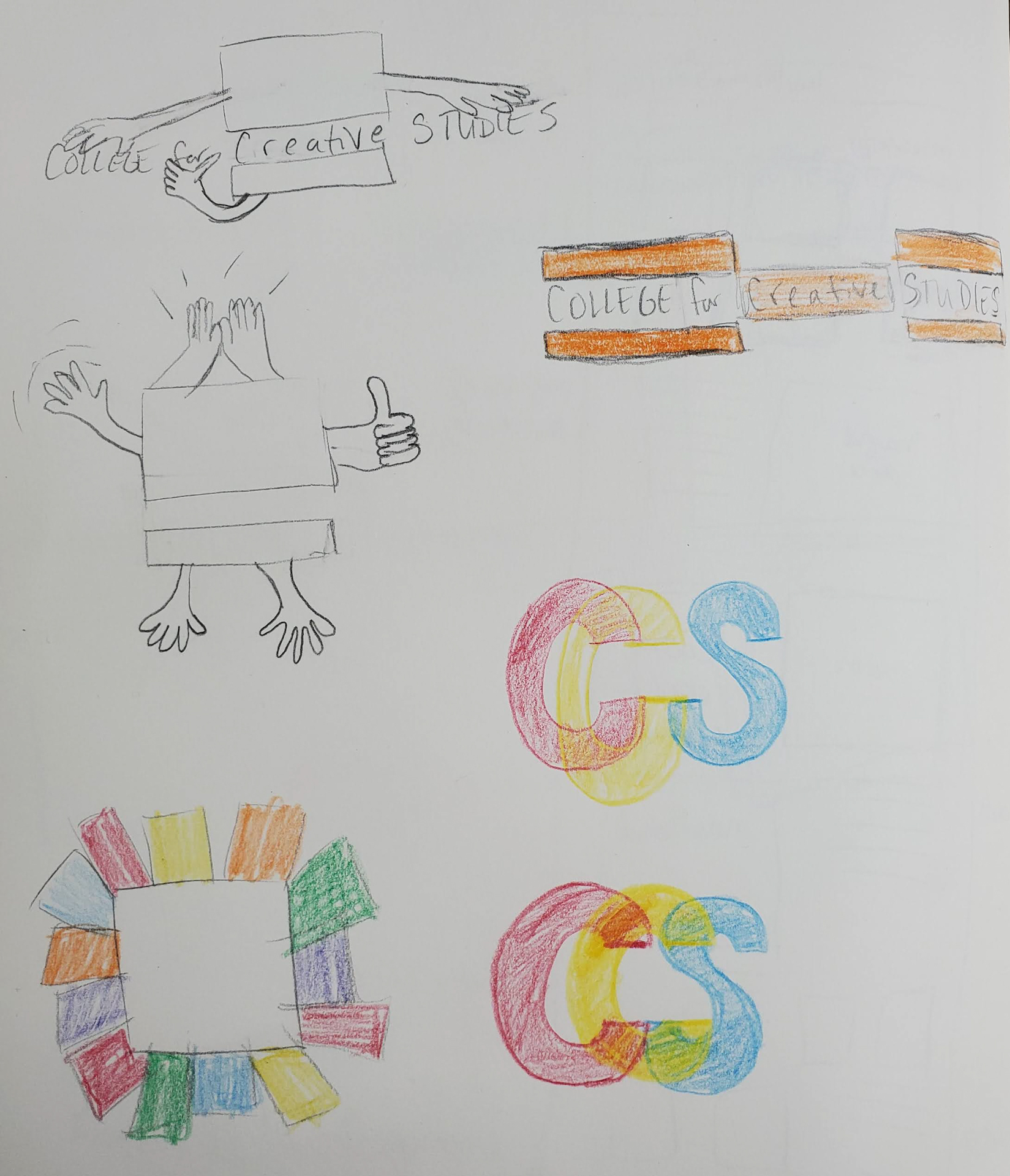

ITERATION