Gettin’ Back To Work
BRAND CAMPAIGN


BRIEF
Detroit has a deep culture in sports, launching the base for our campaign. Our campaign embraces the Detroit Pistons determination in the NBA. We bring the confident energy from the Bad Boys era to uplift and motivate our target audience by showing how practice makes perfect, and the importance of never giving up but cutting in at the angle of finding enjoyment in the process of success.
AUDIENCE
All high schoolers (14-18 years) in the Metro Detroit area
PROCESS
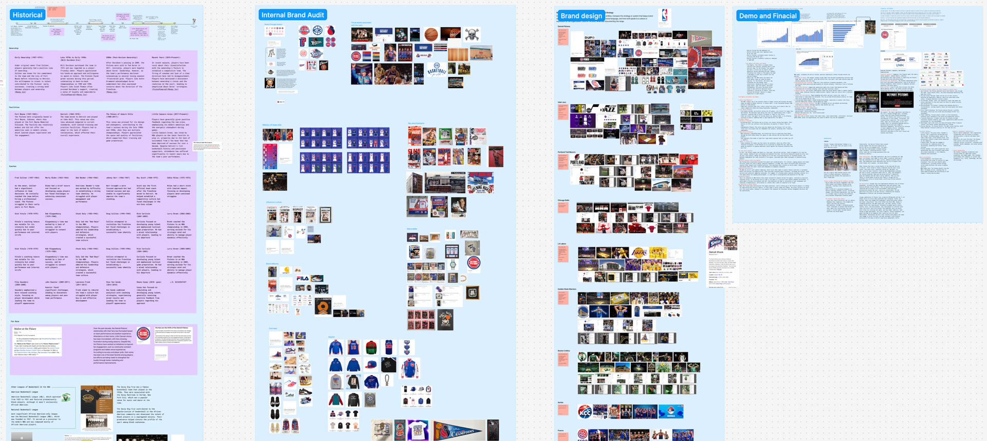
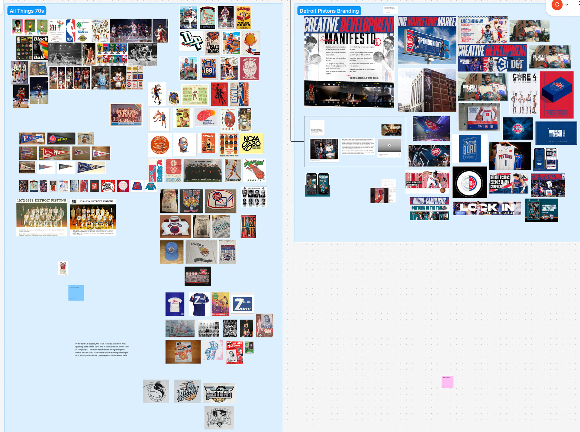
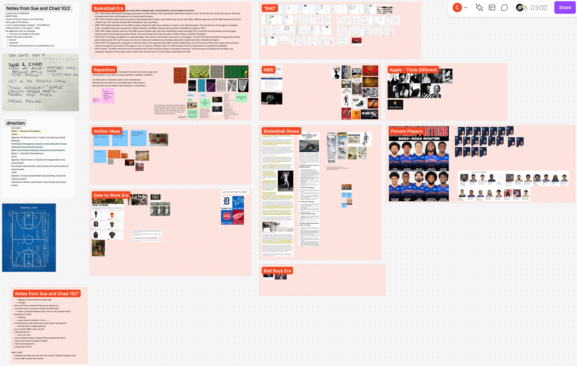
Selecting our Detroit team was chosen at random, as well as with a word to drive our campaign. Our acts of chance provided us with the Detroit Pistons team and the word “iteration” to base our campaign off of.
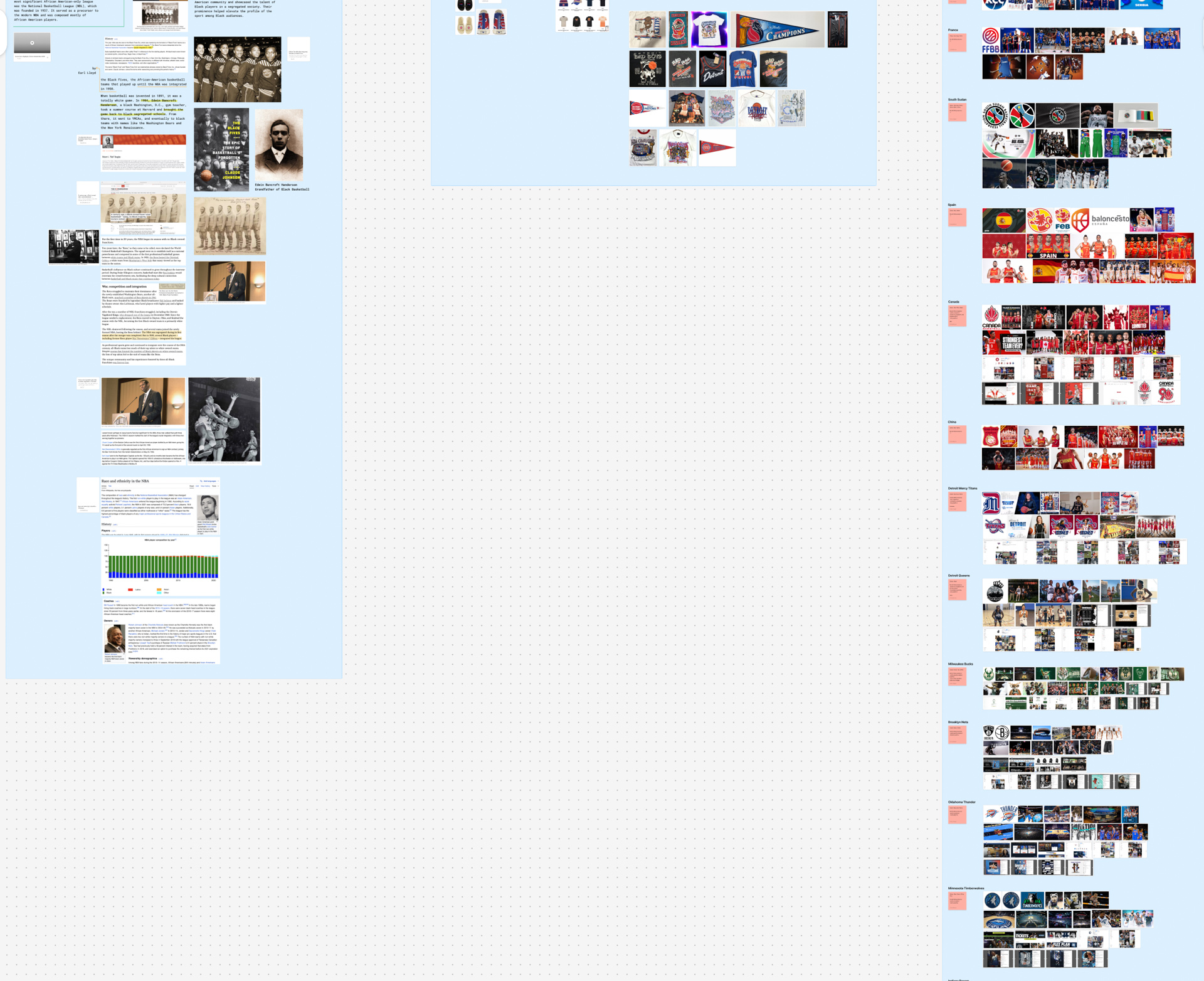
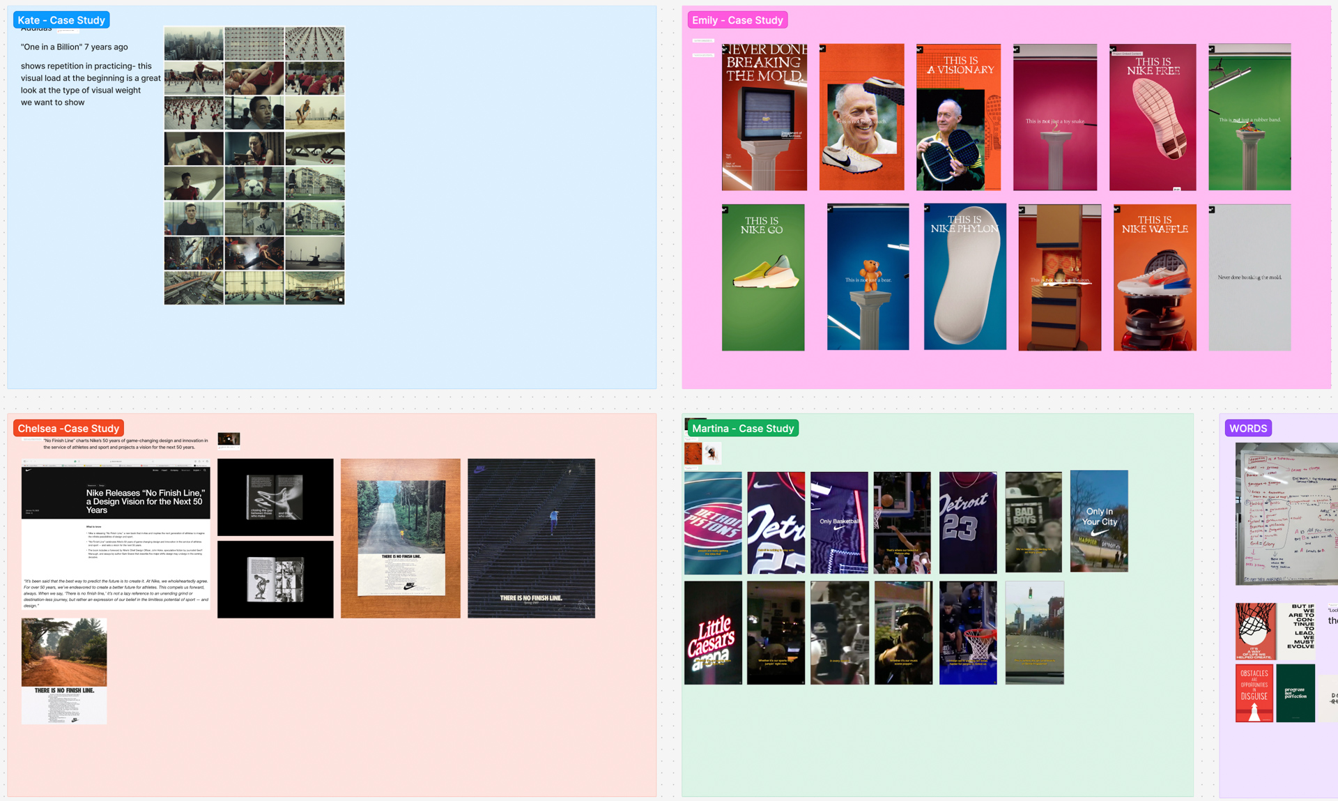
We started by splitting up the research in order to cover every aspect of the Pistons, including areas like history, demographics and finances, internal brand audit, and brand design case studies of other basketball teams. We expanded this research into areas like basketball language, economic impact, and fan celebrations to further understand our subject matter.
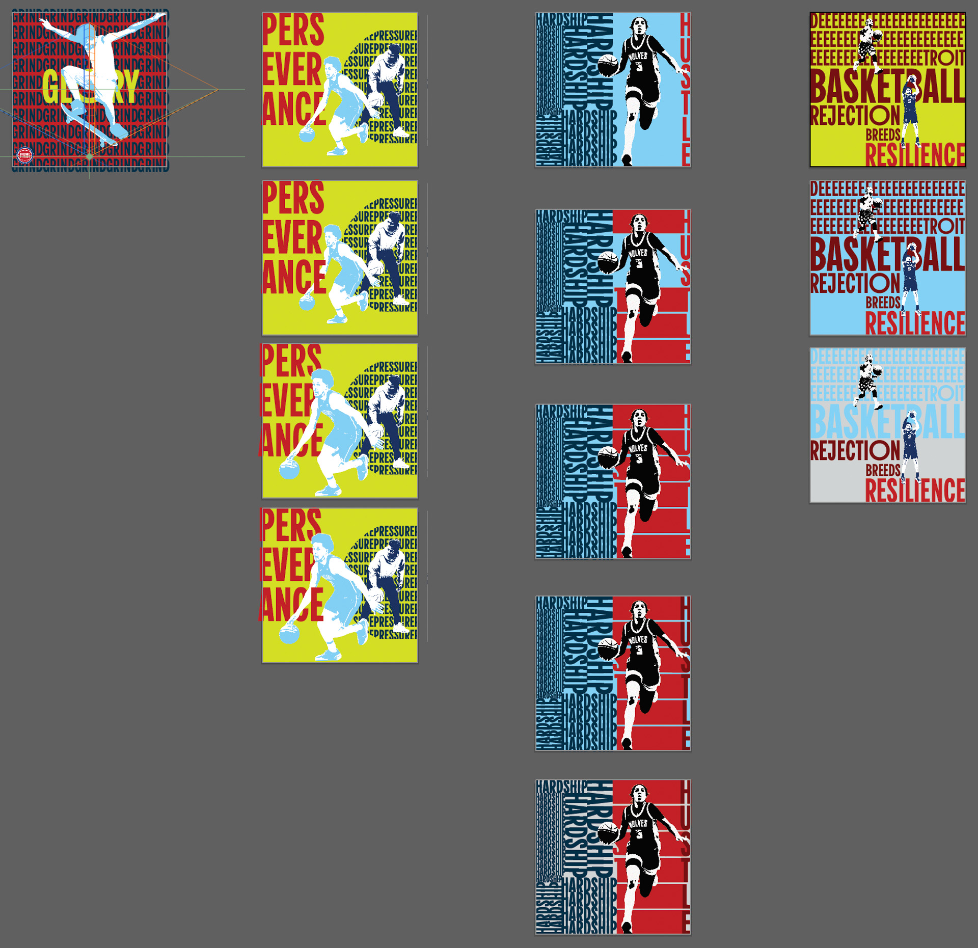
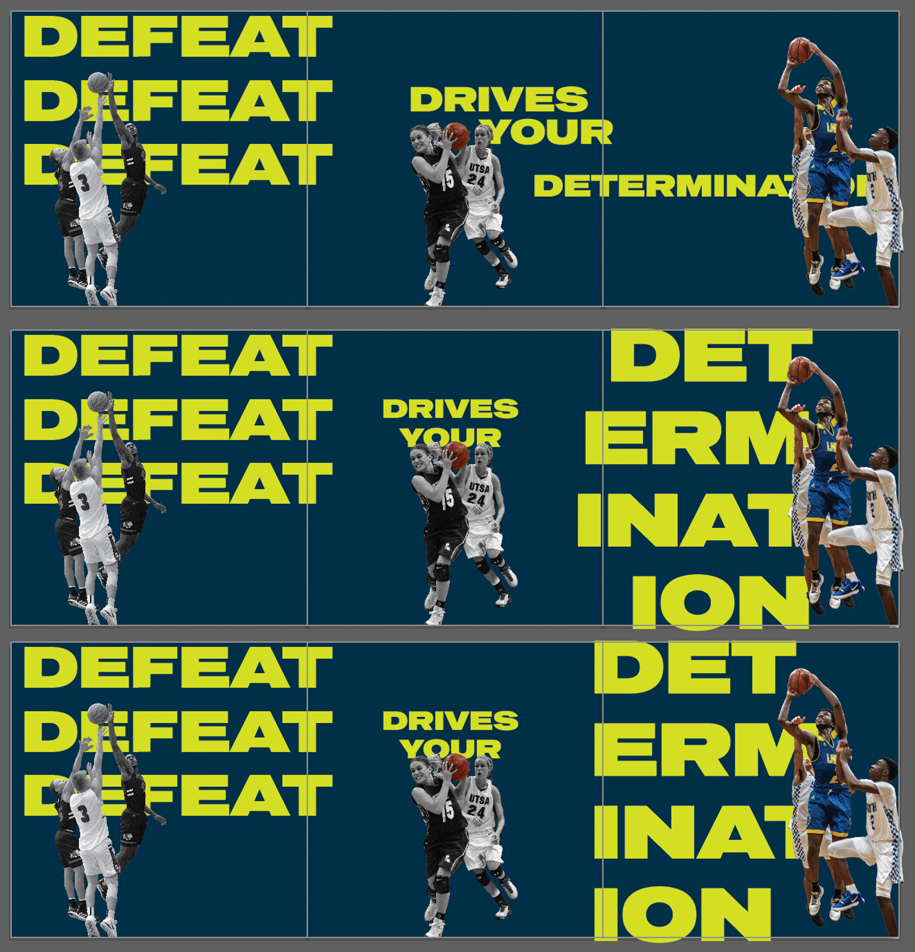
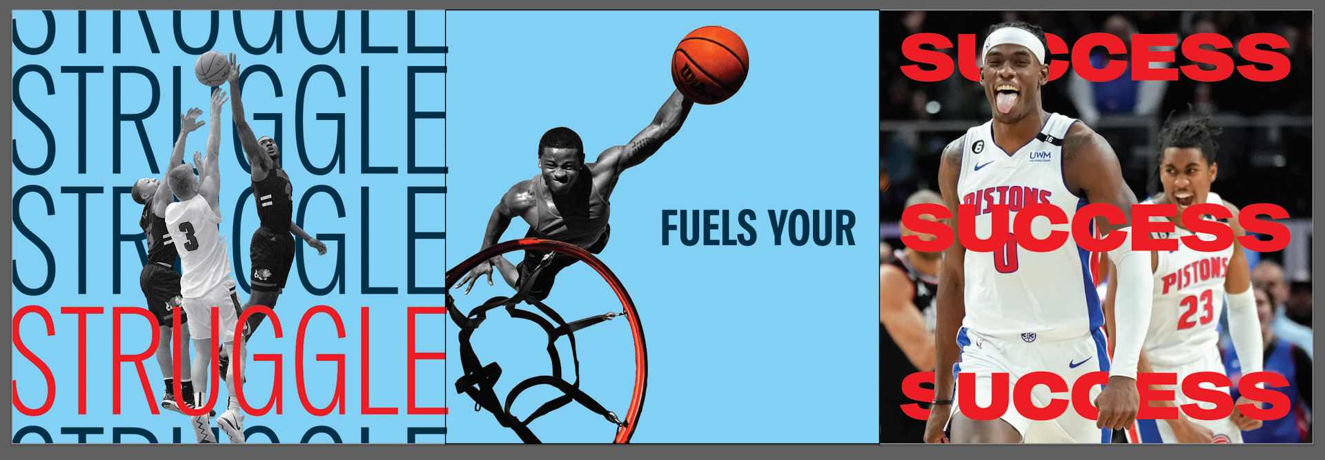
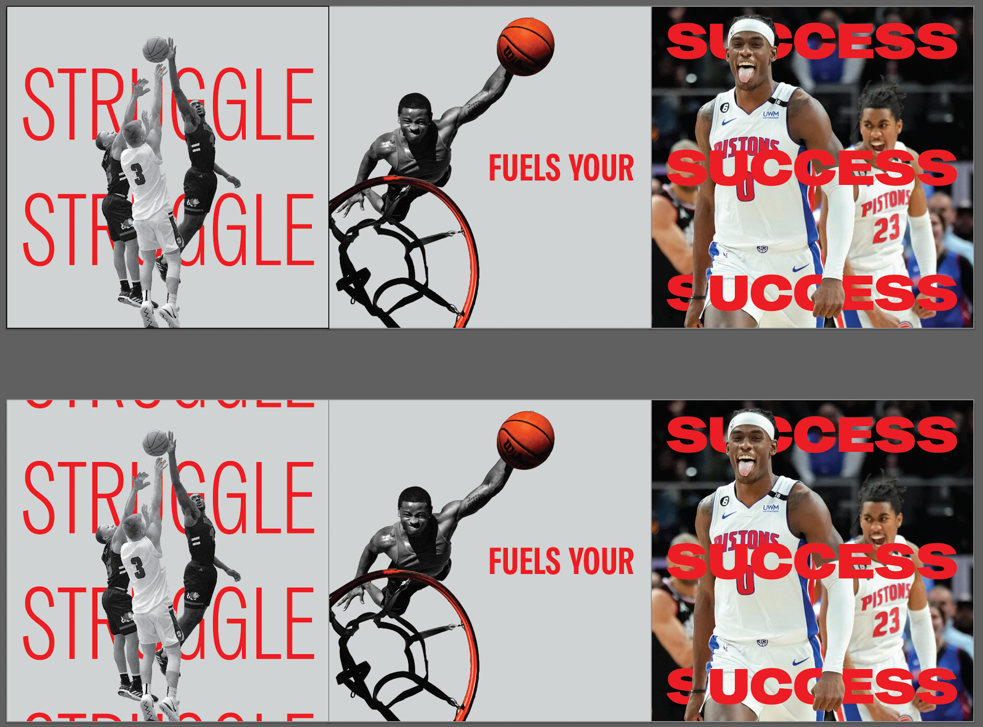
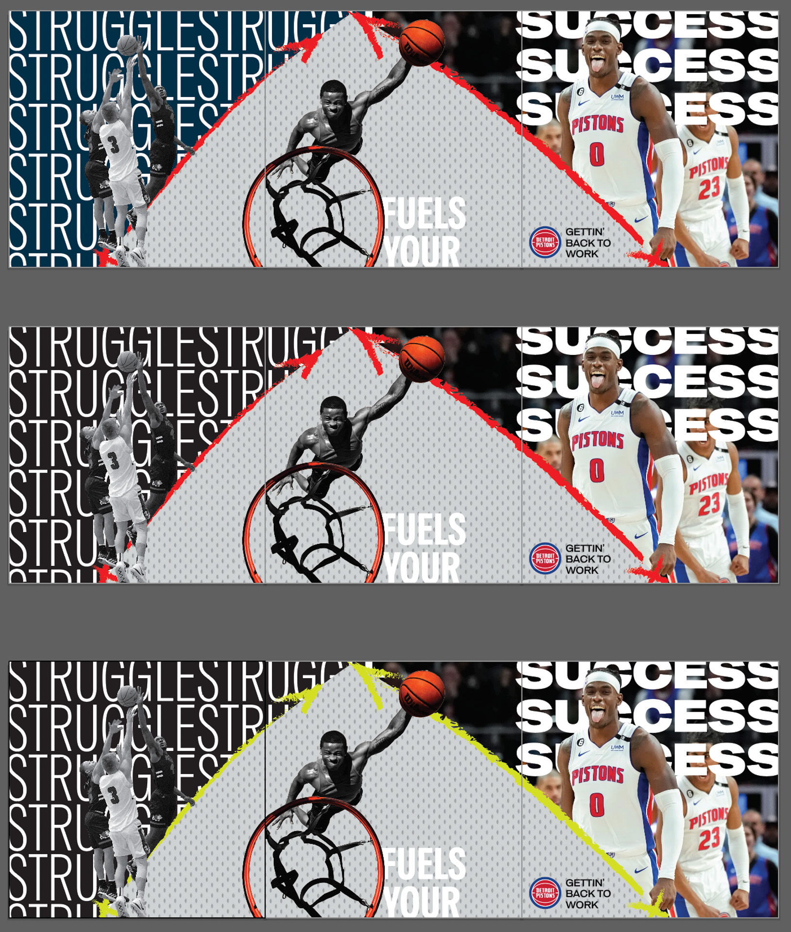
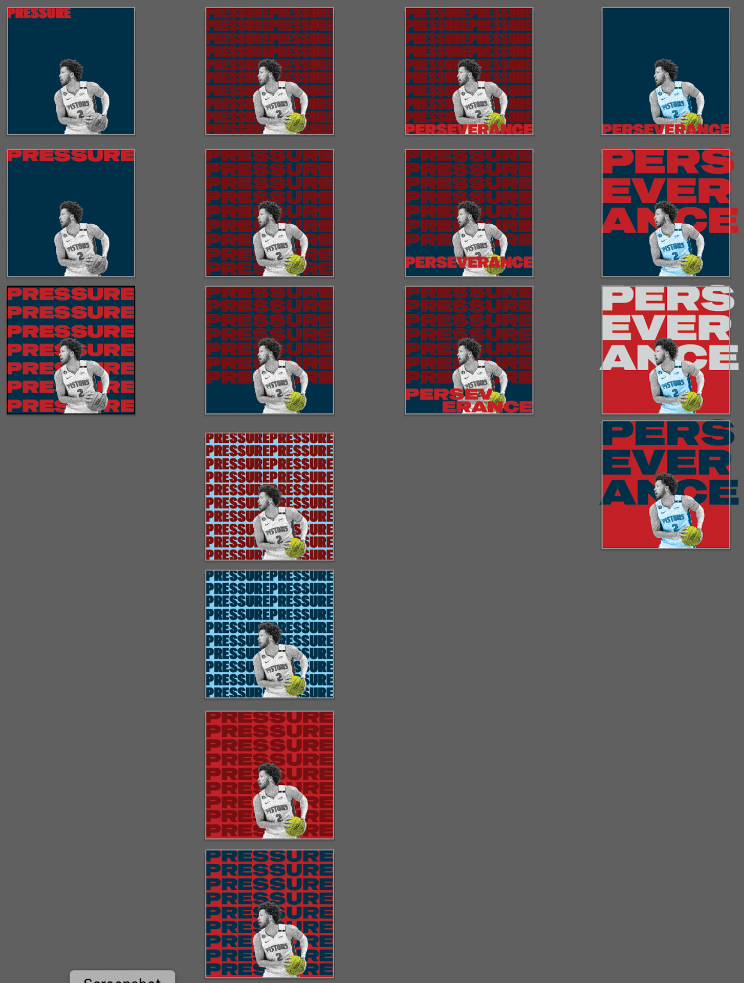
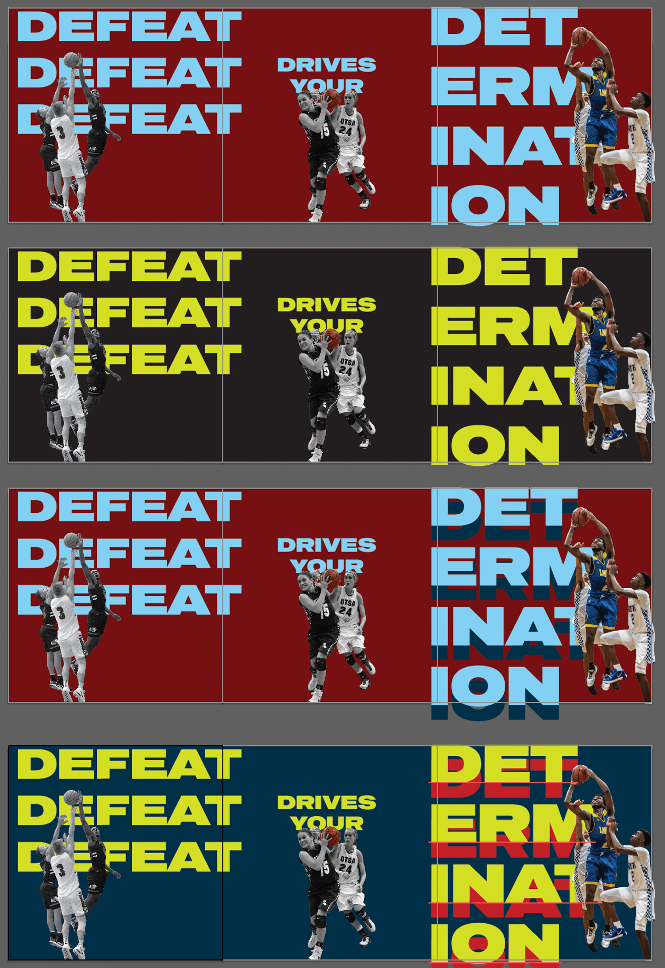
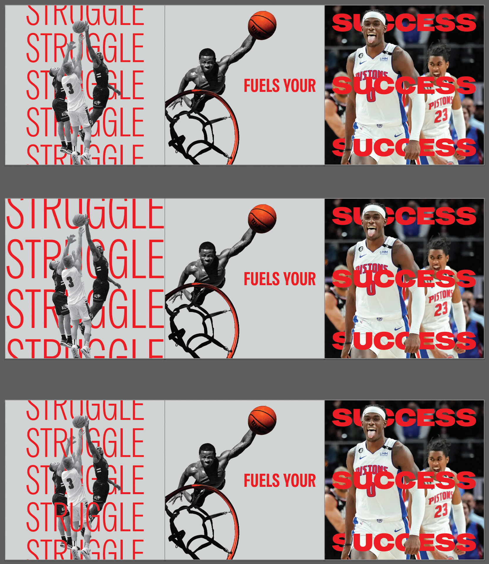
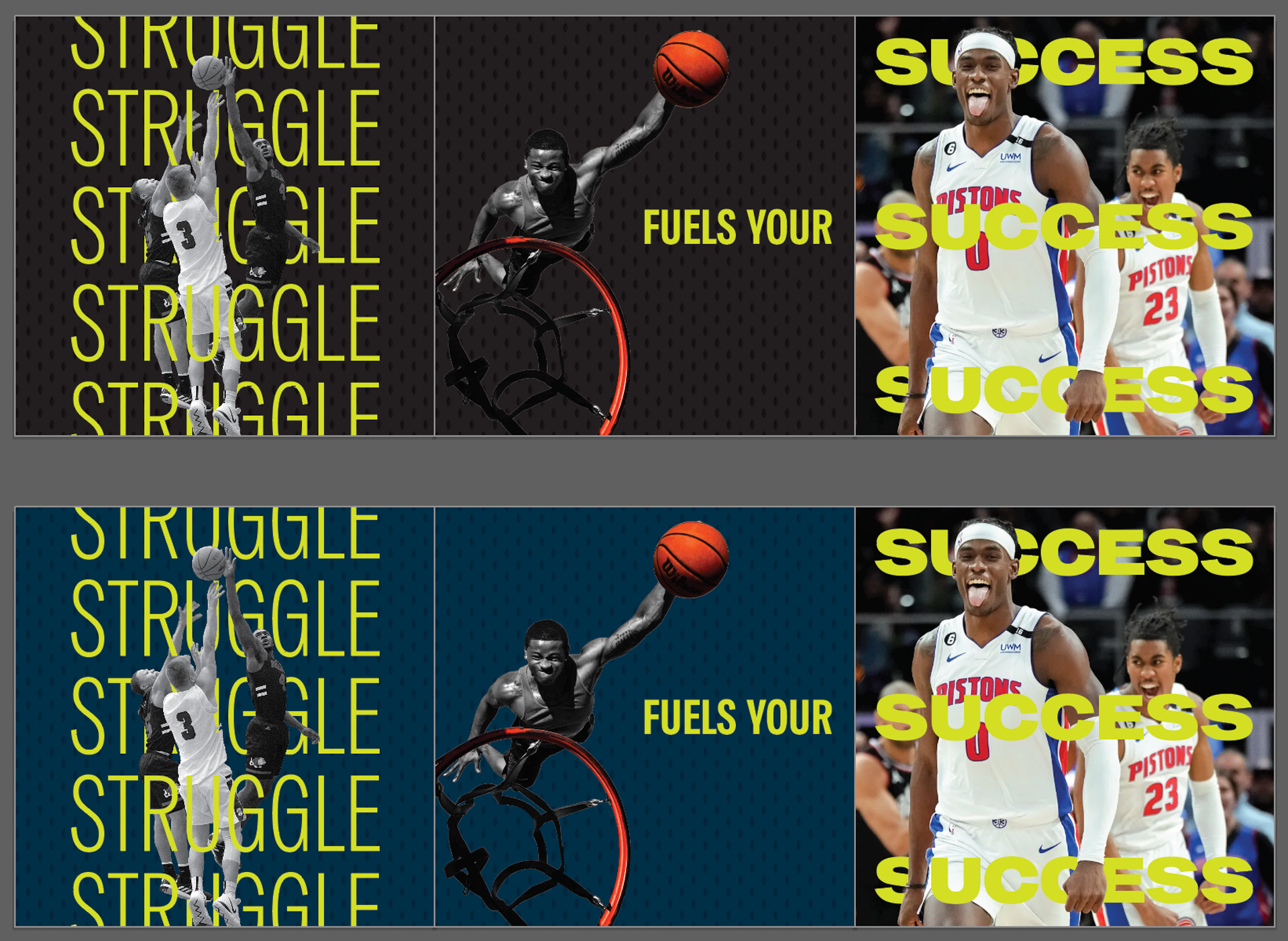
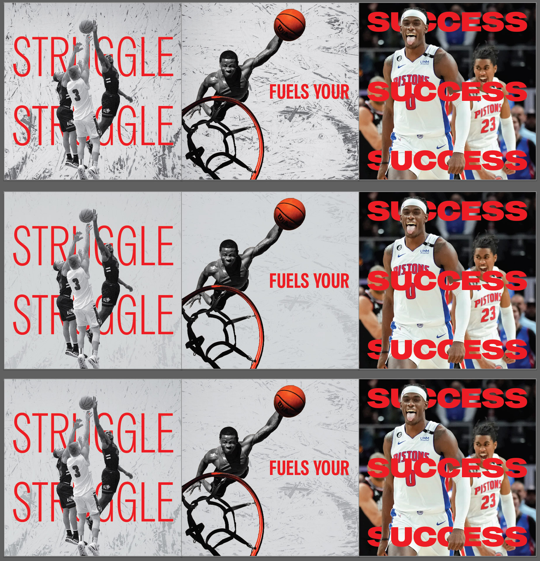
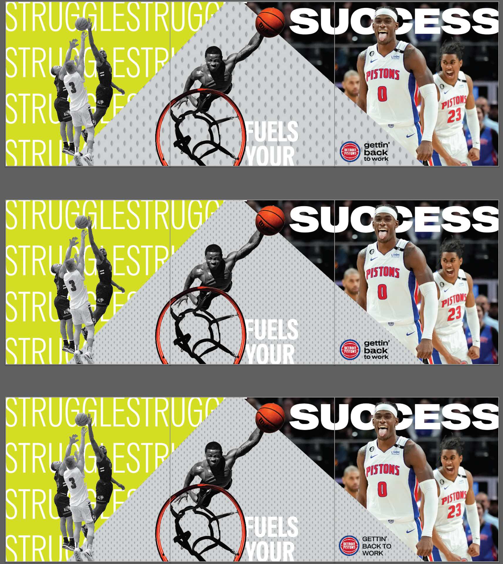
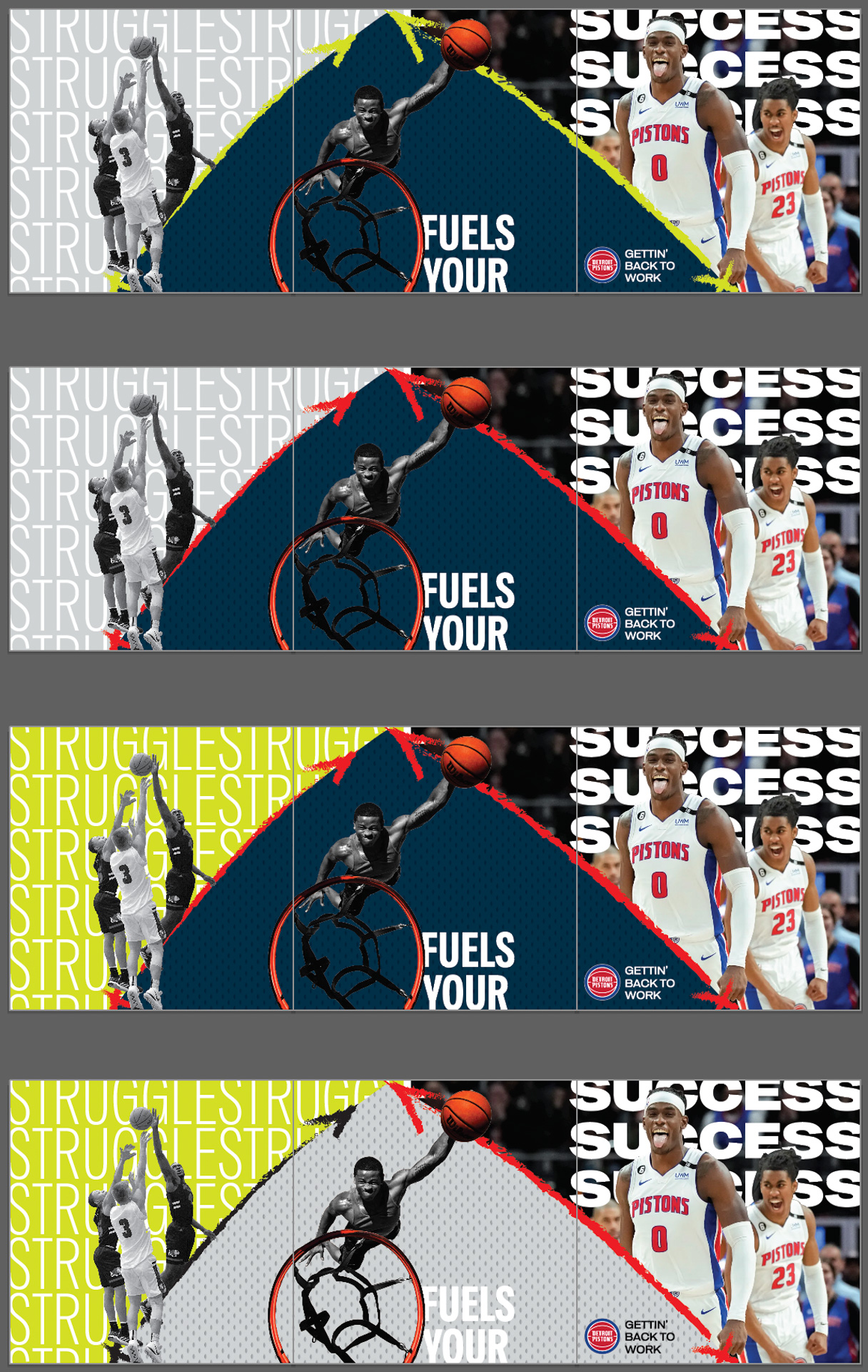
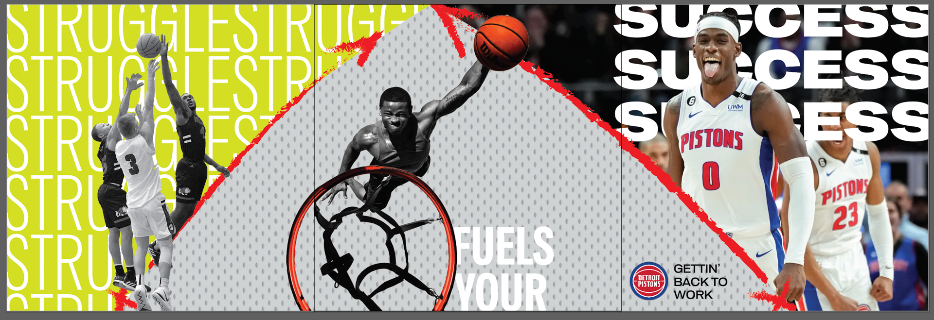
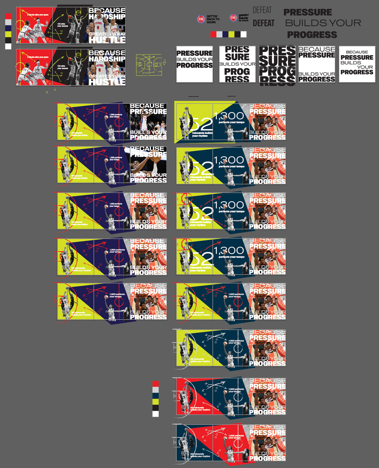
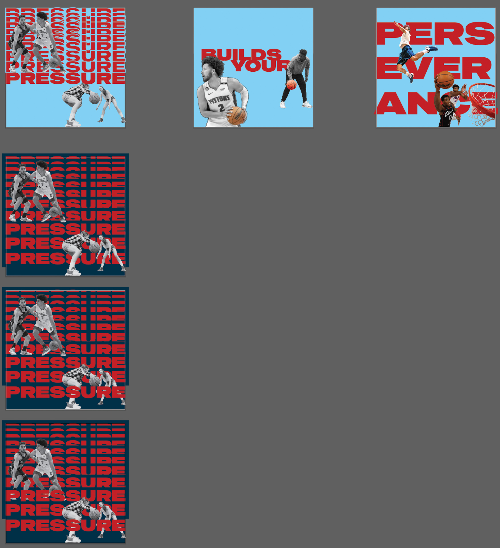
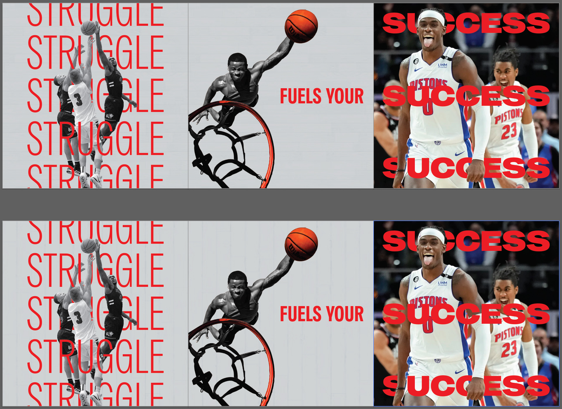
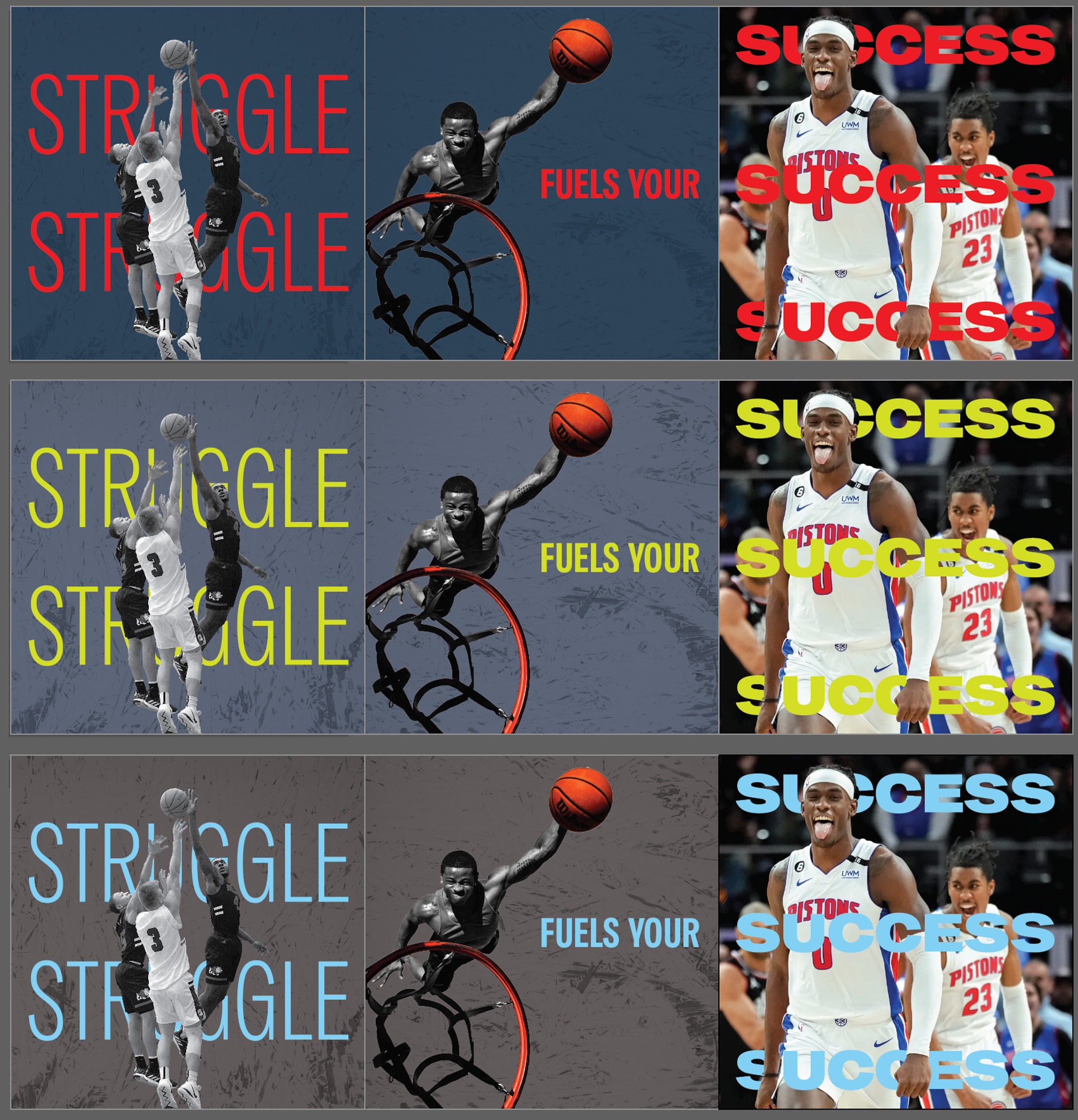
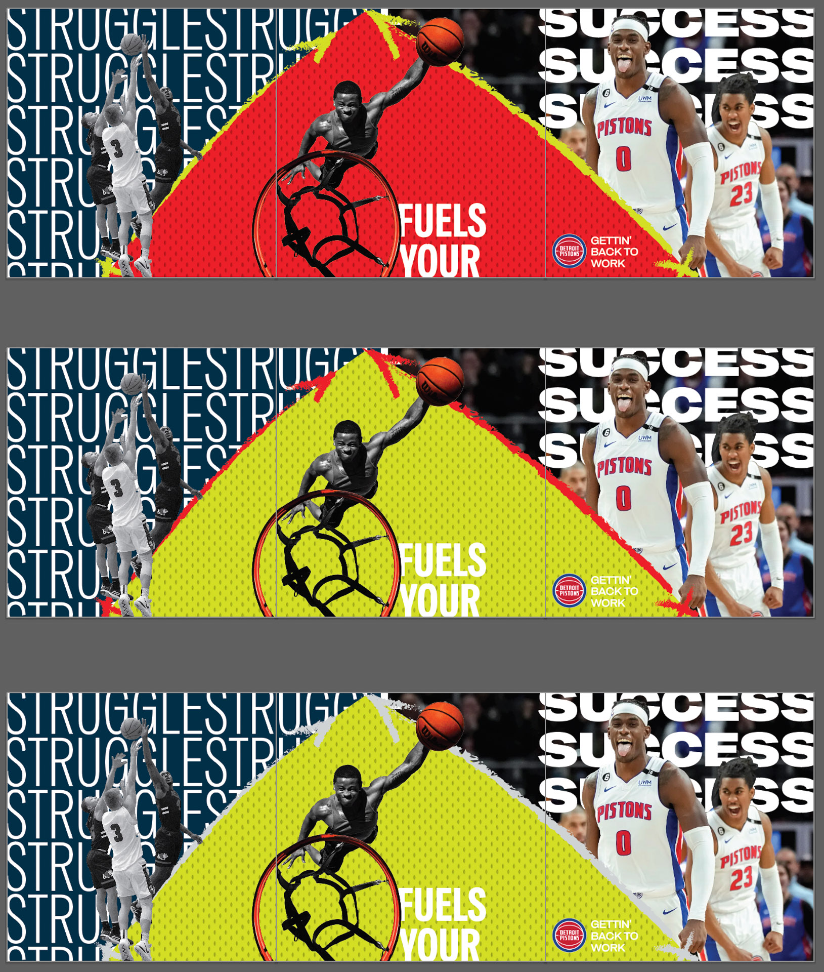
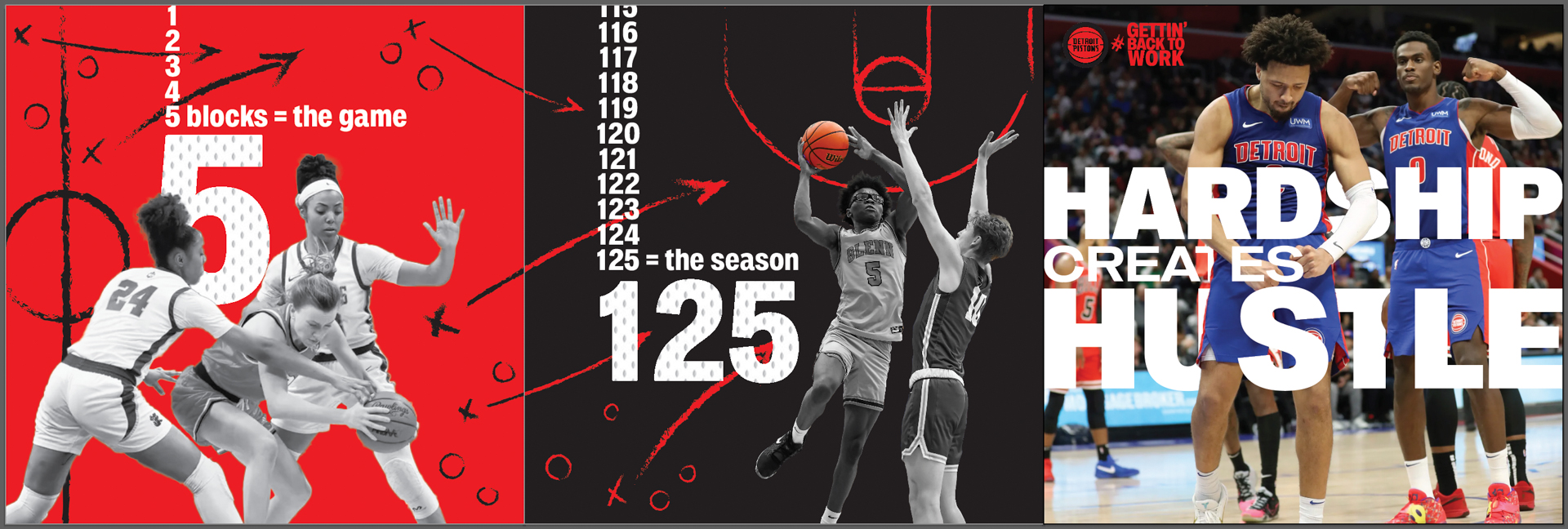
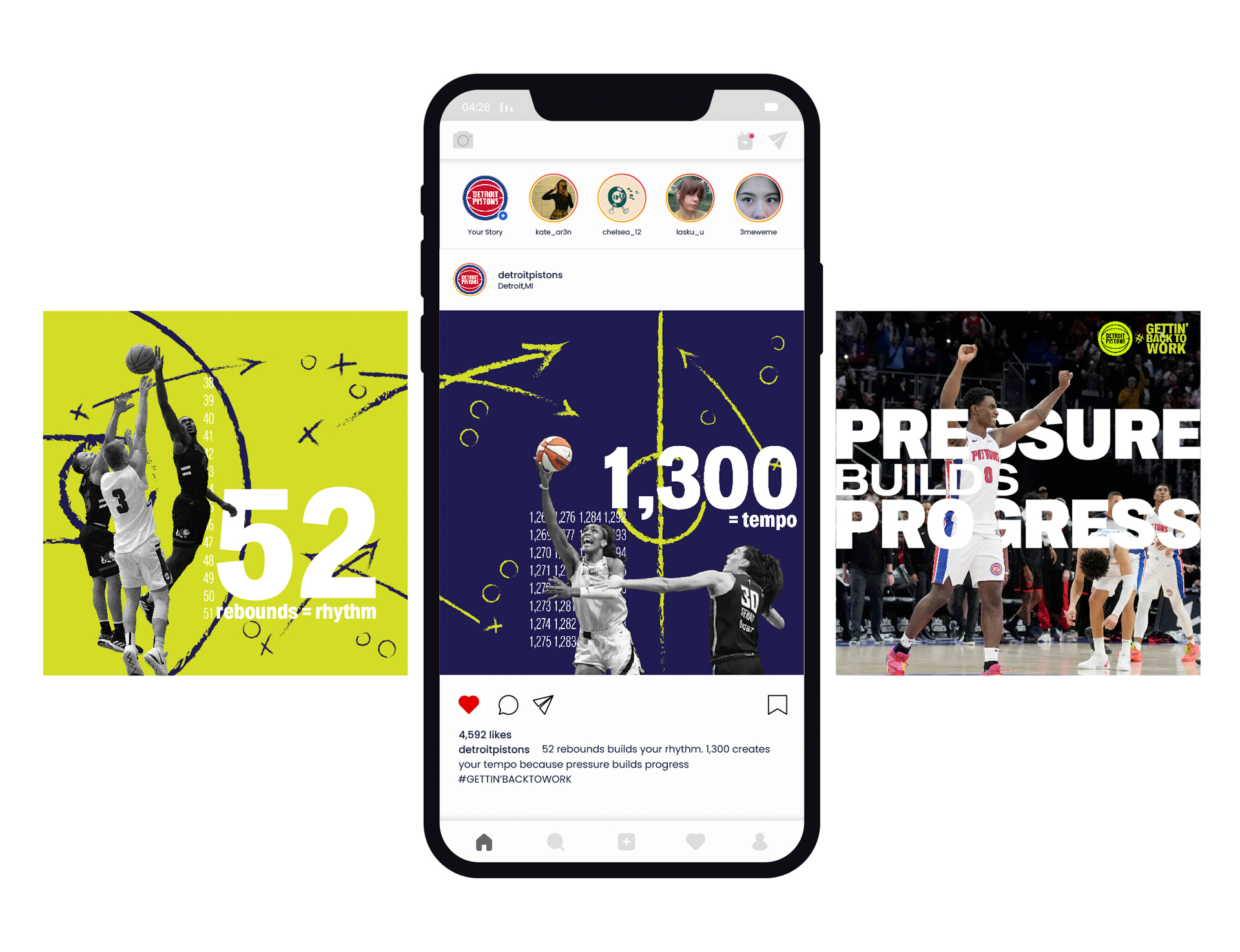
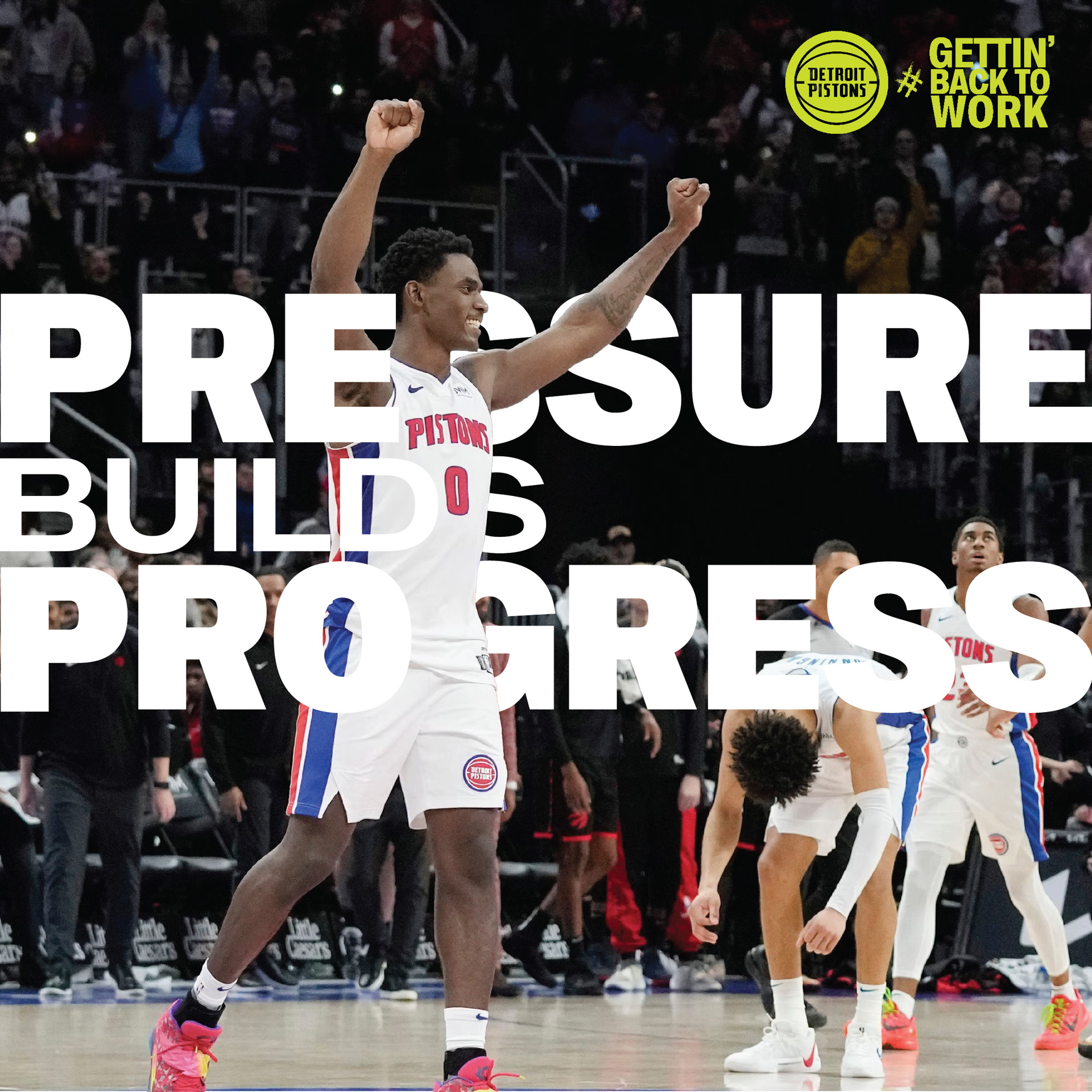
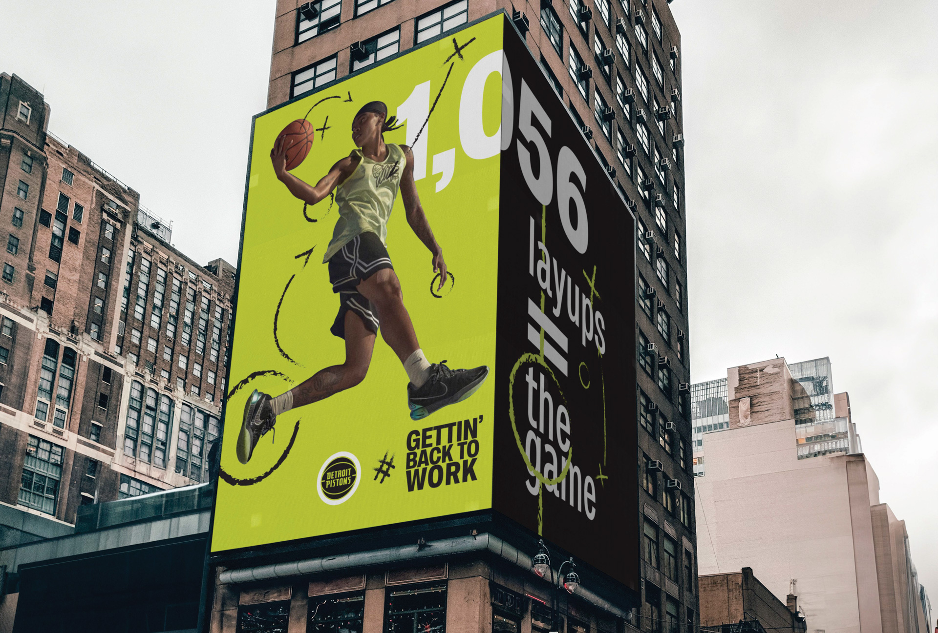
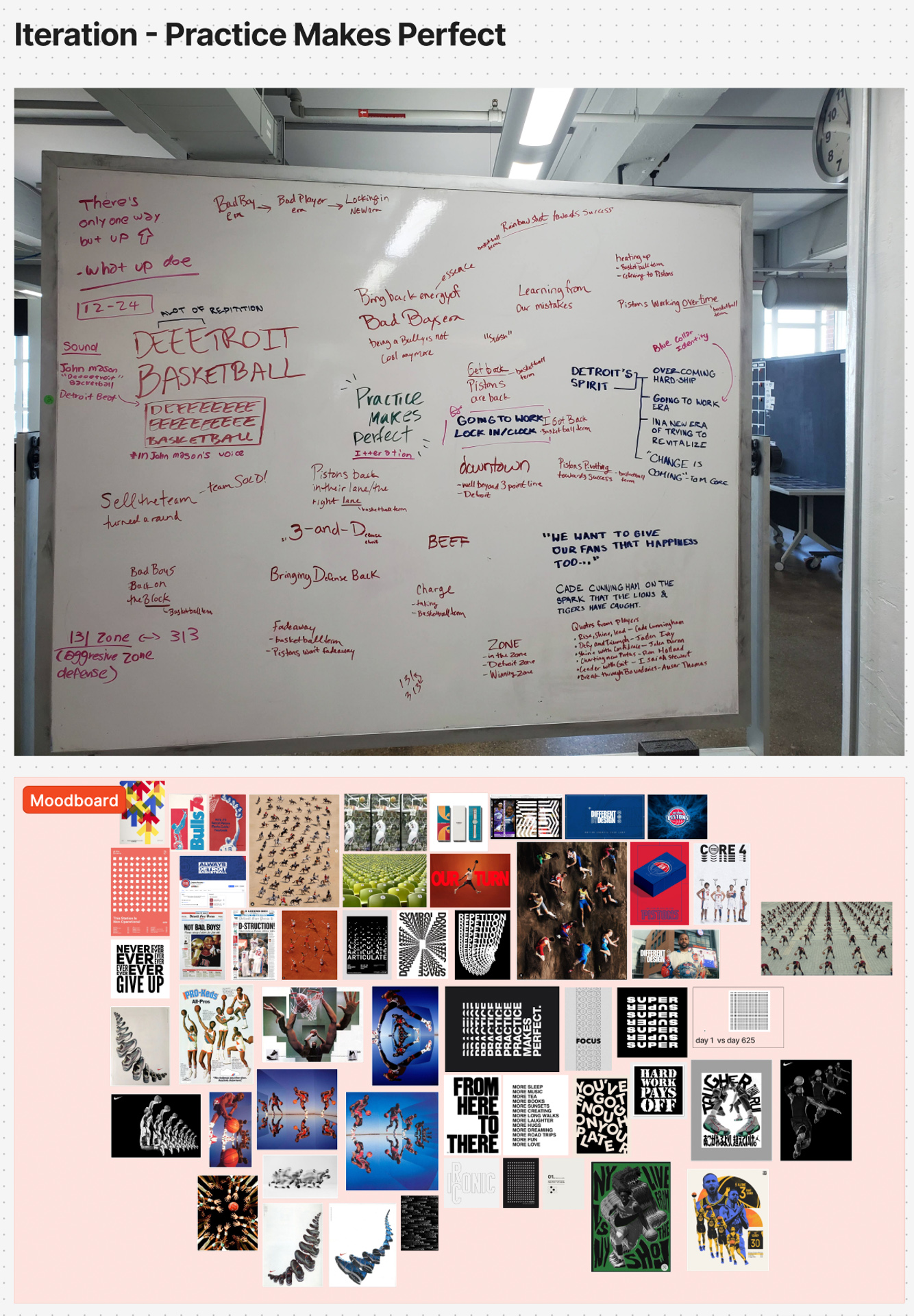
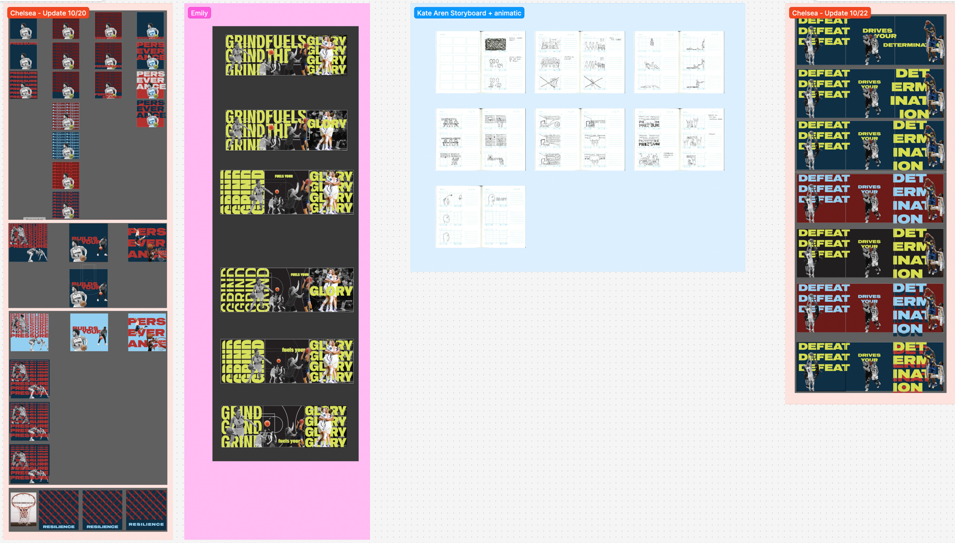
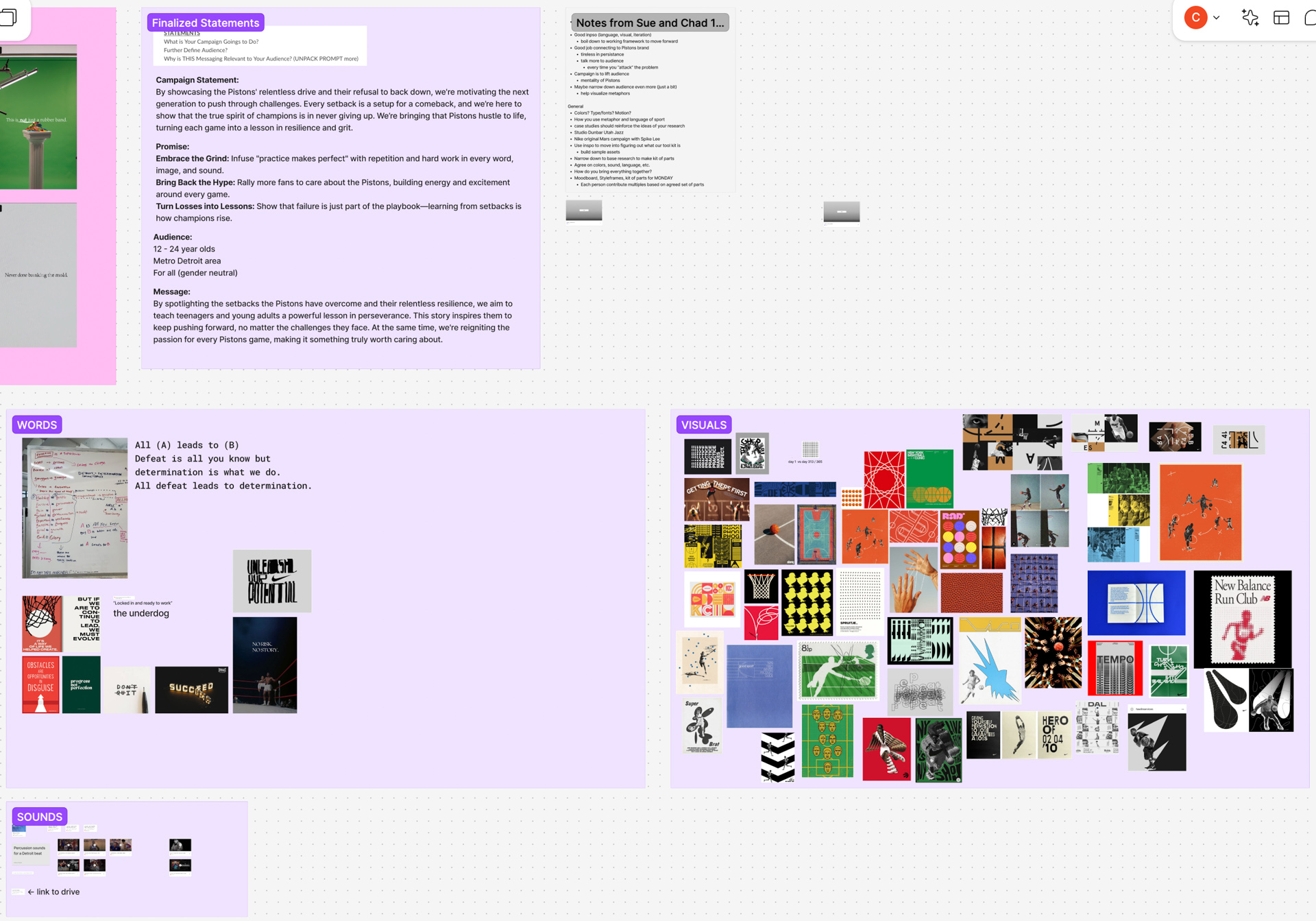
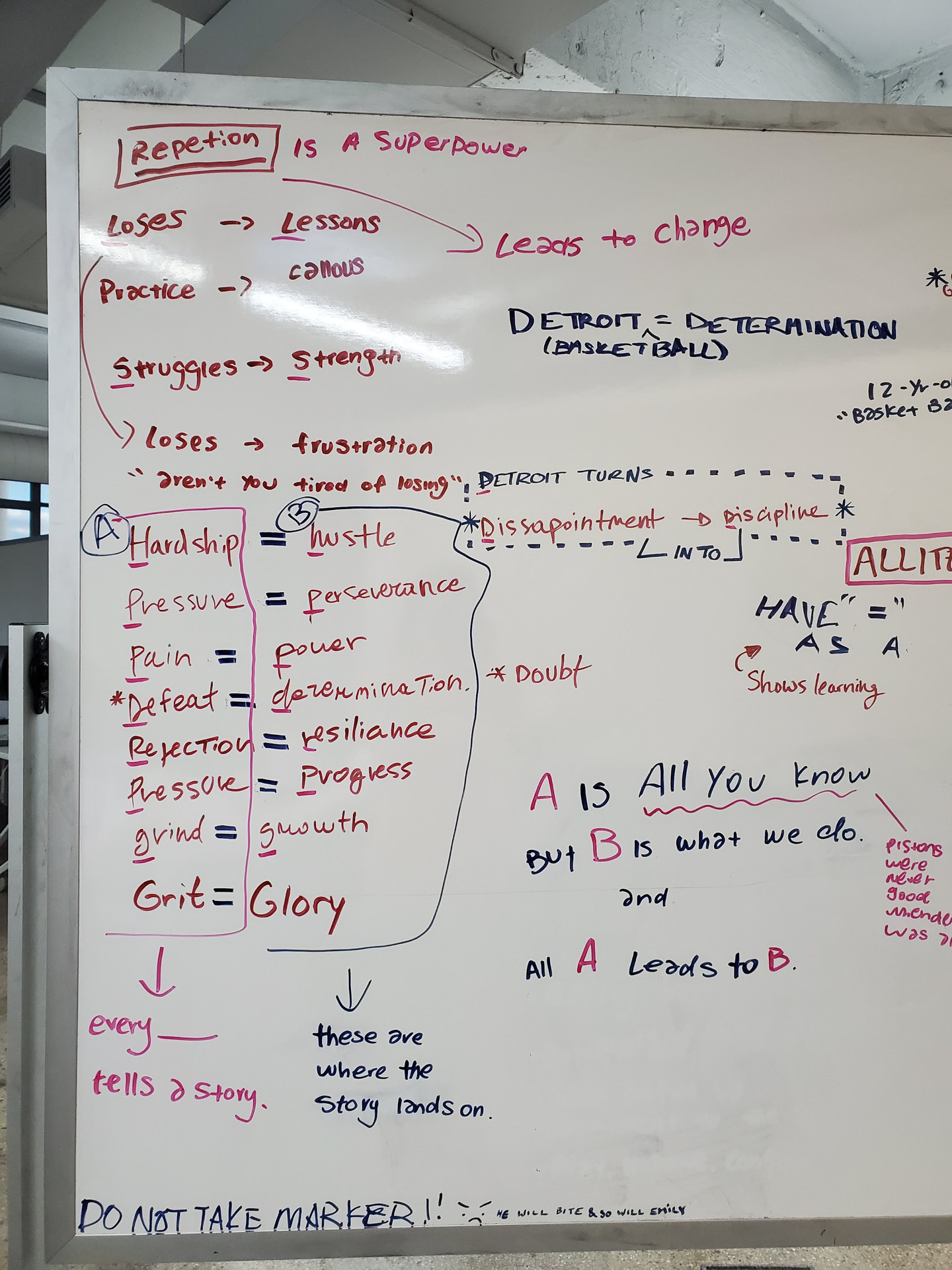
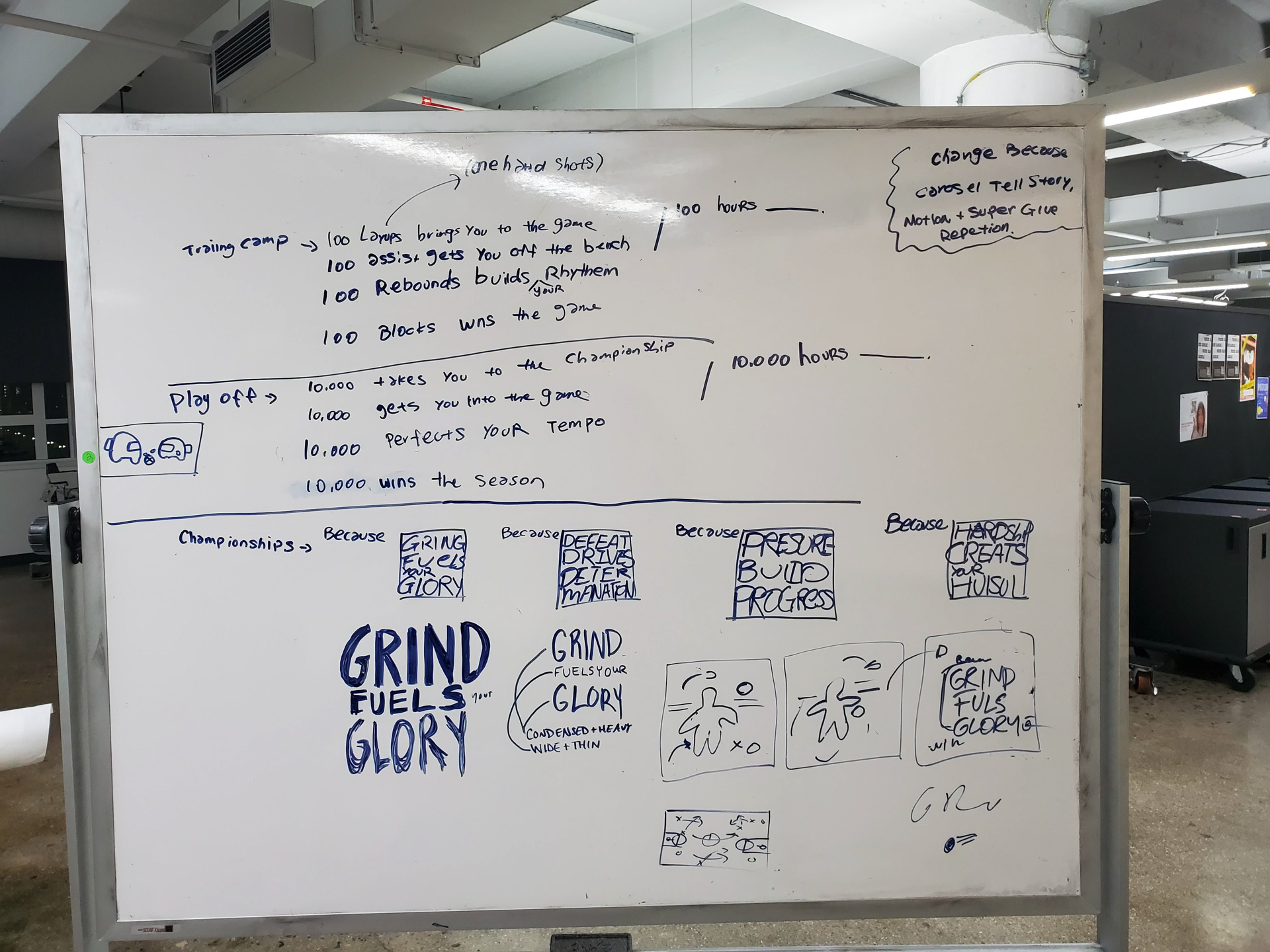
Our randomly assigned word “iteration” fit perfectly with our team and sport, as basketball requires much repetition, like dribbling the ball. From that, we started brainstorming ways to create a campaign on behalf of Pistons that shows this repetition and how it builds progress while tying in the energy of their Bad Boys era, as this was their most known time frame. We chose a font that looked similar to the Pistons’ brand identity. Stzos is a variable font, helping us to explore the range of weights pushing the point of progress makes perfect. We decided to repeat the typography to show the amount of practice it takes to be successful, basing it on a concept of what a skill looks like on day 1 vs day 365 (ex: 1 dot vs 365 dots). Our color palette is based on the Pistons’ team colors, brightening up the red and blue, as well as adding an electric lime green to bring fresh energy. Our image story builds color with each step, pushing the idea of progress. Starting in black and white to resemble the “training camp” stage, then adding a pop of color as the basketball representing being and the game and the energy felt when you have the ball, and finishing with a full-color image showing the payoff and the success achieved through all the hard work.
Detroit has a deep culture in sports, launching the base for our campaign. Our campaign embraces the Detroit Pistons determination in the NBA. We bring the confident energy from the Bad Boys era to uplift and motivate our target audience by showing how practice makes perfect, and the importance of never giving up but cutting in at the angle of finding enjoyment in the process of success.
AUDIENCE
All high schoolers (14-18 years) in the Metro Detroit area
PROCESS
Selecting our Detroit team was chosen at random, as well as with a word to drive our campaign. Our acts of chance provided us with the Detroit Pistons team and the word “iteration” to base our campaign off of.
We started by splitting up the research in order to cover every aspect of the Pistons, including areas like history, demographics and finances, internal brand audit, and brand design case studies of other basketball teams. We expanded this research into areas like basketball language, economic impact, and fan celebrations to further understand our subject matter.
Our randomly assigned word “iteration” fit perfectly with our team and sport, as basketball requires much repetition, like dribbling the ball. From that, we started brainstorming ways to create a campaign on behalf of Pistons that shows this repetition and how it builds progress while tying in the energy of their Bad Boys era, as this was their most known time frame. We chose a font that looked similar to the Pistons’ brand identity. Stzos is a variable font, helping us to explore the range of weights pushing the point of progress makes perfect. We decided to repeat the typography to show the amount of practice it takes to be successful, basing it on a concept of what a skill looks like on day 1 vs day 365 (ex: 1 dot vs 365 dots). Our color palette is based on the Pistons’ team colors, brightening up the red and blue, as well as adding an electric lime green to bring fresh energy. Our image story builds color with each step, pushing the idea of progress. Starting in black and white to resemble the “training camp” stage, then adding a pop of color as the basketball representing being and the game and the energy felt when you have the ball, and finishing with a full-color image showing the payoff and the success achieved through all the hard work.


Knowledge Gained
Working in a team with three other people was a new experience for me, further developing my collaboration skills. This helped build my communication skills, time management, and organization to ensure everything was clear and we all were on the same page. Creating a series of videos starting at 30 seconds and cutting down to 15 and 7 seconds, I learned how to pick out the crucial moments to convey our story well. I gained a deeper understanding of how social media carousels function and how they should correlate with each other. I also further developed my knowledge of branding and how to build off of existing brand guidelines.
SPECS
+ Motion video 7 seconds - 1080x1920
+ Motion video 15 seconds - 1920x1080
+ Motion video 30 seconds - 1920x1080
+ 4 super graphics
+ 12 carousel slides for social media
+ After Effects
+ Illustrator
+ Photoshop
+ Figma
+ Keynote
ROLES
Kate Aren
-Motion videos ( 30, 15, and 7 seconds)
-Researching
-Concept development
-Motion typography
-Deck creation and presentation
Martina Lasku
-Super graphics (4)
-Researching
-Concept development
-Video editing and color correction
-Deck creation and presentation
Chelsea Rogers
-2 carousel designs (3 slides each, 6 total slides)
-Researching
-Concept development
-Narration script writing
-Deck creation and presentation
-Emily Zhang
-2 carousel designs (3 slides each, 6 total slides)
-Researching
-Concept development
-Sound editing
-Deck creation and presentation
![]()
Working in a team with three other people was a new experience for me, further developing my collaboration skills. This helped build my communication skills, time management, and organization to ensure everything was clear and we all were on the same page. Creating a series of videos starting at 30 seconds and cutting down to 15 and 7 seconds, I learned how to pick out the crucial moments to convey our story well. I gained a deeper understanding of how social media carousels function and how they should correlate with each other. I also further developed my knowledge of branding and how to build off of existing brand guidelines.
SPECS
+ Motion video 7 seconds - 1080x1920
+ Motion video 15 seconds - 1920x1080
+ Motion video 30 seconds - 1920x1080
+ 4 super graphics
+ 12 carousel slides for social media
+ After Effects
+ Illustrator
+ Photoshop
+ Figma
+ Keynote
ROLES
Kate Aren
-Motion videos ( 30, 15, and 7 seconds)
-Researching
-Concept development
-Motion typography
-Deck creation and presentation
Martina Lasku
-Super graphics (4)
-Researching
-Concept development
-Video editing and color correction
-Deck creation and presentation
Chelsea Rogers
-2 carousel designs (3 slides each, 6 total slides)
-Researching
-Concept development
-Narration script writing
-Deck creation and presentation
-Emily Zhang
-2 carousel designs (3 slides each, 6 total slides)
-Researching
-Concept development
-Sound editing
-Deck creation and presentation


FINAL PRESENTATION
![]()
RESEARCH & MOODBOARD


EXPERIENCE
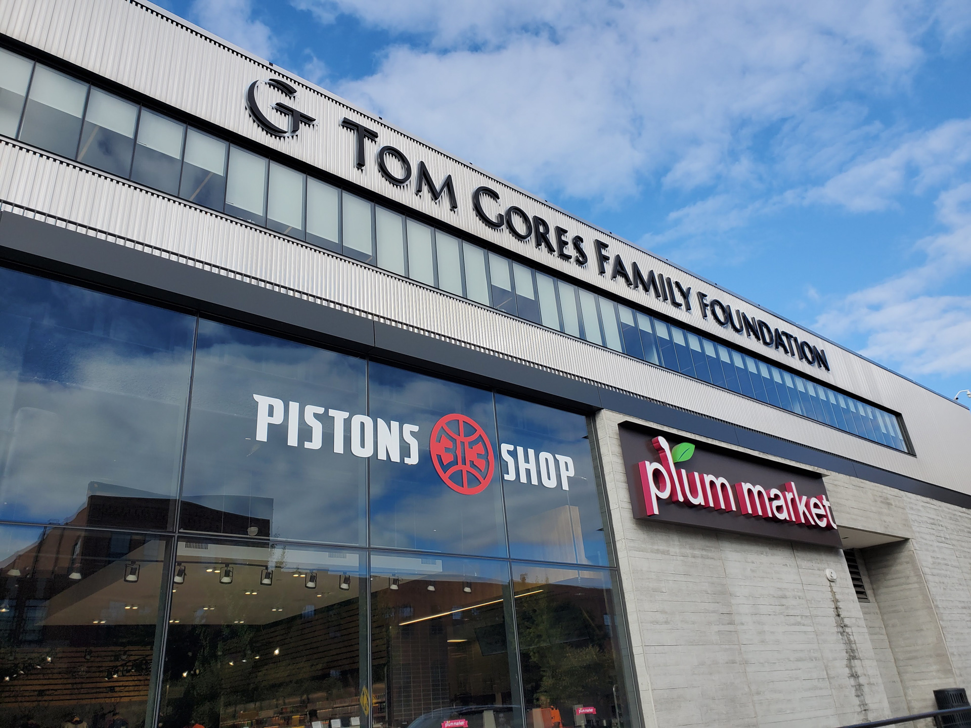
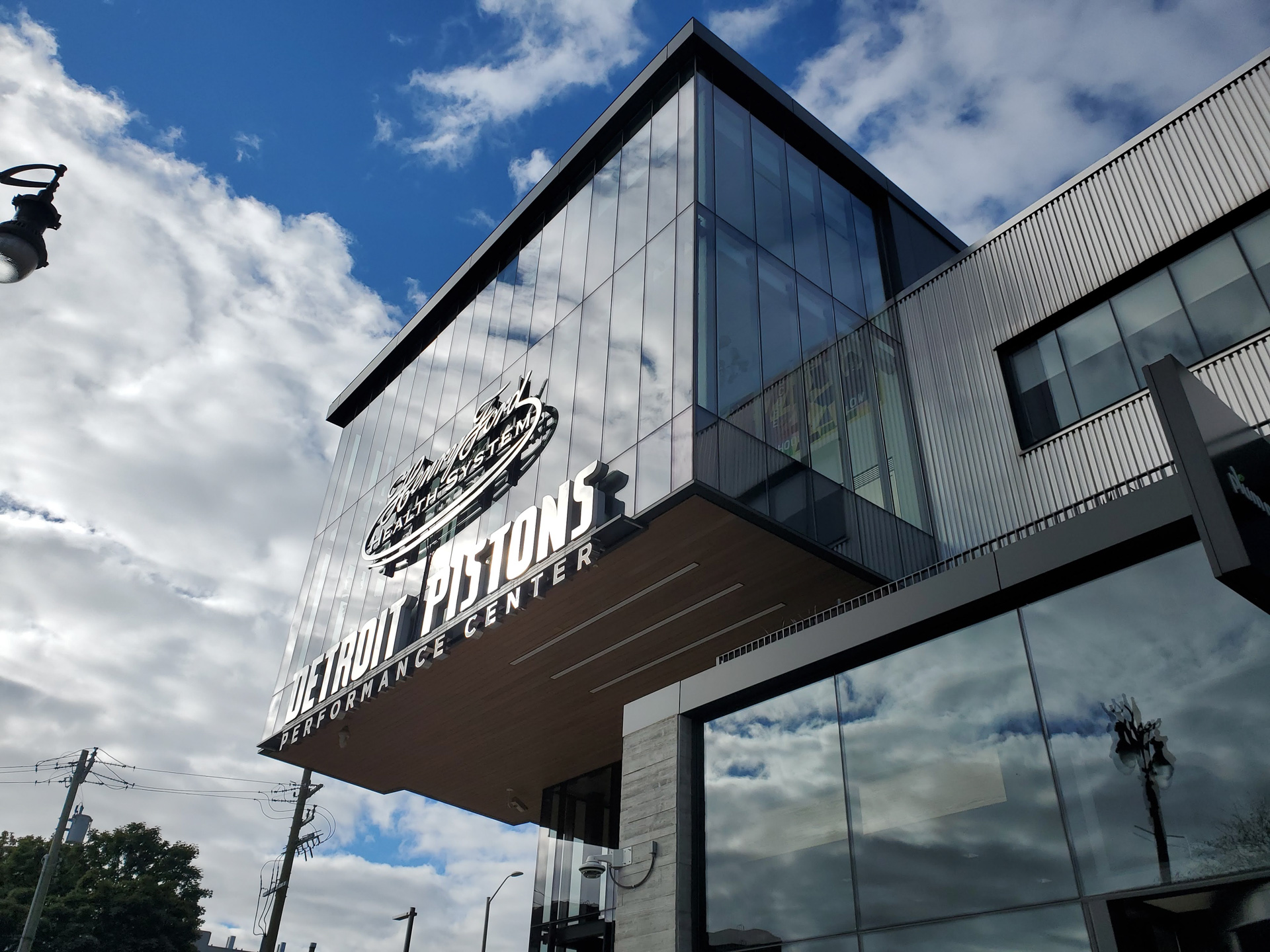
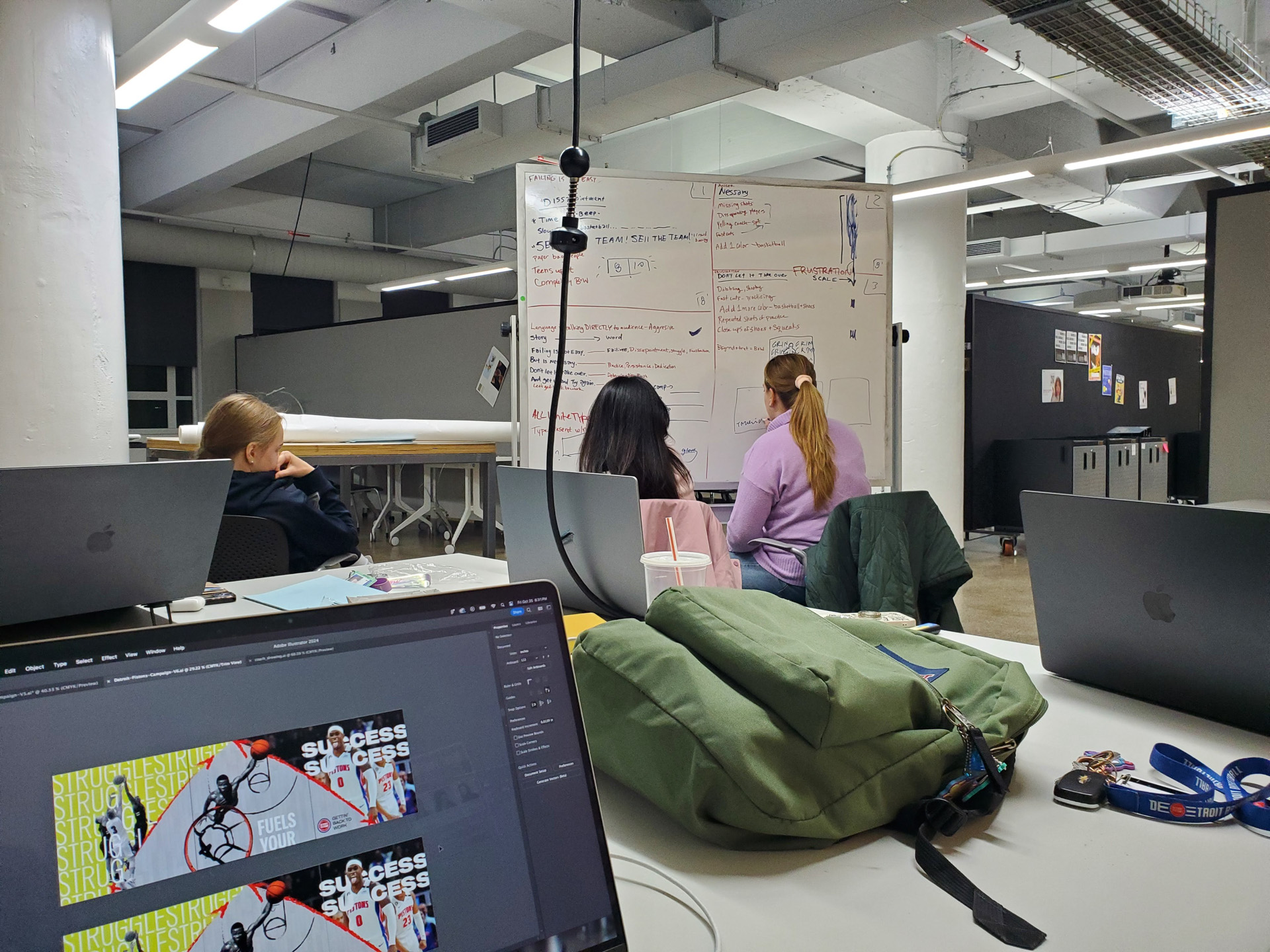
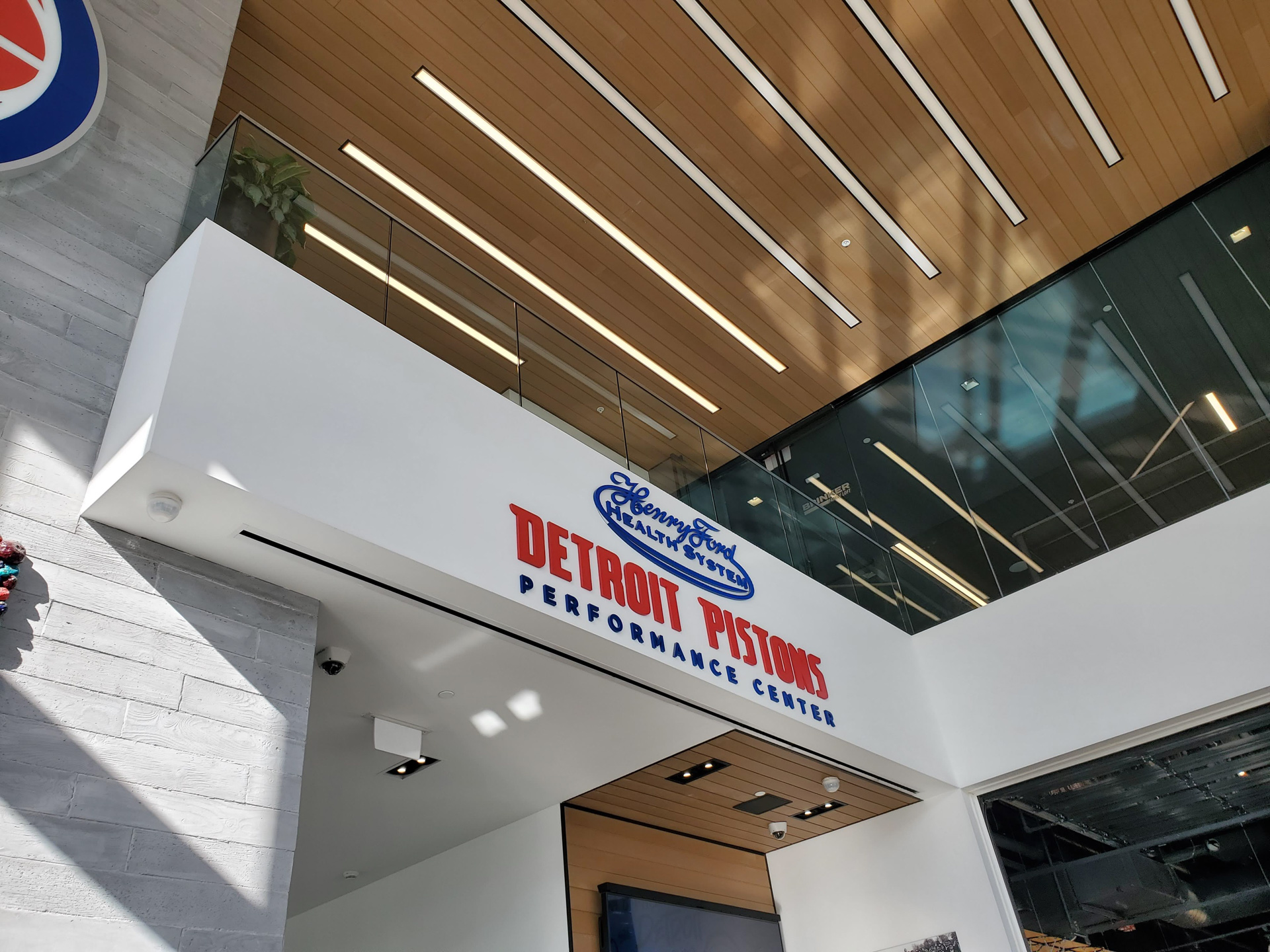
As a team, we walked around the Detroit Pistons’ Performance Center that was only one block away from the CCS Taubman Center. We took pictures to reference and for inspiration. We also used a whiteboard to write down all our thoughts as a way to get ideas out quick and this also connects to the coaches uses whiteboards to run through plays.
![]()
![]()


ITERATION