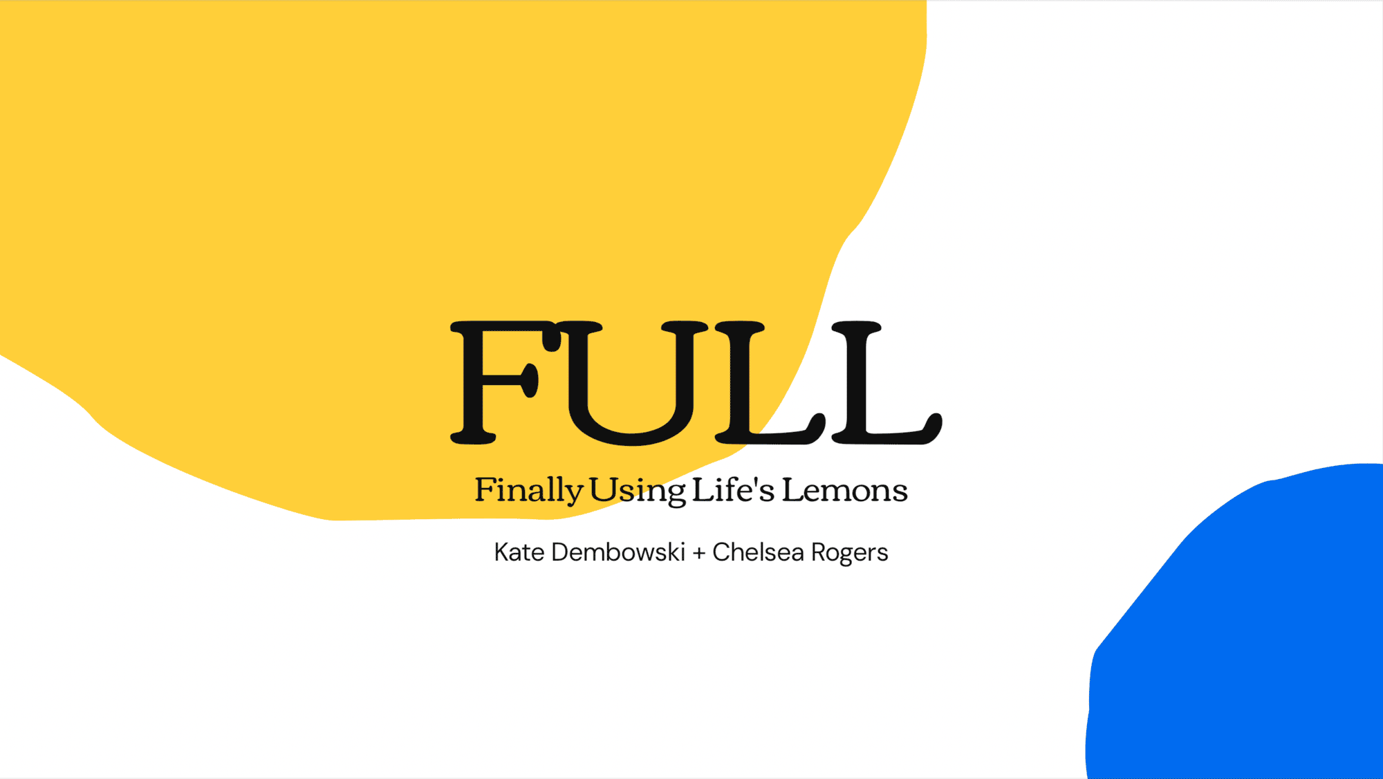
FULL: Finally Using
Life’s Lemons
BRAND IDENTITY


BRIEF
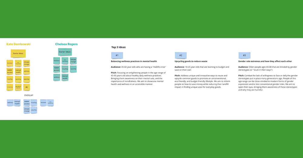
What’s the deal with having a midlife crisis, and why is it stereotypically posed as something negative? How can we make it into something positive and celebratory? We were tasked with selecting, reframing, and branding an American idea working in teams of two. I created this project with Kate Dembowski. When generating ideas for this project, Kate and I had many similarities between our lists. The big common theme was wellness and bettering oneself. Seeing these ideas cross over, we landed upon The Midlife Crisis.
AUDIENCE
People 40-60 years old who are facing a midlife crisis
![]()
![]()
![]()
What’s the deal with having a midlife crisis, and why is it stereotypically posed as something negative? How can we make it into something positive and celebratory? We were tasked with selecting, reframing, and branding an American idea working in teams of two. I created this project with Kate Dembowski. When generating ideas for this project, Kate and I had many similarities between our lists. The big common theme was wellness and bettering oneself. Seeing these ideas cross over, we landed upon The Midlife Crisis.
AUDIENCE
People 40-60 years old who are facing a midlife crisis
PROCESS
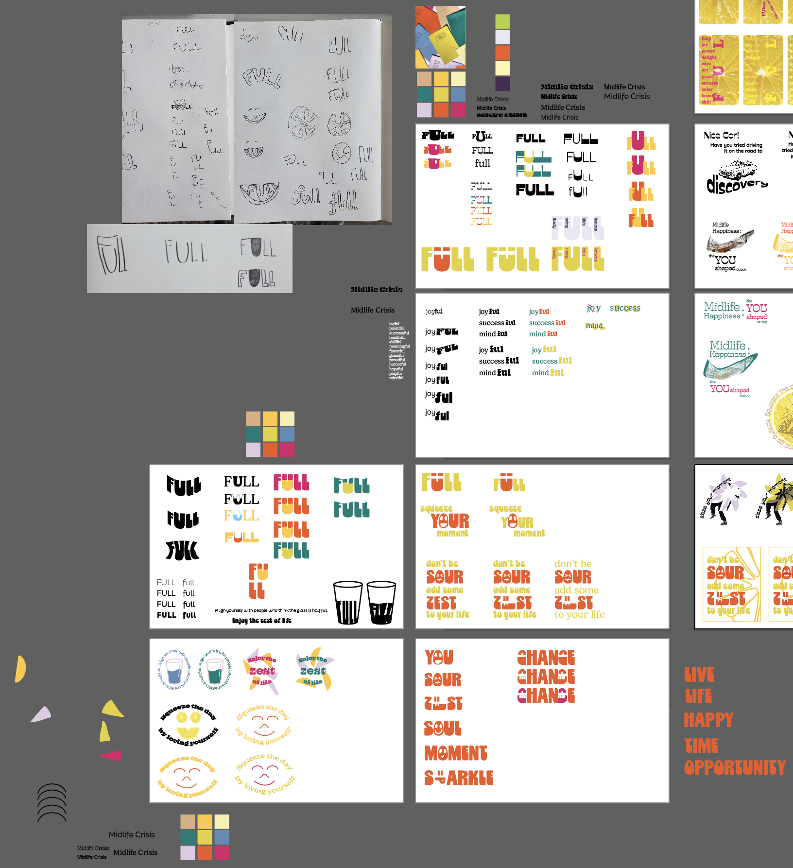
Kate and I wanted to turn the negative connotations surrounding The Midlife Crisis into something positive and embrace it as The Midlife Opportunity. Before landing on a brand strategy, we researched The Midlife Crisis and its symptoms, actions, wellness practices, and so on to fully understand our target audience and the issue. After gathering this information, we started moodboarding our thoughts. We collected words and phrases, colors, styles, fonts, and language that we felt inspired by. After discussing our ideas and inspirations, we needed a brand concept.
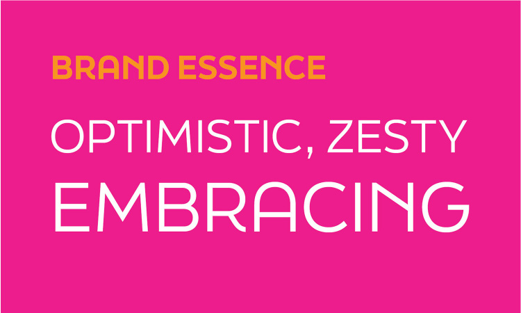
Kate and I came up with several brand concepts and names, finally landing on the name FULL, an acronym for Finally Using Life’s Lemons. We were inspired by the phrase “When life gives you lemons, make lemonade” and thought it lent itself to be an interesting design strategy. After landing on this brand concept, Kate and I nailed down our concept statement, brand promise essence words, mood/tone, and communication plan. We dug deeper and created an expansive mood board with inspiration for each aspect of our brand (color, typography, graphic style/vibes, and target audience). Kate and I also created three personas to help us design appropriate for our target audience.
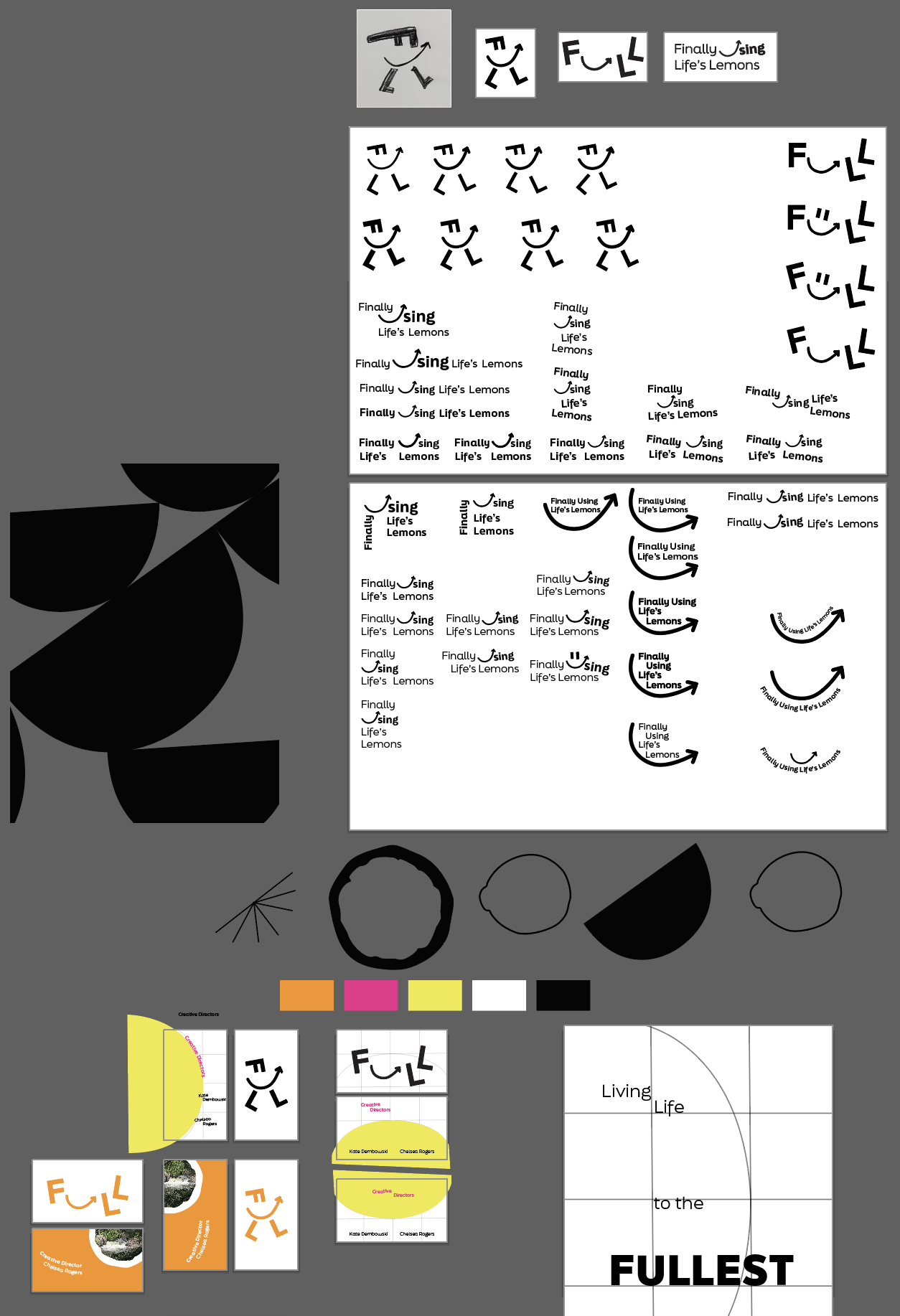
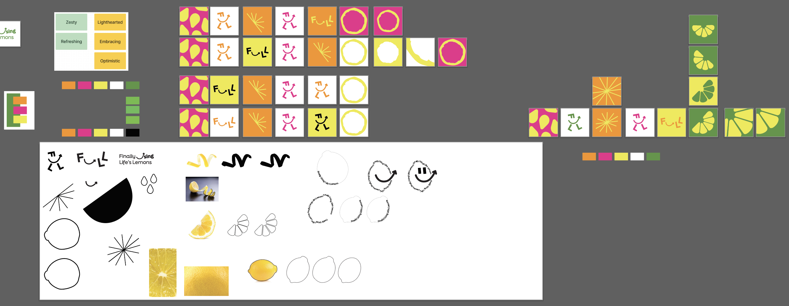
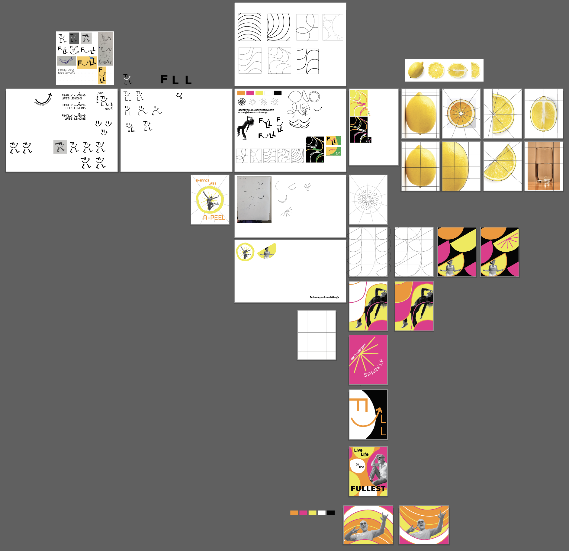
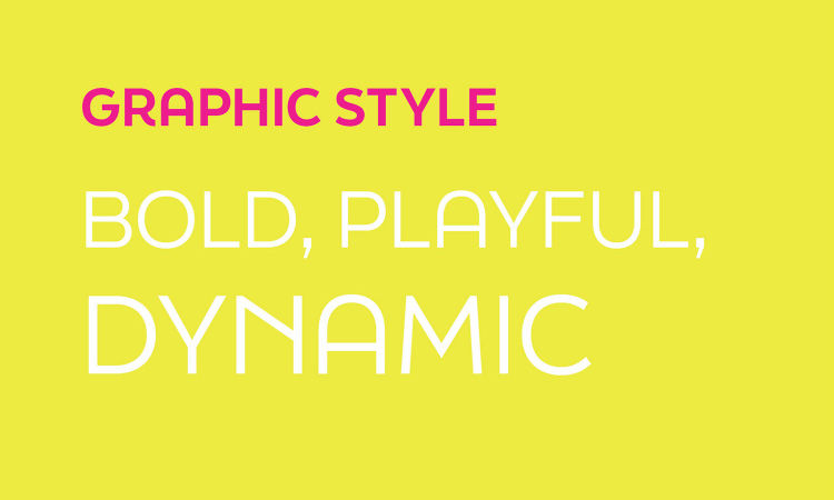
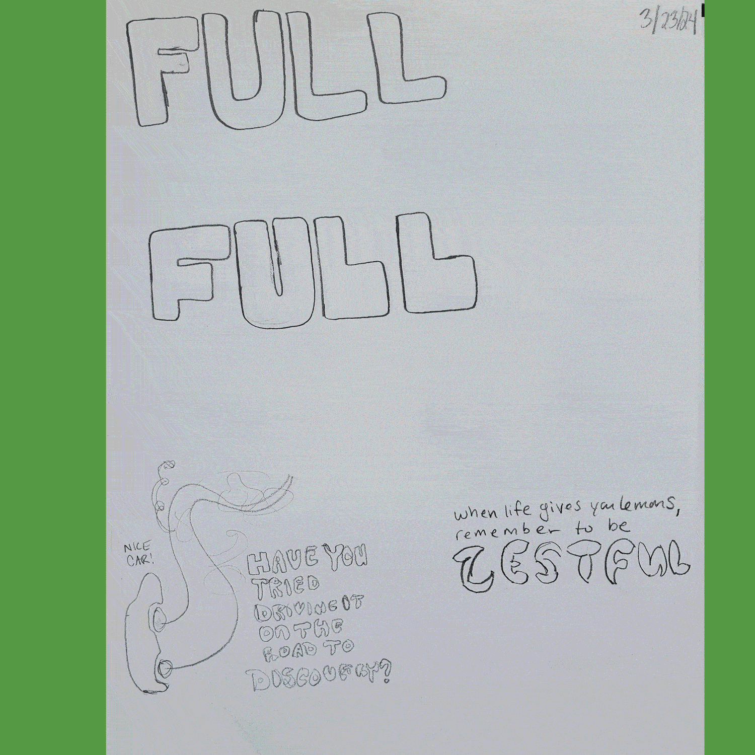
After thinking, researching, moodboarding, and concepting, it was time to create. Kate and I condensed our mood board down into what we decided our core concept inspiration would be. We started sketching graphic elements, uses of type, and brand name lockups of all sorts. We created with pencils, through collaging, and digitally. We eventually landed on a design strategy using different elements of a lemon as our graphic language. We paired these zesty elements with go-getter phrases and fresh colors to create an eye-catching and motivating Midlife Opportunity brand.
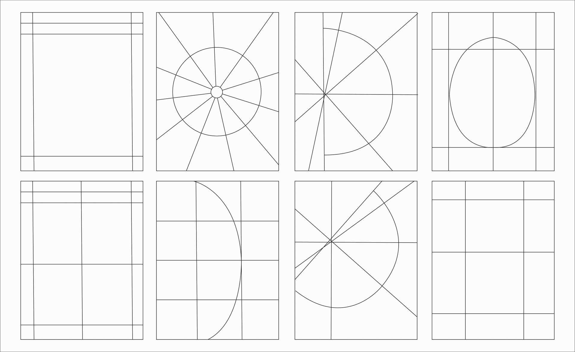
FULL uses shapes inspired by the lemon as patterns and containers. Our images and language are used to encourage and motivate our target audience to embrace life to the fullest. The logo set for FULL was inspired by the happiness curve. This is when people approach the middle of their life they start to become unhappy, but as they age they regain their happiness. We referenced a variety of happiness curve charts and traced them in an attempt to get a perfect arrow for the logo. In addition to all of this, we created a set of grids based on the lemon too.
![]()
![]()
![]()
![]()
![]()
Kate and I wanted to turn the negative connotations surrounding The Midlife Crisis into something positive and embrace it as The Midlife Opportunity. Before landing on a brand strategy, we researched The Midlife Crisis and its symptoms, actions, wellness practices, and so on to fully understand our target audience and the issue. After gathering this information, we started moodboarding our thoughts. We collected words and phrases, colors, styles, fonts, and language that we felt inspired by. After discussing our ideas and inspirations, we needed a brand concept.
Kate and I came up with several brand concepts and names, finally landing on the name FULL, an acronym for Finally Using Life’s Lemons. We were inspired by the phrase “When life gives you lemons, make lemonade” and thought it lent itself to be an interesting design strategy. After landing on this brand concept, Kate and I nailed down our concept statement, brand promise essence words, mood/tone, and communication plan. We dug deeper and created an expansive mood board with inspiration for each aspect of our brand (color, typography, graphic style/vibes, and target audience). Kate and I also created three personas to help us design appropriate for our target audience.
After thinking, researching, moodboarding, and concepting, it was time to create. Kate and I condensed our mood board down into what we decided our core concept inspiration would be. We started sketching graphic elements, uses of type, and brand name lockups of all sorts. We created with pencils, through collaging, and digitally. We eventually landed on a design strategy using different elements of a lemon as our graphic language. We paired these zesty elements with go-getter phrases and fresh colors to create an eye-catching and motivating Midlife Opportunity brand.
FULL uses shapes inspired by the lemon as patterns and containers. Our images and language are used to encourage and motivate our target audience to embrace life to the fullest. The logo set for FULL was inspired by the happiness curve. This is when people approach the middle of their life they start to become unhappy, but as they age they regain their happiness. We referenced a variety of happiness curve charts and traced them in an attempt to get a perfect arrow for the logo. In addition to all of this, we created a set of grids based on the lemon too.


KNOWLEDGE GAINED
This project further developed my understanding of working in a brand system and keeping consistency. I also furthered my knowledge in Illustrator. I evolved my skills working with a partner, sharing files, and communicating clearly to ensure we understood each other.
SPECS
+ Adobe Illustrator
+ Adobe Dimension
+ FigJam
+ Pitch
+ Identity
+ System
+ Typography
+ Collaboration
ROLES
CHELSEA ROGERS
-Researching
-Deck creation and presentation
-Generating ideas and concepts
-Sketching/Ideating
-Creating patterns
-Providing feedback to help improve our project
-Website and mobile
-Billboard
-Pins
-Set of glasses and pitcher
KATE DEMBOWSKI
-Researching
-Deck creation and presentation
-Generating ideas and concepts
-Sketching/Ideating
-Creating patterns
-Providing feedback to help improve our project
-Main logo lockup creation and motion piece
-Stationary
-Social media
-Street poster
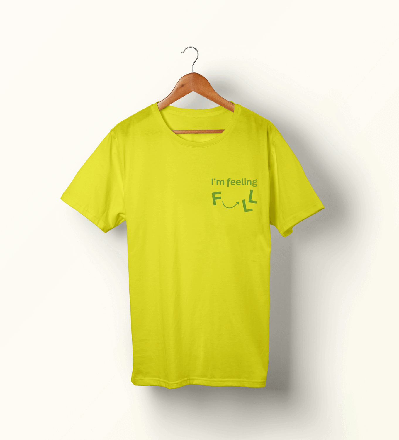
-Tshirts and hat
![]()
![]()
This project further developed my understanding of working in a brand system and keeping consistency. I also furthered my knowledge in Illustrator. I evolved my skills working with a partner, sharing files, and communicating clearly to ensure we understood each other.
SPECS
+ Adobe Illustrator
+ Adobe Dimension
+ FigJam
+ Pitch
+ Identity
+ System
+ Typography
+ Collaboration
ROLES
CHELSEA ROGERS
-Researching
-Deck creation and presentation
-Generating ideas and concepts
-Sketching/Ideating
-Creating patterns
-Providing feedback to help improve our project
-Website and mobile
-Billboard
-Pins
-Set of glasses and pitcher
KATE DEMBOWSKI
-Researching
-Deck creation and presentation
-Generating ideas and concepts
-Sketching/Ideating
-Creating patterns
-Providing feedback to help improve our project
-Main logo lockup creation and motion piece
-Stationary
-Social media
-Street poster
-Tshirts and hat
FINAL PRESENTATION
![]()
MOODBOARD
![]()
SKETCHES
![]()
CONCEPT PRESENTATION
![]()
ITERATION